If you want to give your plots a bit of a high tech look you can use a green phosphor style.
Let's try and create some illuminated storm tracks. The basic technique is to draw a line with a glow around it. This can be done by plotting transparent lines on top of each other. Below you see the basic glow effect. It is a bit exaggerated but it still looks ok.
# Set the background color to black for some illumination effects
rcParams['axes.facecolor'] = 'black'
# Define a new figure
f = figure() # figsize=(15,10))
# Add a subplot (so we can add plots to an axes)
ax = f.add_subplot(1,1,1)
for i in range(10):
    # define random points
    x = random.rand(2)
    y = random.rand(2)
    # Now create 3 lines on top of each other
    ax.plot(x,y, 'g-', linewidth=40, alpha=0.2)
    ax.plot(x,y, 'g-', linewidth=30, alpha=0.2)
    ax.plot(x,y, 'w-', linewidth=20, alpha=0.4)

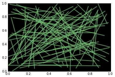
Now make the lines a bit smaller.
# Define a new figure
f = figure() # figsize=(15,10))
# Add a subplot (so we can add plots to an axes)
ax = f.add_subplot(1,1,1)
for i in range(100):
    # define random points
    x = random.rand(2)
    y = random.rand(2)
    # Now create 3 lines on top of each other
    ax.plot(x,y, 'g-', linewidth=4, alpha=0.2)
    ax.plot(x,y, 'g-', linewidth=3, alpha=0.2)
    ax.plot(x,y, 'w-', linewidth=2, alpha=0.4)
When you create more than about 1000 lines there's no need to add the background lines anymore.
I got the dataset from NOAA
import os
import netCDF4

from matplotlib.collections import LineCollection
from matplotlib.cm import ScalarMappable
import numpy as np

datadir = '/Users/fedorbaart/Downloads/ibtracs'
filenames = os.listdir(datadir)


# Define a new figure
f = figure(figsize=(15,10))
# Add a subplot (so we can add plots to an axes)
ax = f.add_subplot(1,1,1)

# Create a normalization function to scale the color from green to white
# not sure what the max of windspeed is
norm = matplotlib.colors.Normalize(0,40)
# use only 1000 files (there's 15000 of them)
for filename in filenames[-5000:]:
    if not filename.endswith('.nc'):
        continue
    ds = netCDF4.Dataset(os.path.join(datadir, filename))
    # Copy the arrays
    lat = ds.variables['lat_for_mapping'][:]
    lon = ds.variables['lon_for_mapping'][:]
    wind = ds.variables['wind_for_mapping'][:]
    # close the file
    ds.close()

    # Now just create 1 line because we have too much green otherwise...
    linecol = LineCollection((np.c_[lon, lat],),
                             linestyle='solid', cmap=matplotlib.cm.Greens_r,
                             alpha=0.2)
    # Use 1 as a linewidth (I think this is in pixels
    linecol.set_linewidth(1)
    # Use the normalized windspeed
    linecol.set_array(norm(wind))
    # The normalized windspeed has range 0-1
    linecol.set_clim(0,1.0)

    ax.add_collection(linecol)
# Reset the limits on the axis, after each plot
ax.set_xlim(-180,180)
# For y also
ax.set_ylim(-90,90)

2 Comments
Gennadii Donchyts
+1
Leroy van Logchem
+1 Some sort of additive blending, just using lines can turn out quite good.