...
| Code Block | ||||
|---|---|---|---|---|
| ||||
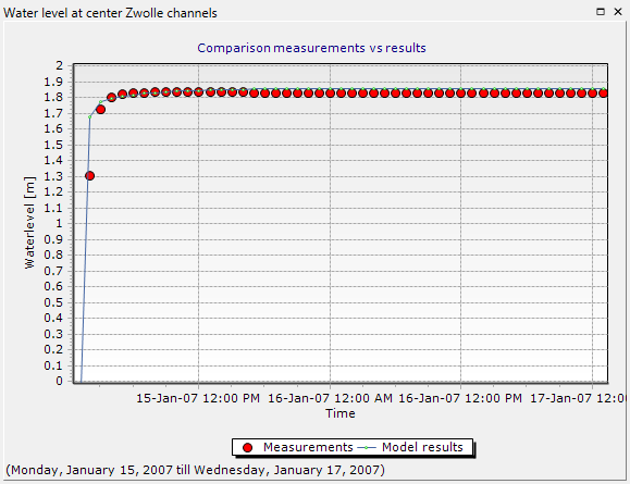
chart.Title = "Comparison measurements vs results" chart.TitleVisible = True chart.BottomAxis.Title = "Time" chart.LeftAxis.Title = "Waterlevel [m]" chart.LeftAxis.Automatic = False chart.LeftAxis.Maximum = 2 chart.LeftAxis.Minimum = 0 chart.Legend.Visible = True chart.Legend.Alignment = LegendAlignment.Bottom |
The figure will now be much easier to understand.
Using the autocomplete function of the scripting editor, change some additional elements of the chart (use auto-complete to check all possible options) until you find that the plot looks the way you want.