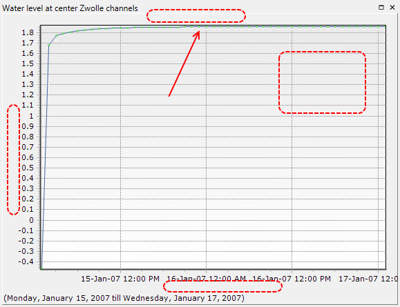
By default, graphs are created in a very basic form: the series have no title, a default color and thickness (maybe not the ones you prefer) is used for all of them, the axes have no title either, no legend is shown, etc.
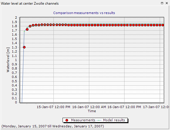
We will now modify the layout and style of the chart to make it easier to read and more appealing (for example to use it in a report). First of all, add a title to the series corresponding to the results of the model with the initial settings. In all the following code, feel free to use the styling options (e.g. colors) you like the most.
lineResults.Title = "Model results"
You can then customize the point series corresponding to the measured data (now, small white dots)
dataSeries.Title = "Measurements"
dataSeries.Color = Color.Red
dataSeries.Size = 4
dataSeries.LineVisible = True
dataSeries.LineColor = Color.Black
Finally, add a title to the entire chart as a whole. Also, add their respective titles to the axes, and show the legend for the plot, which explains what the different series represent.
chart.Title = "Comparison measurements vs results"
chart.TitleVisible = True
chart.BottomAxis.Title = "Time"
chart.LeftAxis.Title = "Waterlevel [m]"
chart.LeftAxis.Automatic = False
chart.LeftAxis.Maximum = 2
chart.LeftAxis.Minimum = 0
chart.Legend.Visible = True
chart.Legend.Alignment = LegendAlignment.Bottom
The figure will now be much easier to understand.
Using the autocomplete function of the scripting editor, change some additional elements of the chart (use auto-complete to check all possible options) until you find that the plot looks the way you want.