...
The Spatial Display grid display can be used to display time series of any type: scalar, polygon or grid. The display will depict the data on a map background. The display time is then set using a ruler that can be moved manually or made to move automatically.

The spatial display consists of following components:
- Spatial Display selection filters
- Control Toolbar with following options:
- Manual zoom and zoom previous buttons
- Zooming and panning
- Toggling on and off map layers or meta data, such as labels, values, flags, thresholds etc
- Play, pause, stop, step forward, step backward and record buttons
- Time slider with time slice indicator
- Data availability and maximum value indicator
- Legend with a
- Moving average or accumulation slider
- Legend
- Contours button
- Export time step data in ascii grid-file
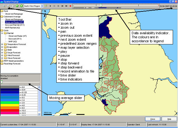
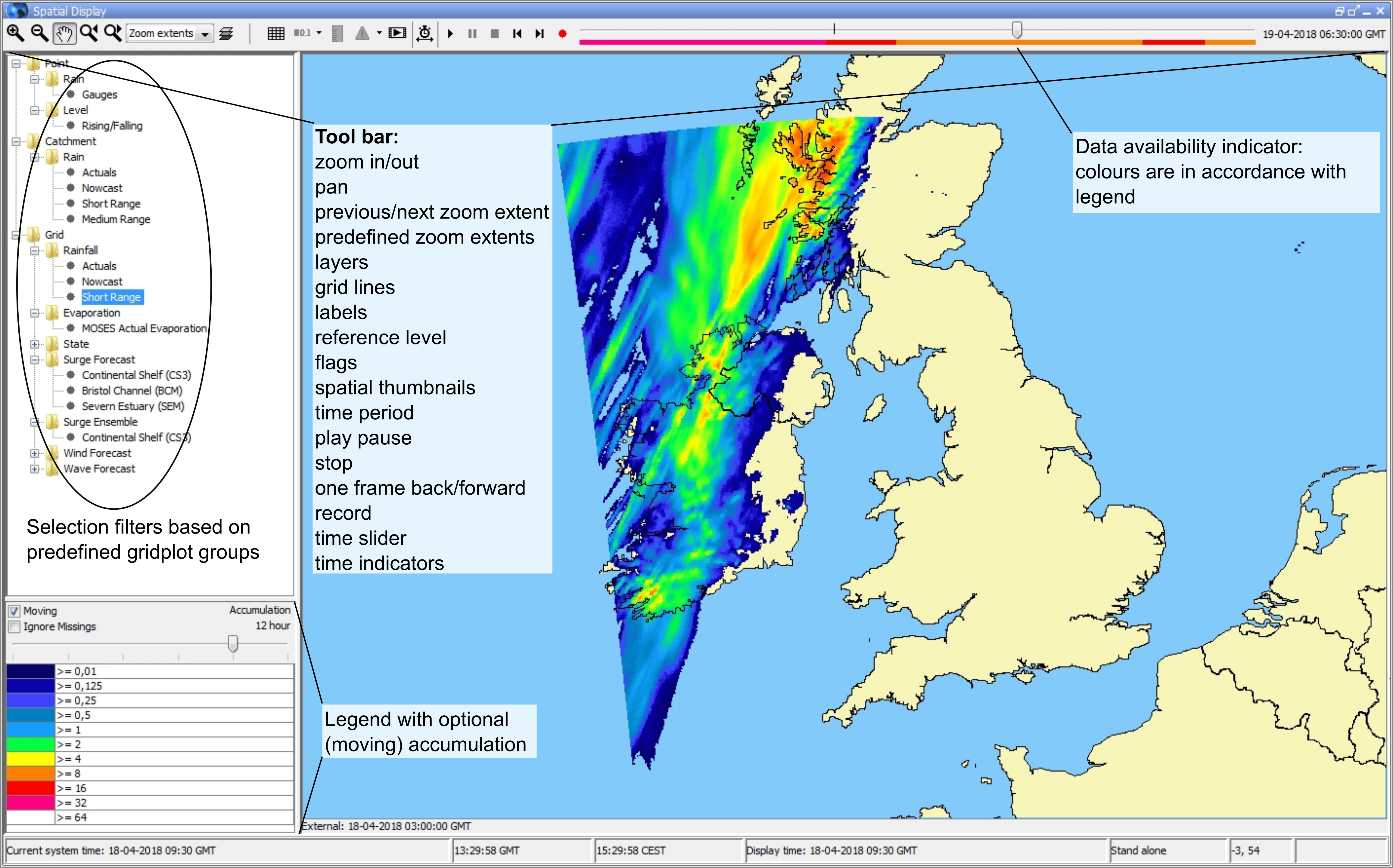
Grid display selection filters
...
The toolbar provides the controls for displaying the spatial information via through the following buttons. The functionality of zoom options and buttons layers is explained in the FEWS Explorer section (see chapter 2).chapter 2).
Button | Description | ||
|---|---|---|---|
 | Contours. To turn on/off contour lines (regular grids configured with contour lines only). Numbers appear when the animation has stopped or paused. The colors, which indicate the value remain visible. | ||
Button | Description | ||
 | Grid lines. Toggles grid lines on or off | ||
 | Labels. Toggles labels on or off (locations, values and/or units) | ||
 | Value to local reference level. | ||
   | Flags. Switches to flags for selected time series / gridplot (quality, modifiers or thresholds) | ||
 | Show spatial thumbnails. Toggles thumbnails of each time step below the main spatial display on or off. | ||
 | Display time. Choose display time (period) | ||
| Play. Starts continuous play mode. The slider will indicate the time slice being shown. | ||
| Pause. Stops continuous play mode. The time slider remains at the time displayed at the moment. | ||
| Stop. Stops continuous play mode. The time reverts back to the start time. | ||
| One frame back. Moves the time slider back one timestep. | ||
| One frame forward. Moves the time slider forwards one timestep. | ||
| Record. Creates an AVI or animated gif movie file. The avi format is used by default unless the filename ends with '.gif'. After opening the file, the display will start playing from the current time position, until the stop button is clicked. | ||
Time slider | The time slider can be dragged to specific time slice. | ||
Data availability | The data availability indicator provides a visual clue as to where you can find data. For those times where data is available, the colour of the data availability indicator will be set to the maximum value found in the data for that time slice.
|


...
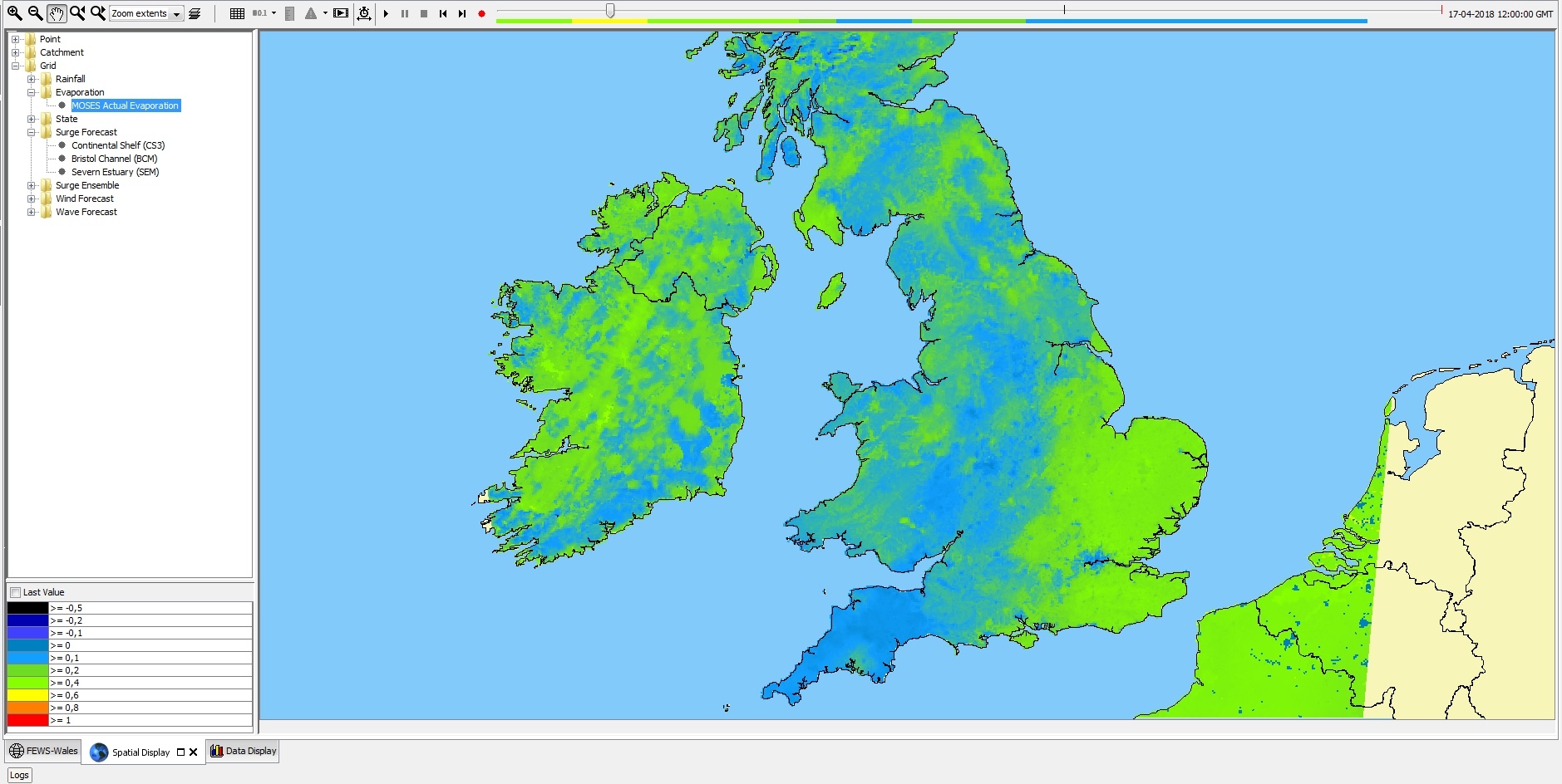
When selected this checkbox shows the last available of time series configured in the grid plot. This can be useful when multiple timeseries with a different or non equidistant time step are defined within one grid plot and a time is selected where one time series does not have data. The time series can be scalar or grid. The checkbox will only appear when no accumulation or moving average slider has been configured, and can be hidden via configuration. The next screenshots show how data with a daily time step will appear at 22:00 even though it is not defined for that time:
...
The legend identifies the colour used for each range of values. The range of values used for each colour can be rescaled by right clicking on the display and selecting 'Rescale Classification' from the pop-up menu. The display colours will be updated to reflect the new classification. After rescaling, the lowest and highest values in the legend will correspond to the minimum and maximum values of the data in the current zoom extent of the display (for the selected time slice). When the display is zoomed in on an area where all data points or grid cells have similar colours, rescaling can be used to see more clearly the differences in the data values. To return to the default classification right click on the display and select 'Back To Default Classification' from the pop-up menu. When selecting a different plot, the classification always changes back to the default classification for that plot.
The legend can be shown as table legend or as bar legend. Bar legend displays fluent scale bar as shown in the picture below:

Contours button
 To turn on/off contour lines (regular grids configured with contour lines only). Numbers appear when the animation has stopped or paused. The colors, which indicate the value remain visible.
Extracting data from the Spatial Display
...