| scrollbar |
|---|
| Table of Contents |
|---|
| Children Display |
|---|
...
In the Button Bar, there is a section further aiding location and parameter selection.


| Rectangle selection: When selected allows you to press left mouse button and drag to create a rectangular box over the Map Display. When released it will select all locations contained in the rectangle. |
| Lasso selection: When selected allows you to create a freehand selection in the Map Display. Press and hold the left mouse button and drag around the locations you want selected. Release to make the selection. |
 | Select with map item selection: When selected allows you to select polygons on the Map Display. When hovering over a polygon, the polygon will be highlighted. If clicked, the locations related to the polygon will be selected. |


There is also a button bar in the Data Viewer which allows storing selections you wish to reuse later.
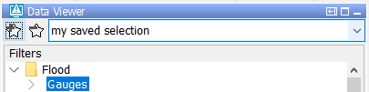
 | Add location parameter selection: Stores the current Map Display filter, location and parameter selection. A Pop-up will allow you to enter a name for this selection. After entering the name and pressing OK, the selection can be found in the dropdown box to the right. |
 | Removes location parameter Remove selection: Removes the current item in the location and parameter saved selection dropdown box to the right of this icon. If there is no current item, or it is empty, nothing will happen. |
| Location parameter Saved selection dropdown: When selecting an item from this dropdownlist the filters, the locations and parameters contained in that item will be selected in the Map Display and the FiltersData Viewer. Selections can be added or removed with the Add / Remove location selection buttons. |

The stored selections endure a restart of FEWS and will only be deleted by manually removing them or when overwritten. The selections are stored in the user settings and will not be visible to other users. The toolbar in the data viewer can be hidden to preserve space by right-clicking one of the trees in the data viewer. The right-click menu contains a "Show ToolBar" menu item.
Note: In versions older than 2018.02, the buttons to store selections where located in the button bar of the map display instead. The stored selections only contained location and parameter selections, the selected filters were not stored. To update old stored location parameter selections with the selected filters, the selection will have to be recreated and re-added manually.
Show map layer information
...
In Delft FEWS the following location icons have been chosen but in principle any icon could be chosen to represent a location type in FEWS.
| gauged fluvial site |
| ungauged fluvial site |
| meteorological site |
| radar data site |
| coastal site |
| catchment centre point |
| default site |


Data availability and validation
Data availability icons show what kind of data is available for the timeSeries selected in a filter.
| no data stored in database (also when looking outside of the view period) |
| only missing values available in view period |
| only missing values available in view period for some time series (configurable since 2011_02; see someSeriesCompletelyMissingIconVisible in the Explorer file) |
| some missing values available in view period |
| soft validation limit exceeded |
| hard validation limit exceeded |
| data edited or interpolated |


| Info |
|---|
Although the icon descriptions are always true, there are some common assumptions that are not always correct. Following are some examples and an elaboration with details why it's not true. -"If a timeSeries contains only missing values (also when looking outside of the view period), it will have a purple cross". This often results from the missing values not being stored in the database but are deduced (i.e, for an equidistant time steps). However, missing values that are the result of a manual adjustment are stored in the database. -"If a timeSeries has a red cross, there are some values available, just not in this view period". The only reason a red cross is not a purple cross is because data are stored in the database (for the timeSeries). But besides values there are also other data stored for a timeSeries, like expired forecasts or the example shown above. These two "data" examples are not an exhaustive list and are not meant to be, but they show that this assumption is not correct. -"A red cross means that one will see no data in the timeSeries display (or the other way around)". The selected filter determines the view period that is used to determine which data availability icon should be shown. This view period configured for a filter does not have to be the same as the view period for the timeSeries displayed in the timeSeries Dialog. If the relative view periods are the same, then the assumption can be used. |
...
In case the high flow thresholds or rainfall thresholds are exceeded somewhere in the configured view period, the following icon is displayed.
| a threshold exceeded in view period |

The threshold status icons are only displayed for the current forecast or selected forecast and observed data.
...
There are 5 extra icons pre-configured for 5 threshold levels that are merged with the original threshold icon. These extra icons are:
| Level 1 threshold crossing in historic and forecast period |
| Level 2 threshold crossing in historic and forecast period |
| Level 3 threshold crossing in historic and forecast period |
| Level 4 threshold crossing in historic and forecast period |
| Level 5 threshold crossing in historic and forecast period |


For a level 3 threshold crossing in the historic period the combined threshold icon for a location will look as follows:
...
It is possible to search elements in the list boxes. Select the appropriate list box and start typing the search criteria, see examples below. The cursor jumps to the next element starting with the letters you typed; in determining a match a closing asterisk "*" is implied. You may also use the asterisk "*" explicitly in the search criteria, for example if you do not want to start with the first character of the elements in the list box. When the search criteria turns red, the search criteria can not be found.
|
|
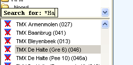

By using the up and down arrow keys you can jump to the next element in the list boxes that match the search criteria.
...
The following type of system messages are identified:
Log level | Description |
|---|---|
Fatal | Severe errors that cause premature termination |
Error | Other runtime errors or unexpected conditions |
Warn | Events that are undesirable or unexpected, but not necessarily wrong |
Info | Runtime events (startup/shutdown) that allows tracking of the progress of the system |
Per message, the Log Viewer provides the following information:
...
The System status icon- in the lower right corner of the display- indicates whether the system operates normally or that severe errors are encountered. The icon has the following display modes:
| Icon | Color | Description |
|---|---|---|
 | Green | System is running normally but warnings have been encountered. |
 | Yellow | System encountered severe errors in the past 48 hours. This means that at least one system message has been generated with log level ERROR. After all messages with this log level have been acknowledged by the user via the System Monitor (see also System Monitor ), the icon becomes green again. |
 | Red | System encountered fatal errors in the past 48 hours. This means that at least one system message has been generated with log level FATAL. After all messages with this log level have been acknowledged by the user via the System Monitor (see also System Monitor ), the icon becomes green again. |
Notification (default disabled)
...