| scrollbar |
|---|
| Table of Contents |
|---|
Components of spatial display
...
The Spatial Display grid display can be used to display time series of any type: scalar, polygon or grid (see figures below for examples). The display will depict the data on a map background. The display time is then set using a ruler that can be moved manually or made to move automatically.

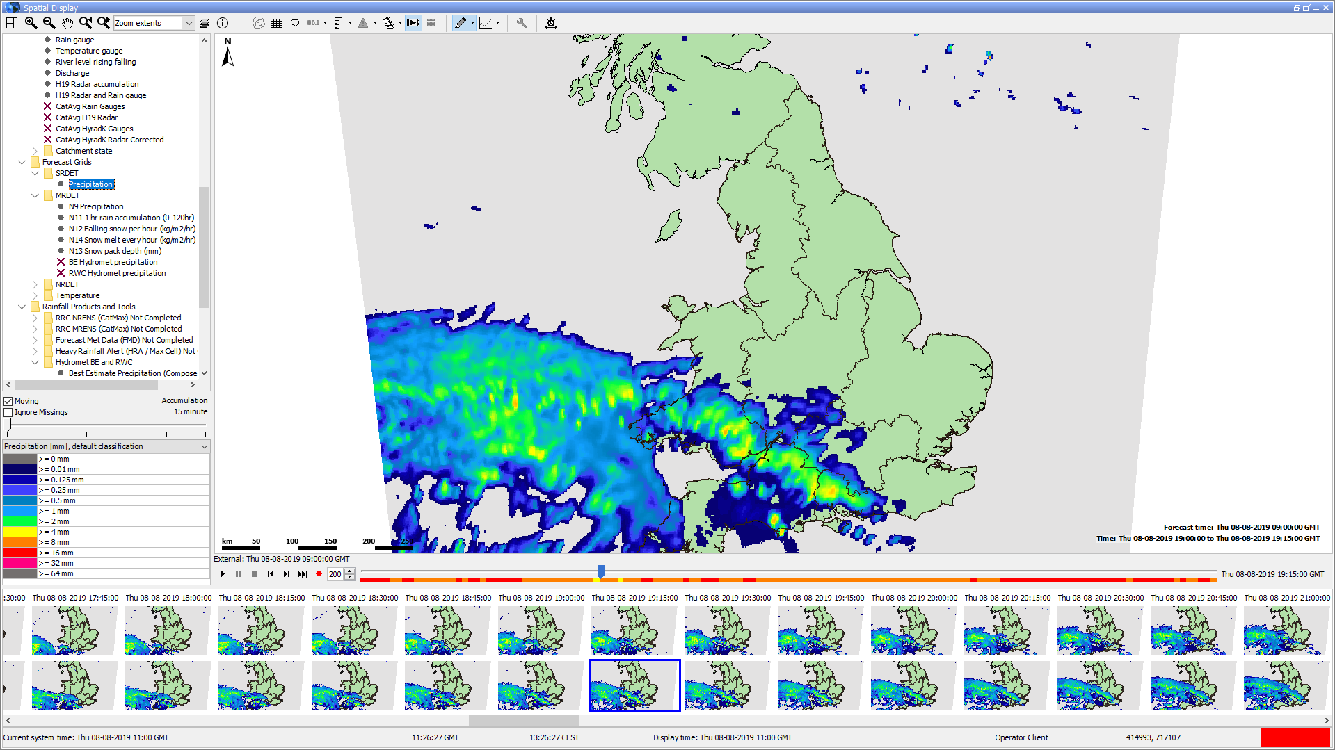

The spatial display consists of following components:
- Spatial/grid/map display with configurable background layers
- Control Toolbar with following generic options:
- Zooming and panning
- Toggling on and off map layers or meta data, such as labels, values, flags, thresholds etc
- Time Slider Toolbar with the following generic options (located at the bottom of the map since 2019.02):
- Play, pause, stop, step forward, step backward and record buttons
- Time slider with time slice indicator
- Data availability and maximum value indicator (colours are in accordance with legend)
- Spatial Display selection filters (preconfigurable plots)
- Table or Bar Legend (with optional accumulation)
- Options to export or record data and time series
...
Button | Description | ||
|---|---|---|---|
 | Contours. To turn on/off contour lines (regular grids configured with contour lines only). Numbers appear when the animation has stopped or paused. The colors, which indicate the value remain visible. | ||
 | Grid lines. Toggles grid or polygon lines on or off | ||

| LabelsProduct Info. Toggles labels product info on or off. (only shown if there are products present in the configuration, see the page on the Forecast Product Information Panel) | ||
| Labels. Toggles labels on or off (locations, values and (locations, values and/or units) | ||
 | Value to local reference level. | ||
   | Flags. Switches to flags for selected time series / gridplot (quality, modifiers or thresholds) | ||
| Search and select forecasts. Switches to (previous) forecasts. | ||
| Show spatial thumbnails. Toggles thumbnails of each time step below the main spatial display on or off. | ||
 | Display time. Choose display time (period) | ||
 | Attributes. | ||
| Play. Starts continuous play mode. The slider will indicate the time slice being shown. | ||
| Pause. Stops continuous play mode. The time slider remains at the time displayed at the moment. | ||
| Stop. Stops continuous play mode. The time reverts back to the start time. | ||
| One frame back. Moves the time slider back one timestep. | ||
| One frame forward. Moves the time slider forwards one timestep. | ||
| Record. Creates an AVI or animated gif movie file. The avi format is used by default unless the filename ends with '.gif'. After opening the file, the display will start playing from the current time position, until the stop button is clicked. | ||
Time slider | The time slider can be dragged to specific time slice. | ||
Data availability | The data availability indicator provides a visual clue as to where you can find data. For those times where data is available, the colour of the data availability indicator will be set to the maximum value found in the data for that time slice.
|


...
| Show spatial ensemble thumbnails. Displays the ensemble thumbnails panel. | ||
| Sketch mode buttons and other sketch drawing options. Switches the sketch mode between drawing points, adding points, drawing longitudinal profiles and drawing areas when the map is clicked. Contains additional options to save/load sketches and delete the current sketch. | ||
| Options to show a graph based on current sketch. Drop-down menu with options to extract scalar time series, vertical profiles, longitudinal profiles, 2D longitudinal profiles, calculate budget and calculating the mean max min time series (for sketched areas). | ||
| Activate spatial modifier mode. Toggles spatial modifier mode on or off (only shown if at least one spatial modifier is configured in ModifierTypes.xml). The additional modifier mode buttons shown when modifier mode is toggled on are explained in the spatial modifier section. | ||
| Display time. Choose display time (period) | ||
| Attributes. | ||
| Play. Starts continuous play mode. The slider will indicate the time slice being shown. | ||
| Pause. Stops continuous play mode. The time slider remains at the time displayed at the moment. | ||
| Stop. Stops continuous play mode. The time reverts back to the start time. | ||
| One frame back. Moves the time slider back one timestep. | ||
| One frame forward. Moves the time slider forwards one timestep. | ||
| Record. Creates an AVI or animated gif movie file. The avi format is used by default unless the filename ends with '.gif'. After opening the file, the display will start playing from the current time position, until the stop button is clicked. | ||
Time slider | The time slider can be dragged to specific time slice. | ||
Data availability | The data availability indicator provides a visual clue as to where you can find data. For those times where data is available, the colour of the data availability indicator will be set to the maximum value found in the data for that time slice.
|
Selection filters
The selection filters show which displays have been configured. Select a filter to display the data. Note that each grid display may be configured differently, i.e. with a different period of data to be displayed, with a different background map, etc. The configuration allows filters to be highlighted in bold.

Legend
The legend can be shown as table legend or as bar legend. The legend identifies the color used for each range of values. The range of values used for each color can be rescaled by right clicking on the display and selecting 'Rescale Classification' from the pop-up menu. The display colors will be updated to reflect the new classification. After rescaling, the lowest and highest values in the legend will correspond to the minimum and maximum values of the data in the current zoom extent of the display (for the selected time slice). When the display is zoomed in on an area where all data points or grid cells have similar colors, rescaling can be used to see more clearly the differences in the data values. To return to the default classification right click on the display and select 'Back To Default Classification' from the pop-up menu. When selecting a different plot, the classification always changes back to the default classification for that plot.
The user can change the classification colors by double clicking the colored squares in the table legend. These changes are stored in the user settings. If a user has made changes, they can be discarded by right clicking the display and selecting 'Discard User-Defined Classification Colors'.
When several classifications are configured, the user can select a classification through the drop down menu directly above the table legend.

A bar legend displays fluent scale bar as shown in the picture below:

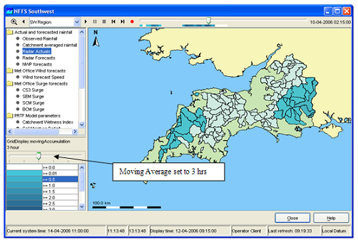
Moving Average or Accumulation Slider
The moving average slider can be configured to allow the user to select a number of moving average settings. Each moving average window is then recalculated for the entire period.
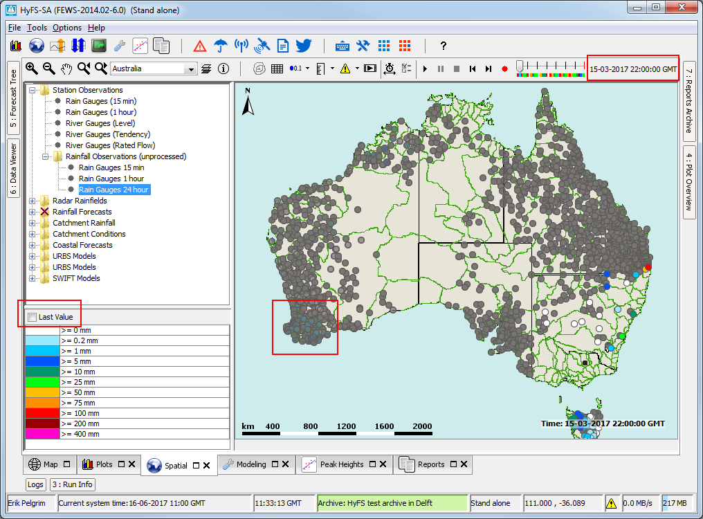
Last Value Checkbox
When selected this checkbox shows the last available of time series configured in the grid plot. This can be useful when multiple timeseries with a different or non equidistant time step are defined within one grid plot and a time is selected where one time series does not have a time step. The time series can be scalar or grid. For scalars the last time step (that is still within the visible period) that does not have a missing value is shown, but for grids just the last time step is shown even though it can be a missing value. The checkbox will only appear when no accumulation or moving average slider has been configured, and can be hidden via configuration. The next screenshots show how data with a daily time step will appear at 22:00 even though it is not defined for that time:

Selecting different forecasts
Selecting different forecast times
Since 2019.02 a "search and select forecast" button is available: ![]() . This button is enabled if there is more than one forecast available, i.e. there are several forecast time series with different forecast times present in the database and the <numberOfRecentForecasts> is set to more than 1 for the selected grid plot. Click the button to cycle through the available forecasts. The drop-down menu will show the forecast times of the available forecasts and selecting one of these forecast times will show change the shown forecast to the one selected.
. This button is enabled if there is more than one forecast available, i.e. there are several forecast time series with different forecast times present in the database and the <numberOfRecentForecasts> is set to more than 1 for the selected grid plot. Click the button to cycle through the available forecasts. The drop-down menu will show the forecast times of the available forecasts and selecting one of these forecast times will show change the shown forecast to the one selected.
Alternatively the spatial thumbnails can be used to select different forecasts (and select different time steps). The spatial thumbnails panel will show one row for each forecast available. Toggle the panel on or off using the  button.
Selecting different ensemble members
Available since 2019.02. The ![]() can be used to open the spatial ensemble thumbnails panel.
can be used to open the spatial ensemble thumbnails panel.
TODO Erik: finish documentation.
Extracting data from the Spatial Display
Export time step data in ascii grid-file
By right clicking on the display, the grid data for a specific timestep can be exported in an ascii file. Select the desirable time step with the control toolbar.
Extracting scalar time series from grid
Scalar time series can be extracted from the grid by double clicking the point of interest. Depending on the type of data, which is displayed, the scalar time series will be relevant to either a point, polygon or grid cell. This can also be done in the following way. First select the point of interest by left clicking. A colored dot will be drawn to indicate the selected point. For grid data an additional green dot will be drawn to indicate the center of the selected grid cell (you may need to zoom in to see the green dot since it will be covered by the colored dot if they overlap). Extract the time series for the selected point either by selecting 'Show Time Series' from the drop-down menu of the ![]() button or by using the Ctrl+F3 shortcut.
button or by using the Ctrl+F3 shortcut.
Instead of immediately extracting the time series and showing the a time series dialog, the "Copy Time Series" option can be used to copy the time series for the selected point to the clipboard. Copied time series can then later be pasted in a time series dialog through the paste button in its tool bar.
Several points can be drawing by selecting the "Draw Points" sketch mode through the sketch mode button or holding the left ctrl and shift buttons while left clicking on the points of interest. When several points have been drawn, the "Show time Series" and "Copy Time Series" options will show/copy separate time series for each of the drawn points.
Instead of manually drawing a point / points, the 'Show Time Series For Coordinates...' option in the drop-down menu of the ![]() button can be used (shortcut: Ctrl+Shift+F3) which will open a small dialog prompting the user to enter coordinates of the point they wish to use
button can be used (shortcut: Ctrl+Shift+F3) which will open a small dialog prompting the user to enter coordinates of the point they wish to use
The selection filters show which displays have been configured. Select a filter to display the data. Note that each grid display may be configured differently, i.e. with a different period of data to be displayed, with a different background map, etc. The configuration allows filters to be highlighted in bold.
Legend
The legend can be shown as table legend or as bar legend. The legend identifies the colour used for each range of values. The range of values used for each colour can be rescaled by right clicking on the display and selecting 'Rescale Classification' from the pop-up menu. The display colours will be updated to reflect the new classification. After rescaling, the lowest and highest values in the legend will correspond to the minimum and maximum values of the data in the current zoom extent of the display (for the selected time slice). When the display is zoomed in on an area where all data points or grid cells have similar colours, rescaling can be used to see more clearly the differences in the data values. To return to the default classification right click on the display and select 'Back To Default Classification' from the pop-up menu. When selecting a different plot, the classification always changes back to the default classification for that plot.
A bar legend displays fluent scale bar as shown in the picture below:
Moving Average or Accumulation Slider
The moving average slider can be configured to allow the user to select a number of moving average settings. Each moving average window is then recalculated for the entire period.
Last Value Checkbox
When selected this checkbox shows the last available of time series configured in the grid plot. This can be useful when multiple timeseries with a different or non equidistant time step are defined within one grid plot and a time is selected where one time series does not have a time step. The time series can be scalar or grid. For scalars the last time step (that is still within the visible period) that does not have a missing value is shown, but for grids just the last time step is shown even though it can be a missing value. The checkbox will only appear when no accumulation or moving average slider has been configured, and can be hidden via configuration. The next screenshots show how data with a daily time step will appear at 22:00 even though it is not defined for that time:
Extracting data from the Spatial Display
Export time step data in ascii grid-file
By right clicking on the display, the grid data for a specific timestep can be exported in an ascii file. Select the desirable time step with the control toolbar.
Extracting scalar time series from grid
Scalar time series can be extracted from the grid by double clicking the point of interest. Depending on the type of data, which is displayed, the scalar time series will be relevant to either a point, polygon or grid cell. This can also be done in the following way. First select the point of interest either by right clicking and selecting 'Draw Point' from the pop-up menu or by left clicking. A coloured dot will be drawn to indicate the selected point. For grid data an additional green dot will be drawn to indicate the centre of the selected grid cell. Then extract the time series for the selected point either by right clicking and selecting 'Show Time Series' from the pop-up menu or by pressing the F3 key.
A series, that is extracted from a grid, is not related to a known location or polygon ID. The series will then be identified using the grid coordinates.
...
To extract a different scalar time series double-click on another point of interest. This will draw a new dot and extract a scalar time series for that point. Please be aware that when extracting a scalar time series from a data point in the display, then the dot drawn on top of the data point has a different colour from the point itself. This way it may look like the data point has a different colour color because of the dot. The dot can be erased by right clicking and selecting 'Delete PointPoints' from in the popdrop-up menudown menu of the sketch mode button (or using the keyboard shortcut Ctrl+Delete).
Note:
Make sure that you stop the grid movie before you make a time series graph, this can cause the system to slow down because multiple processes have to be executed that take a lot of processing time.
Note:
Extraction of scalar time series is not available for rotated pole geodatum types. In some cases extraction of scalar time series can exhibit unexpected behaviour near the North Pole or South Pole.
time.
Note:
Extraction of scalar time series is not available for rotated pole geodatum types. In some cases extraction of scalar time series can exhibit unexpected behaviour near the North Pole or South Pole.
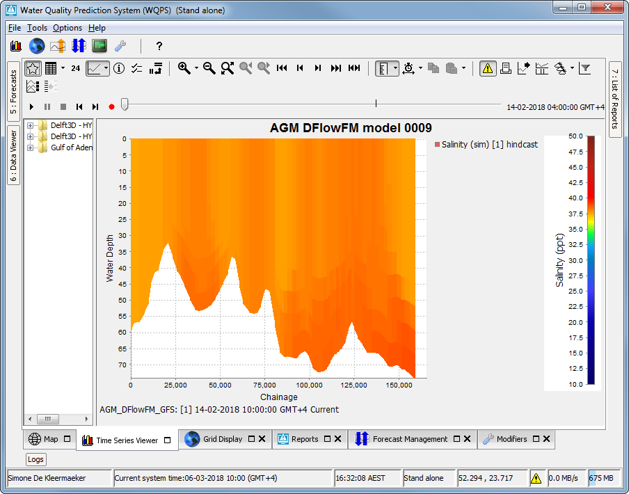
Extracting vertical profiles from 3D data
When the spatial display is showing 3D (layered) data, a vertical profile can be extracted. A point should be drawn as described in the previous section, then the 'Show Vertical Profile' option in the drop-down menu of the ![]() button to show a time series dialog with the vertical profile for the drawn point. Alternatively a 'Show Vertical Profile For Coordinates...' option is available.
button to show a time series dialog with the vertical profile for the drawn point. Alternatively a 'Show Vertical Profile For Coordinates...' option is available.
Extracting longitudinal profiles (Xsections) from a grid time series
Longitudinal profiles time series can be extracted from grid data and shown in a separate graph as well. The profile (or cross section) is defined by drawing a profile sketch. Start drawing a profile sketch either by right clicking opening the drop-down menu of the sketch mode button and selecting 'Start Drawing Profile' from the pop-up menu or by Ctrl+left clicking on the desired start point for the profile. A coloured colored dot will be drawn to indicate the selected start point. Add additional line segments to the profile by left clicking in the display. Finish drawing by double-clicking on the desired end point for the profile. Green dots along the profile indicate which grid cells are used for the profile.
Once a profile sketch has been drawn, extract the profile either by right clicking and selecting 'Show Longitudinal Profile' from the popdrop-up down menu of the ![]() button or by pressing using the F2 key. The graph of the profile will show automaticallyCtrl+F2 shortcut. The graph of the profile will show automatically.
button or by pressing using the F2 key. The graph of the profile will show automaticallyCtrl+F2 shortcut. The graph of the profile will show automatically.
Instead of drawing the profile on the map, the 'Show Longitudinal Profile For Coordinates...' option can be used to enter coordinates for the profile points.
To extract a different profile just start drawing another profile. This will erase the previous sketch. The profile sketch can also be erased by right clicking and selecting 'Delete Sketch' from the popdrop-up menudown menu of the sketch mode button or pressing the Delete key on the keyboard.
When animating the grid, the profile follows the same animation. When animating the profile only, the grid animation remains fixed. Note that the same cross section can be reused when switching to another plot (Ctrl+F2 will open a new window).
...
Note:
If longitudinal profile data is displayed in the spatial display, then there is no need to draw a profile sketch. Just press the F2 key or right click and select 'Show Profile' from the pop-up menu to show the graph of the profile. 
Create 2D longitudinal profiles
...
from data in the Spatial Display
Create a 2D longitudinal profile on the fly for 3D data a in the spatial display. Start drawing a A longitudinal profile with a CTRL-click in the spatial display and click to add points as required. Finish the profile with a double-click for the last point. Open up the longitudinal profile in the timeseriesdisplay with CTRL-F11, or via the context menushould be drawn as described in the previous section. Open up the 2D longitudinal profile in the Time Series Display with Ctrl-F11, or by selecting the 'Show 2D Longitudinal Profile' option in the drop-down menu of the ![]() button. There is also a 'Show 2D Longitudinal Profile For Coordinates...' option, to allow entering coordinates of the profile points instead of sketching the profile on the map.
button. There is also a 'Show 2D Longitudinal Profile For Coordinates...' option, to allow entering coordinates of the profile points instead of sketching the profile on the map.
Note, this feature only works for
- data within 1 grid partition. In some cases 3D data model runs are run on multiple domain partitions. This data can be shown as a 2D longitudinal profile, but only if the profile remains within a single domain.
- scalar data (e.g. Water temperature or salinity), and not yet for vector data like currents.

Extracting data for an area from a grid time series (
...
Calculate Budget)
For certain types of data it is possible to extract time series data for a specific part of a grid and show this in a separate graph. This is only possible for scalar data with dimension L3/T, L3, L/T, L or 'amount of substance' and for horizontal flow data with dimension L3/T or L/T. The specific part of the grid is defined by drawing an area sketch (a closed polygon surrounding the desired area). Start drawing an area sketch either by right clicking and selecting 'Start Drawing Area' from the popdrop-up menu down menu of the sketch mode button and then left clicking the map, or by Shift+left clicking on an edge the desired start point for the desired area. A coloured colored dot will be drawn to indicate the selected point. Add additional line segments along the edge of the desired area by left clicking in the display. Finish drawing by double-clicking. The last point in the sketch will be connected to the first point automatically to create a closed polygon that surrounds the desired area. Each grid cell inside the area is marked with a green dot. that surrounds the desired area.
Once an area sketch has been drawn, extract the desired data by right clicking and selecting 'Calculate Budget' from the pop-up menu. The corresponding graph will show automatically. The 'Calculate Budget' option will perform one of the following calculations, depending on the type and the dimension of the selected data (The dimension can be defined in a parameterGroup in the region configuration).
...
To extract data for a different area just start drawing another area. This will erase the previous sketch. The area sketch can also be erased by right clicking and selecting 'Delete Sketch' from the pop-up menu.
When animating the grid display, a marker will move over the time series graph as well. Note that the same area sketch can be reused when switching to another plot (right clicking and selecting one of the relevant options will open a new window). 
Note:
Even more essential then for scalars, it is wise to pause the grid animation when dragging an area for extracting data.
Note:
Extraction of data for an area is not available for quadrilateral grids, irregular grids, points and polygons. The area sketch will be erased when switching to a plot that contains data of one of these types. Extraction of data for an area is also not available for rotated pole geodatum types. In some cases extraction of data for an area can exhibit unexpected behaviour for areas crossing the dateline or located near the North Pole or South Pole.
-up menu.
When animating the grid display, a marker will move over the time series graph as well. Note that the same area sketch can be reused when switching to another plot (right clicking and selecting one of the relevant options will open a new window).
Note:
Even more essential then for scalars, it is wise to pause the grid animation when dragging an area for extracting data.
Note:
Extraction of data for an area is not available for quadrilateral grids, irregular grids, points and polygons. The area sketch will be erased when switching to a plot that contains data of one of these types. Extraction of data for an area is also not available for rotated pole geodatum types. In some cases extraction of data for an area can exhibit unexpected behaviour for areas crossing the dateline or located near the North Pole or South Pole.
Note:
The green dots only mark grid cells of which the cell centre is inside the area. The actual calculations also use grid cells that are partially inside the area.
Extracting min max and mean time series for an area
Available since 2019.02. An area should be drawn as described in the first paragraph of the previous section. Then select 'Show Min Max Mean Time Series For Area' in the drop-down menu of the ![]() button. A Time Series Dialog will show the expected time series.
button. A Time Series Dialog will show the expected time series.
 Note:
Note:
The green dots only mark grid cells of which the cell centre is inside the area. The actual calculations also use grid cells that are partially inside the area.
Extracting data for multiple plots at once (available since build 18645)
...
Once a profile sketch or an area sketch has been drawn, the sketch can be saved as a shape file (*.shp file) by right clicking and selecting 'Save Sketch As Shape File' in the drop-down menu of the sketch mode button (shortcut: Ctrl+Shift+S). A saved sketch or any other shape file that represents a profile or an area (a closed polygon) can be loaded into the display by right clicking and selecting 'Load Sketch From Shape File' (shortcut: Ctrl+Shift+S). The loaded sketch can then be used for extracting data. When loading a sketch, the previous sketch will be erased.
...