...
The hidden columns will be stored in the user settings
Changing the view period
![]()
Since 2020.01 it is possible to move the view period to the first or to the last data point available. The buttons are in the following order:
- move to first datapoint available of selected time series (the length of the period will remain the same)
- move one full viewperiod back
- move a half viewperiod back
- move a half viewperiod forward
- move a whole viewperiod forward
- move to the last datapoint available of selected time series (the length of the period will remain the same)
- set view period to include all data of selected time series
 Rotate Splitter
With this button the splitter between table and graph can be placed in a horizontal position. Clicking the same button again returns the splitter to its default vertical position.
...
Rotate Splitter
With this button the splitter between table and graph can be placed in a horizontal position. Clicking the same button again returns the splitter to its default vertical position.
 Rotate Legend
This button can be used to place the graph legend underneath the graph. Clicking the same button again returns the legend to its default position at the right hand side of the graph.

 Toggle Graph
When multiple data series are selected for a single data type (parameter), the graphs will be placed in one subplot of the graph. This sometimes complicates the analysis of time series with different data ranges. By clicking the above mentioned button you can change the layout of the chart:
- Merged into a single graph
- Stacked in different subplots
 Scale to show unreliable Data
This button can be used to place the graph legend underneath the graph. Clicking the same button again returns the legend to its default position at the right hand side of the graph.
Toggle Graph
When multiple data series are selected for a single data type (parameter), the graphs will be placed in one subplot of the graph. This sometimes complicates the analysis of time series with different data ranges. By clicking the above mentioned button you can change the layout of the chart:
- Merged into a single graph
- Stacked in different subplots
Scale to show unreliable Data
This button can be used to focus on time intervals with unreliable data within the selected time series. Data is marked as unreliable, if values exceed hard limits.
 No Thresholds Scaling
By clicking this button there will be no scaling in order to show thresholds out of data range.
 Scale to show relevant Thresholds
With this option the graph is scaled in such a way, that relevant thresholds (the closest threshold values) are displayed together with the selected time series in the graph.

 Scale to show all Thresholds
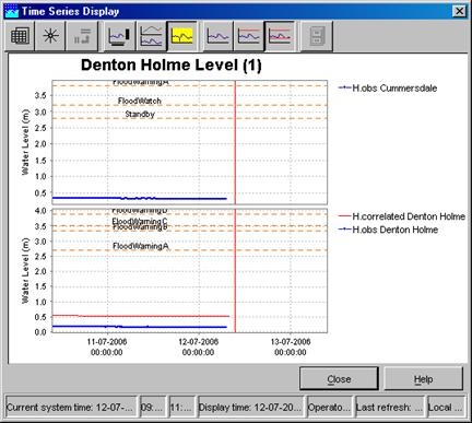
This button can be used to show all pre-configured thresholds of a certain parameter at the selected location(s). This means that all thresholds levels (e.g. Standby, Flood Watch, Flood Warning and Severe Flood Warning) are displayed in the graph.
 Show data labels
Clicking the 'Show data labels' will you to display quality flags for the data you are presenting. The information is shown at the bottom of the screen.
The following colour codes have been used:
- the upper line indicates the origin of the data
- original data: no line is displayed
- automatically corrected data (original data flagged as unreliable and automatically interpolated): blue line
- automatically completed data (original data is missing and interpolated by system): magenta line
- manual corrected data (original data edited by a user): dark blue line
- manual completed data (filled up by a user): dark magenta line
- the middle line indicates the quality of the data
- reliable data: no line is displayed
- doubtful data: orange
- unreliable data: yellow
focus on time intervals with unreliable data within the selected time series. Data is marked as unreliable, if values exceed hard limits.
No Thresholds Scaling
By clicking this button there will be no scaling in order to show thresholds out of data range.
Scale to show relevant Thresholds
With this option the graph is scaled in such a way, that relevant thresholds (the closest threshold values) are displayed together with the selected time series in the graph.
Scale to show all Thresholds
This button can be used to show all pre-configured thresholds of a certain parameter at the selected location(s). This means that all thresholds levels (e.g. Standby, Flood Watch, Flood Warning and Severe Flood Warning) are displayed in the graph.
Show data labels
Clicking the 'Show data labels' will you to display quality flags for the data you are presenting. The information is shown at the bottom of the screen.
The following colour codes have been used:
- the upper line indicates the origin of the data
- original data: no line is displayed
- automatically corrected data (original data flagged as unreliable and automatically interpolated): blue line
- automatically completed data (original data is missing and interpolated by system): magenta line
- manual corrected data (original data edited by a user): dark blue line
- manual completed data (filled up by a user): dark magenta line
- the middle line indicates the quality of the data
- reliable data: no line is displayed
- doubtful data: orange
- unreliable data: yellow
- the lower line indicates where comments have been added to the data
- no comment: no line is displayed
- comment available: dark
- the lower line indicates where comments have been added to the data
- no comment: no line is displayed
- comment available: dark red
The lines are displayed under the data points. The colours correspond with the colouring used in the tables.
...
In the popup dialog “Zoom to range…” it is possible to set the minimum and maximum of the left vertical axis.

This manually entered range will stay that way until the user starts zooming again. This functionality is activated when from the zoom tool the drop-down option “Allow Vertical Axis Zoom” is selected.
...
is possible to set the minimum and maximum of the left vertical axis.
This manually entered range will stay that way until the user starts zooming again. This functionality is activated when from the zoom tool the drop-down option “Allow Vertical Axis Zoom” is selected.

Changing the view period
![]()
Since 2020.01 it is possible to move the view period to the first or to the last data point available. The buttons are in the following order:
- move to first datapoint available of selected time series (the length of the period will remain the same)
- move one full viewperiod back
- move a half viewperiod back
- move a half viewperiod forward
- move a whole viewperiod forward
- move to the last datapoint available of selected time series (the length of the period will remain the same)
- set view period to include all data of selected time series
Data Editor
The Graph and Editor display has a table and an edit mode.
...