...
The legend can be displayed as a table or a bar. It identifies the color associated with each range of values. You can rescale the range of values for each color by right-clicking on the display and choosing ‘Rescale Classification’ from the pop-up menu. The display colors will then be updated to match the new classification. After rescaling, the lowest and highest values in the legend will match the minimum and maximum values of the data in the current zoom extent of the display (for the selected time slice). If you zoom in on an area where all data points or grid cells have similar colors, you can use rescaling to better see the differences in data values. To go back to the default classification, right-click on the display and choose ‘Back To Default Classification’ from the pop-up menu. When you select a different plot, the classification always reverts back to the default for that plot.
Users can change the classification colors by double-clicking the colored squares in the table legend. These changes are saved in the user settings. If a user has made changes, they can discard them by right-clicking the display and selecting ‘Discard User-Defined Classification Colors’.
When multiple classifications are set up, users can select a classification from the drop-down menu located directly above the table legend.

A bar legend displays fluent scale bar as shown in the picture below:
...
The moving average slider can be set up to let the user choose from a number of moving average settings. Each moving average window is then recalculated for the whole period.
When you close the program, both the selected grid plot and the chosen aggregation time step are saved in the user settings. When you reopen FEWS, the same aggregation time step will be selected. If you’ve selected an aggregation time step and then switch between different plots, FEWS will try to select the same time step again for the new plot. In the image below, the Moving Accumulation Slider is set to 1 day.

Since the 2023.02 the accumulation slider automatically contains an extra tick at the end of the slider do accumulate the time steps to/from the display time
...
A “search and select forecast” (![]() ) button is available. This button becomes active if more than one forecast is available, meaning there are multiple forecast time series with different forecast times in the database and the
) button is available. This button becomes active if more than one forecast is available, meaning there are multiple forecast time series with different forecast times in the database and the <numberOfRecentForecasts> is set to more than 1 for the selected grid plot. Clicking the button allows you to cycle through the available forecasts. The drop-down menu will display the forecast times of the available forecasts, and selecting one of these times will change the displayed forecast to the one selected.
Alternatively, you can use the spatial thumbnails to select different forecasts (and different time steps). The spatial thumbnails panel will display one row for each available forecast. You can toggle this panel on or off using the button (![]() ).
).

Selecting different ensemble members
...
The spatial ensemble thumbnails window will open, displaying a thumbnail for each individual ensemble member at the selected time.
In this window, users can choose the ensemble thumbnail they want to view. This selected ensemble member will then be visualized in the grid display.
The ensemble member is identified at the bottom of the thumbnail and in the bottom right corner of the grid display.
The thumbnails can be resized at the bottom right corner of the first thumbnail. A resize mouse cursor will appear when hovering over that corner.
The size will be stored in the user settings for future use.
Contours
The contour button generates contours in real-time for the grids being displayed. Since 2021.01, it’s also possible to show contours for irregular grids and across multiple grids displayed simultaneously. When the contour button is pressed, bilinear interpolation is used to calculate a value for each pixel individually. The grid display knows the grid cell for every pixel at the current map extent and zoom level. The detection of neighboring cells is done at the screen pixel level and works for existing configurations. The interpolation is automatically turned off for individual cells that are not rectangular or are rotated more than 10 degrees compared to the screen. The contours are calculated for the interpolated pixel values for the current zoom extent. The contour button is disabled for point data and when contours are configured for a different parameter on top of the parameter that is using the colors from the legend.
...
| Info | ||
|---|---|---|
| ||
In 2019.02 the options to extract data from the spatial display were moved from the right-click menu of the map to the drop-down menu of a new |
...
Extracting scalar time series from grid
...
You can extract scalar time series
...
from the grid by double-clicking on the point of interest. Depending on the type of data
...
displayed, the scalar time series will
...
correspond to
...
a point, polygon, or grid cell.
...
Here’s another way to do it:
- First, select the point of interest by left-clicking. A colored dot will
...
- appear to
...
- mark the selected point. For grid data, an additional green dot will be drawn to indicate the center of the selected grid cell (you may need to zoom in to see the green dot
...
- if it overlaps with the colored dot
...
- ).
- Extract the time series for the selected point either by selecting
...
- ‘Show Time
...
- Series’ from the drop-down menu of
...
- the (
 )button or by using the Ctrl+F3 shortcut.
Instead of immediately extracting the time series and showing
...
a time series dialog, you can use the
...
“Copy Time
...
Series” option
...
to copy the time series for the selected point to the FEWS clipboard. Copied time series can then
...
be pasted
...
into a time series dialog
...
later using the paste button in its
...
toolbar.
...
You can draw several points by selecting the
...
“Add Point” sketch mode through the sketch mode button (![]() ) or by holding the left ctrl and shift buttons while left-clicking on the points of interest. When several points have been drawn, the
) or by holding the left ctrl and shift buttons while left-clicking on the points of interest. When several points have been drawn, the
...
“Show Time Series” and “Copy Time Series” options will show
...
or copy separate time series for each of the drawn points.
...
Instead of manually drawing a point
...
or points, you can use the
...
‘Show Time Series For
...
Coordinates…’ option in the drop-down menu of
...
the (![]() ) button. This will open a small dialog prompting
) button. This will open a small dialog prompting
...
you to enter the coordinates of the point
...
you wish to use.
A series
...
extracted from a grid
...
is not related to a known location or polygon ID. The series will
...
be identified using the grid coordinates.
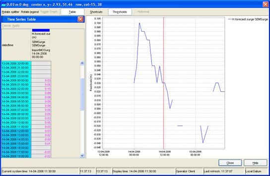
The graph will automatically pop up with the time series of the selected point, polygon, or grid cell. When animating the grid display, a marker will move over the time series graph as well.
To extract a different scalar time series, double-click on another point of interest. This will draw a new dot and extract a scalar time series for that point. Please
...
note that when extracting a scalar time series from a data point in the display,
...
the dot drawn on top of the data point has a different
...
color from the point itself. This
...
might make it
...
look like the data point has a different color because of the dot. The dot can be erased by selecting
...
‘Delete Points’ in the drop-down menu of the sketch mode button (or using the keyboard shortcut Ctrl+Delete).
Note:
...
It’s important to stop the grid movie before
...
creating a time series graph
...
. Running both at the same time can slow down the system
...
due to the heavy processing load from executing multiple processes simultaneously.
The extraction
...
of scalar time series is not available for rotated pole geodatum types. In some cases, the extraction of scalar time series
...
may behave unexpectedly near the North Pole or South Pole.
Extracting scalar time series for each ensemble member at one from grid
Since Since the 2020.01 it is version, it’s possible to show display the scalar time series for each ensemble member for a single grid cell.


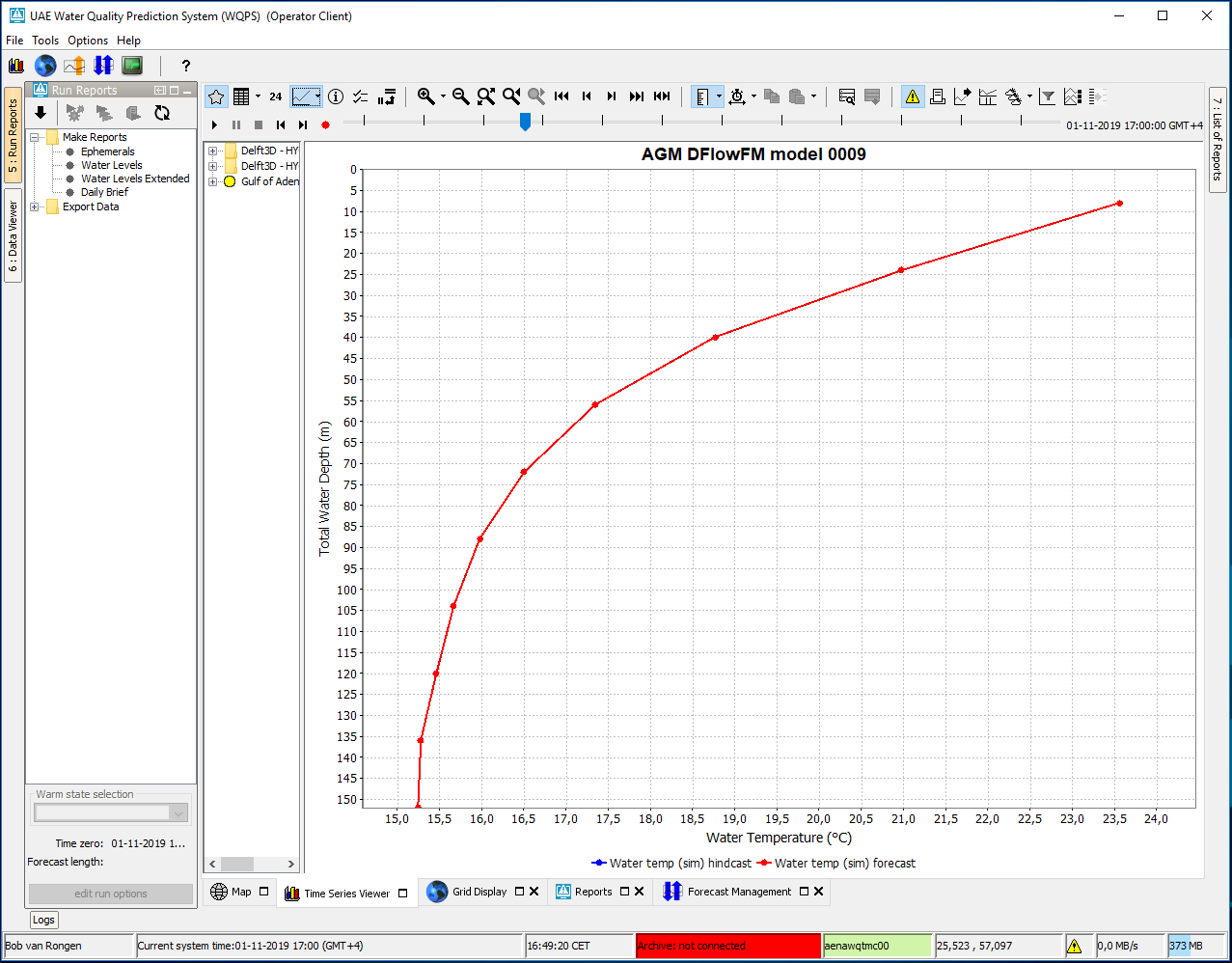
Extracting vertical profiles from 3D data
When the spatial display is
...
presenting 3D (layered) data, you can extract a vertical profile
...
. Here’s how:
- Draw a point as described in the previous section.
- Then,
...
- select the
...
- ‘Show Vertical
...
- Profile’ option in the drop-down menu of the
...
- button or press Ctrl+
...
- F4. This will open a time series dialog with the vertical profile for the drawn point.
...
Alternatively, you can use the ‘Show Vertical Profile For
...
Coordinates…’ option in the drop-down menu or
...
press Ctrl+Shift+F4.
...
You can also create a vertical profile with a color map
...
:
- Select the ‘Use Color Map’ option in the drop-down menu of
...
- the button or use Ctrl-M.
- The vertical profile will then be
...
- displayed as a graph of
...
- a parameter over time, with the colors in the plot indicating the values of the selected parameter.
Extracting longitudinal profiles (Xsections) from a grid time series
...