...
The legend identifies the colour used for each range of values. The range of values used for each colour can be rescaled by right clicking on the display and selecting 'Rescale Classification' from the pop-up menu. The display colours will be updated to reflect the new classification. After rescaling, the lowest and highest values in the legend will correspond to the minimum and maximum values of the data in the current zoom extent of the display (for the selected time slice). When the display is zoomed in on an area where all data points or grid cells have similar colours, rescaling can be used to see more clearly the differences in the data values.
To return to the default classification right click on the display and select 'Back To Default Classification' from the pop-up menu. When selecting a different plot, the classification always changes back to the default classification for that plot.
...
Scalar time series can be extracted from the grid by double clicking the point of interest. Depending on the type of data, which is displayed, the scalar time series will be relevant to either a point, polygon or grid cell. This can also be done in the following way. First select the point of interest by right clicking and selecting 'Draw Point' from the pop-up menu or by left clicking. A coloured dot will be drawn to indicate the selected point. For grid data an additional green dot will be drawn to indicate the centre of the selected grid cell. Then extract the time series for the selected point by right clicking and selecting 'Show Time Series' from the pop-up menu or by pressing the F3 key.
A series, that is extracted from a grid, is not related to a known location or polygon ID. The series will then be identified using the grid coordinates.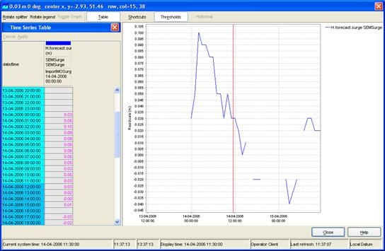
This can be done by double clicking on a grid cell on the grid display. The graph will automatically pop up with the time series of the selected point, polygon or grid cell. When animating the grid display, a marker will move over the time series graph as well.
Note:
Make sure that you stop the grid movie before you make a time series graph, this can cause the system to slow down because multiple processes have to be executed that take a lot of processing time.
Extracting longitudinal profiles (Xsections) from a grid time series
...