| Table of Contents |
|---|
| Children Display |
|---|
Data Display and Data Editor
The Data Display and Data Editor offer graphical displays for presenting and editing of data. Both have the nearly the same functionality, but only the Data Editor allows you to edit data. In addition, the Data Editor can only be opened once, while multiple instances of the Data Display can be opened.
This display offers the following features:
Display of time series in:
- graphs
- Graphs (scalar/longitudinal profiles)
- Tables (scalar/longitudinal profiles)
- Tabular data editor
- Display of actual data with:
- Historical events
- Threshold levels
Data is displayed in a table and a graph simultaneously. The splitter between the table and the graph can be moved to modify the display. Select the data series , that should be displayed with help of using the List Boxes and/or the Map Display (see also Filters).
| Wiki Markup |
|---|
When the display is started through the FEWS Tools menu item _Data Editor_ , data can be edited and the edited data can be stored in the FEWS data base. When the display is started through the FEWS Tools menu item _Data Display_ or through the FEWS toolbar, the data can only be viewed.
1.1 <ac:structured-macro ac:name="anchor" ac:schema-version="1" ac:macro-id="8cbd56c6-b596-46aa-b135-274938d08f19"><ac:parameter ac:name="">_Toc172823841</ac:parameter></ac:structured-macro><ac:structured-macro ac:name="anchor" ac:schema-version="1" ac:macro-id="f249ed5e-bfb9-4fca-8138-9f5018732dd6"><ac:parameter ac:name="">_Toc140564169</ac:parameter></ac:structured-macro>Data Display
Press the \[*Data Display* \] button !image002.png! on the toolbar to present graphs displaying the data. The splitter is normally positioned on the left of the display. |
When data series of different data types have been selected, the data will be presented in different subplots with the data series of a single data type merged into one subplot.
The data in the graph is updated automatically in case new data becomes available.
Following buttons are used in the Time Series Display:
 Table
Table
By clicking this button the time series in the graph is also displayed in tabular format. Please note that in case you like to edit data, you have to select the Data Editor from the Tools menu (see section 4.3).

 Shortcuts
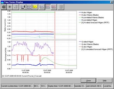
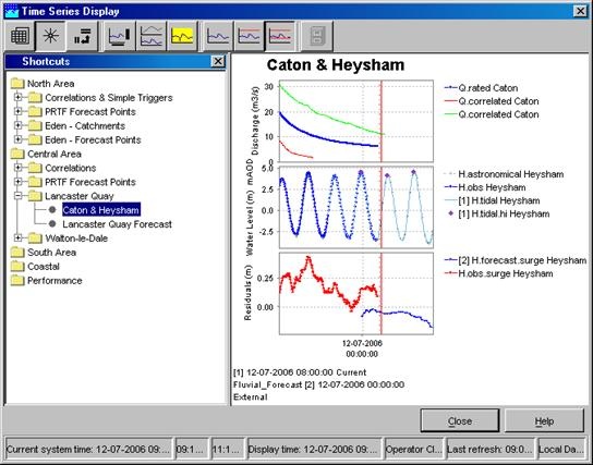
Display templates are available for rapid assessment of data. The templates can be activated by clicking the above mentioned button. The left side of the display shows the available shortcuts in a pre-configured grouping.
The data shown via the Shortcuts belong to the forecasts selected in the Forecasts panel of the FEWS Explorer. Please note that the current forecast is always displayed in the graphs.
 Rotate Splitter
With this button the splitter between table and graph can be placed in a horizontal position. Clicking the same button again returns the splitter to its default vertical position.
 Rotate Legend
This button can be used to place the graph legend underneath the graph. Clicking the same button again returns the legend to its default position at the right hand side of the graph.

 Toggle Graph
When multiple data series are selected for a single data type (parameter), the graphs will be placed in one subplot of the graph. This sometimes complicates the analysis of time series with different data ranges. By clicking the above mentioned button you can change the layout of the chart:
- Merged into a single graph
- Stacked in different subplots
 Scale to show unreliable Data
This button can be used to focus on time intervals with unreliable data within the selected time series. Data is marked as unreliable, if values exceed hard limits.
 Show no Thresholds
By clicking this button all pre-configured thresholds which can also be shown in the graphs with the selected time series disappear.
 Scale to show relevant Thresholds
With this option the graph is scaled in such a way, that relevant thresholds (the closest threshold values) are displayed together with the selected time series in the graph.

 Scale to show all Thresholds
This button can be used to show all pre-configured thresholds of a certain parameter at the selected location(s). This means that all thresholds levels (e.g. Standby, Flood Watch, Flood Warning and Severe Flood Warning) are displayed in the graph.
 Show data labels
Clicking the 'Show data labels' will you to display quality flags for the data you are presenting. The information is shown at the bottom of the screen.
The following clolour codes have been used:
- the upper line indicates the origin of the data
- original data: no line is displayed
- corrected data (original data flagged as unreliable and automatically interpolated): blue line
- completed data (original data is missing and interpolated by system): magenta line
- the middle line indicates the quality of the data
- reliable data: no line is displayed
- doubtful data: light yellow
- unreliable data: dark yellow
- the lower line indicates where comments have been added to the data
- no comment: no line is displayed
- comment available: dark red
The lines are displayed under the data points. The colours correspond with the colouring used in the tables.

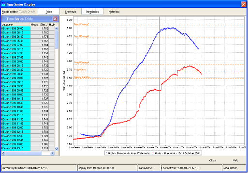
 Historical Events
With this button historical events can be activated (provided that they are pre-configured). They will be displayed in the same graph to enable a comparison with the actual timeseries. Further explanation is given in section 4.4.
Display time
| Wiki Markup |
|---|
To change the view period in the graph, the field _Display time_ in the Status Bar below the graph should be double clicked. The display time can now be changed with help of the menu. Press \[*OK* \] to accept the changed view period. The next time the chart is opened the original configured display time will be used again. |

Datum Toggle
The Datum Toggle at the lower right hand corner of the display allows levels to be displayed with reference to Local Datum or mAOD .
Navigating in Graphs
Zooming in and out can be done with help of the scroll wheel of the mouse. Scrolling away from the user results in zooming in while scrolling towards the user results in zooming out.
Zooming is also possible by selecting a zoom range. Drag the mouse holding down the right button to form a rectangular area to zoom in to.
When clicking the right mouse button, the dropdown menu presented below appears. The menu gives you some additional options.

Save As
You can save the graph to file with this option.
This option allows you to print the graph.
Zoom in / out
You can select to zoom in and out along one or both axis with this option.
Allow Vertical / Horizontal Axis Zoom
You can select to allow for zooming in and out along one of the axis with this option.
Auto Range
This feature allows you the set automatic scaling along one or both axis.
Data Editor
Select the Data Editor option of the FEWS Tools menu to present tables displaying the data. The splitter can be positioned in such a way, that the complete table is visible.

The most left column shows the date and time of the data. The period displayed spans the overall period defined in the filters for all time series.
The colours in the headings of the columns correspond with the line colour in the graph.
In the date/time column different colours are used to provide a logical meaning to certain important moments:
- Light blue: historical data, either observed or hindcast (data before T~0~ )
- Dark blue: forecast data (data after T~0~ )
For the data columns the background colour is used to indicate the quality of the data, identified by the data flags set of the Validation utility. Further, an indication of the editability of the data is given by the the background colour. The meaning of the background colours in the data fields is:
- White: reliable, editable
- Light yellow: doubtful
- Bright yellow: unreliable
- Gray: not editable
The font colour in the data fields indicates the data origin. Following colours are used:
- Black: original data
- Blue: corrected (original data flagged "Unreliable" and interpolated)
- Magenta: completed (original data missing and interpolated)

| Wiki Markup |
|---|
Data (only those with a white background) can be edited by double clicking a field in the column. Editing may be done in the table directly. The result of an edit action is directly displayed in the corresponding graph. Manually corrected data will be saved to the database by clicking \[*Apply* \]. With \[*Cancel* \] before saving, changes can be undone. With \[*Enter* \] the changes are validated. |
| Wiki Markup |
|---|
Through manual editing of data, the source of the data changes from original to corrected. The font colour used for edited data is blue to indicate that it is completed data. The background colour remains white, as the data has not yet been validated. If however, after pressing \[*Apply* \] validation indicates that the value exceeds certain validation limits, the background colour will be set accordingly. |
Editing Data
By pressing the right mouse button a list with edit actions appears on the screen. These includes to copy and fill in data. The display that pops up after clicking the right mouse button is shown below.

The options have the following meaning...
<ac:structured-macro ac:name="unmigrated-wiki-markup" ac:schema-version="1" ac:macro-id="61cc29f9-4e0f-48aa-bcd1-519dc3f564d0"><ac:plain-text-body><![CDATA[ | [Select All] | Select all data displayed in the editor | ]]></ac:plain-text-body></ac:structured-macro> |
<ac:structured-macro ac:name="unmigrated-wiki-markup" ac:schema-version="1" ac:macro-id="2f2ca73a-7961-4670-ab13-a860cda1d01a"><ac:plain-text-body><![CDATA[ | [Select Column] | Select all data in the column in which the cursor is placed | ]]></ac:plain-text-body></ac:structured-macro> |
<ac:structured-macro ac:name="unmigrated-wiki-markup" ac:schema-version="1" ac:macro-id="2a333121-9d26-4132-9488-9cf822e5d1e8"><ac:plain-text-body><![CDATA[ | [Select Row] | Select all data in the row in which the cursor is placed | ]]></ac:plain-text-body></ac:structured-macro> |
<ac:structured-macro ac:name="unmigrated-wiki-markup" ac:schema-version="1" ac:macro-id="a9f4e53c-14fc-4761-8f97-d861e34da62a"><ac:plain-text-body><![CDATA[ | [Expand Selection] | Select all data in the row in which the cursor is placed | ]]></ac:plain-text-body></ac:structured-macro> |
<ac:structured-macro ac:name="unmigrated-wiki-markup" ac:schema-version="1" ac:macro-id="a3545038-954c-41ea-9a49-818aecce7113"><ac:plain-text-body><![CDATA[ | [Edit Value] | The cell on which the cursor is place can be edited | ]]></ac:plain-text-body></ac:structured-macro> |
<ac:structured-macro ac:name="unmigrated-wiki-markup" ac:schema-version="1" ac:macro-id="86a2e5b6-140f-42a8-9142-4e27cfc94644"><ac:plain-text-body><![CDATA[ | [Cut] | Move the selected data (including the date / time field) to the clipboard | ]]></ac:plain-text-body></ac:structured-macro> |
<ac:structured-macro ac:name="unmigrated-wiki-markup" ac:schema-version="1" ac:macro-id="1e092032-b538-439e-a69c-ed40a3afab46"><ac:plain-text-body><![CDATA[ | [Copy] | Copy the selected data (included the date / time field) to the clipboard | ]]></ac:plain-text-body></ac:structured-macro> |
<ac:structured-macro ac:name="unmigrated-wiki-markup" ac:schema-version="1" ac:macro-id="2c73abcd-2697-4347-952c-fee451a578d7"><ac:plain-text-body><![CDATA[ | [Copy Values Only] | Copy the data values in the selection to the clipboard | ]]></ac:plain-text-body></ac:structured-macro> |
<ac:structured-macro ac:name="unmigrated-wiki-markup" ac:schema-version="1" ac:macro-id="361789fe-2d8d-4080-8bf7-7fe204bcb18a"><ac:plain-text-body><![CDATA[ | [Copy Reliable Values Only] | Copy the data values in the selection classified as reliable to the clipboard | ]]></ac:plain-text-body></ac:structured-macro> |
<ac:structured-macro ac:name="unmigrated-wiki-markup" ac:schema-version="1" ac:macro-id="f9652f04-739f-48f2-9160-bdf2efd80889"><ac:plain-text-body><![CDATA[ | [Copy Reliable and Doubtful Values Only] | Copy the data values in the selection classified as reliable and doubtful to the clipboard | ]]></ac:plain-text-body></ac:structured-macro> |
<ac:structured-macro ac:name="unmigrated-wiki-markup" ac:schema-version="1" ac:macro-id="f7a5afb9-4339-454c-b64b-d04dee4d52c3"><ac:plain-text-body><![CDATA[ | [Copy Times Only] | Copy the selected date / time in the selection to clipboard | ]]></ac:plain-text-body></ac:structured-macro> |
<ac:structured-macro ac:name="unmigrated-wiki-markup" ac:schema-version="1" ac:macro-id="fd9b24b1-3b01-4684-baa5-b1ed4c2780a2"><ac:plain-text-body><![CDATA[ | [Paste] | Paste the data from the clipboard into the selected fields | ]]></ac:plain-text-body></ac:structured-macro> |
<ac:structured-macro ac:name="unmigrated-wiki-markup" ac:schema-version="1" ac:macro-id="2969a0bf-a12c-43f5-abc8-ad5569389587"><ac:plain-text-body><![CDATA[ | [Clear] | Delete the data values in the selection | ]]></ac:plain-text-body></ac:structured-macro> |
<ac:structured-macro ac:name="unmigrated-wiki-markup" ac:schema-version="1" ac:macro-id="373a91b7-82d0-47c7-a68d-4824b2a990a9"><ac:plain-text-body><![CDATA[ | [Clear Doubtfuls] | Delete the data values in the selection classified as doubtful | ]]></ac:plain-text-body></ac:structured-macro> |
<ac:structured-macro ac:name="unmigrated-wiki-markup" ac:schema-version="1" ac:macro-id="d3697998-49cc-4361-ae68-c20dbe5db899"><ac:plain-text-body><![CDATA[ | [Clear Unreliables] | Delete the data values in the selection classified as unreliable | ]]></ac:plain-text-body></ac:structured-macro> |
<ac:structured-macro ac:name="unmigrated-wiki-markup" ac:schema-version="1" ac:macro-id="a5d92842-a2d2-47d8-8a41-63704f911a58"><ac:plain-text-body><![CDATA[ | [Block Fill Missing Data] | Fill the selected fields with the last value available value in the same column | ]]></ac:plain-text-body></ac:structured-macro> |
<ac:structured-macro ac:name="unmigrated-wiki-markup" ac:schema-version="1" ac:macro-id="78c51c5d-27f1-49e6-a1ec-a8c76620fee0"><ac:plain-text-body><![CDATA[ | [Lineair Fill Missing Data] | Apply lineair interpolation when filling in the selected fields | ]]></ac:plain-text-body></ac:structured-macro> |
<ac:structured-macro ac:name="unmigrated-wiki-markup" ac:schema-version="1" ac:macro-id="3cfbefff-46b4-4240-b312-4a2602946c37"><ac:plain-text-body><![CDATA[ | [Fill Missing Data from Clipboard] | Fill in the selected fields with data copied to the clipboard | ]]></ac:plain-text-body></ac:structured-macro> |
<ac:structured-macro ac:name="unmigrated-wiki-markup" ac:schema-version="1" ac:macro-id="846fc7ae-19a4-4b7b-9109-7f2ece0ae839"><ac:plain-text-body><![CDATA[ | [Set maximum fill gap] | Set the maximum gap size to be interpolated | ]]></ac:plain-text-body></ac:structured-macro> |
Historic Events
A special option in the Data Display is the option to add historic events to the chart window.
To show historic events for a specific location take following steps:
- Select the location from the location list box in the FEWS explorer
- Select the parameter from the parameter list box
- Open the chart display by pressing the chart button
- Press the
 button in the Chart Display and select one of the historical events from the list
| Wiki Markup |
|---|
A new (red) line will be added to the chart. This event line can now be shifted forwards and backwards in time using the "+" and "-" keys on your keyboard. To activate this shift procedure press the \[*Historic Events* \] button in the Chart Display and select Shift Time. |
Decimals for the reference values (ticks) in the chart autorange between 0 and 6, always using the lowest amount necessary to differentiate between ticks.
When the display is started through the FEWS Tools menu item Data Editor, data can be edited and the edited data can be stored in the FEWS database. When the display is started through the FEWS Tools menu item Data Display or through the FEWS toolbar, the data can only be viewed.
1.1 Data Display
Press the [Data Display] button on the toolbar to present graphs displaying the data. The splitter is normally positioned on the left of the display.
When data series of different data types have been selected, the data will be presented in different subplots, with the data series of a single data type merged into one subplot.

The data in the graph is updated automatically when new data becomes available. Below the graph, the workflows that generated the forecast time series are listed. Their numbers are used in the graph legend and table headers as well.
Time series and graph order
There are specific rules for time series ordering. For time series from the data viewer, the order of filters is used.
Time series are first ordered by their filter and then according to their time series set within the filter.
There are also rules for the ordering of the graphs when the time series come from the data viewer/filters.
The graphs follow the order of the parameter groups defined in Filters.xml.
Some Things to Keep in Mind:
- Since the parameter group ordering may not exactly match the filter and time series set ordering, it can happen that the letters associated with the time series in the graphs will not be ascending.
- When parameters and/or locations are present in multiple filters, it can happen that for the same parameter-location selection, the order of time series is different depending on which filters are selected. The first selected filter a time series is part of will determine its order.
The following buttons are used in the Time Series Display:
 Table
Table
By clicking this button, the time series in the graph is also displayed in tabular format. Please note that if you want to edit data, you must select the Data Editor from the Tools menu (see section 4.3).

Selecting the small arrow at the right of the icon shows the next menu:

| Function | Description |
|---|---|
| Validation | shows a separate column with the validation flags |
| Users | shows a separate column with the user names of edited values |
| Comments | shows a separate column with the comments |
| Units | shows in the header the unit of the parameter |
| Location Names | shows in the header the location name |
| Location Ids | shows in the header the location ID |
| Modules | shows in the header the moduleInstanceId |
| Qualifiers | shows in the header the Qualifier |
| Forecast Times | |
| Column statistics | shows between the header and the table statistics of the values in the current relativeViewPeriod, like mean, sum, min, max |
| Threshold crossing | shows in the cells (on the left side) a small bar with a color according to the threshold definition, that indicates a threshold crossing |
| Normal | shows the values in a normal table, so all times have a row |
| Days | shows the values in an aggregated way, so that each day gets its own column. Useful to series with for example an hourly time step. It sets up the hours from 00:00 until 23:00. |
| Weeks | shows the values in an aggregated way, so that each week gets its own column. Useful to series with for example a daily time step. |
| Months | shows the values in an aggregated way, so that each month gets its own column. Useful to series with for example daily time step. |
| Years | shows the values in an aggregated way, so that each year gets its own column. Useful to series with for example monthly time step. |
| Group columns by time series | |
| Time order reversed | Shows the times in reversed order, so from new to old |
| Removed times | Show the deleted time steps from non-equidistant time steps. |
 Shortcuts
Display templates are available for rapid assessment of data. The templates can be activated by clicking the aforementioned button. The left side of the display shows the available shortcuts in a pre-configured grouping.
The data shown via the Shortcuts belong to the forecasts selected in the Forecasts panel of the FEWS Explorer. Please note that the current forecast is always displayed in the graphs.

 Graph
Graph
This button can be used to hide or show the graph. If the table was not yet selected, it will appear.
Selecting the small arrow to the right of the icon shows the following menu:

 Toggle graph
When multiple data series are selected for a single data type (parameter), the graphs will be placed in one subplot of the graph. This sometimes complicates the analysis of time series with different data ranges. By clicking the above-mentioned button, you can change the layout of the chart to either:
- Merged into a single graph
- Stacked in different subplots
 Scale to show unreliable data
This button can be used to focus on time intervals with unreliable data within the selected time series. Data is marked as unreliable if values exceed hard limits.
 Show data labels
Clicking the 'Show data labels' button allows you to display quality flags for the data you are presenting. The information is shown at the bottom of the screen.
The following color codes have been used:
The upper line indicates the origin of the data:
- Original data: no line is displayed
- Automatically corrected data (original data flagged as unreliable and automatically interpolated): blue line
- Automatically completed data (original data is missing and interpolated by system): magenta line
- Manual corrected data (original data edited by a user): dark blue line
- Manual completed data (filled up by a user): dark magenta line
The middle line indicates the quality of the data:
- Reliable data: no line is displayed
- Doubtful data: orange
- Unreliable data: yellow
The lower line indicates where comments have been added to the data:
- No comment: no line is displayed
- Comment available: dark red
The lines are displayed under the data points, and the colors correspond with the coloring used in the tables.
 Show threshold colors in background
 Toggle Filter and Shortcuts
 Hide unreliables
 Stack plot
 Show legend at vertical axis
 Show legend inside graph
 Show legend at horizontal axis
 Hide legend
 Hide footer
 Show selected values in legend
 Show on/off checkboxes in legend
It is possible to show checkboxes in the legend to quickly hide/unhide time series in the time series dialog. You can find the option to show legend checkboxes in the chart dropdown button in the toolbar.
Toggling off a checkbox will only hide the individual time series. If you toggle off all time series in a chart or subplot, the plot will still show an empty chart. This is by design so that the checkboxes still indicate which time series can be toggled back on. To hide an entire chart or subplot, you should use the TimeSeries Visibility Dialog with the legend checkboxes disabled.

When statistical series are active, it is possible to also hide them individually. The same applies to their source series, they can be hidden without the resulting statistical series being hidden.
When checkboxes are not shown in the legend the hidden series will not be in the legend.

But when checkboxes are shown in the legend, their will be an empty checkbox for the series just like in the visibility dialog.

When "hide original series" is selected for the statistical functions, the sources series for the statistics will not be shown in the graph, table, visibility dialog and legend (with or without checkboxes)

For resampling, one can use the following button: 

 Show column indicator in legend (since 2024.01)
If toggled, the indicator of the table column corresponding to the time series is added to the legend. For example, the following legend

will then be shown as

corresponding to the columns in the table

 No threshold scaling
By clicking this button, the scaling will not adjust to show thresholds that are out of the data range.
 Scale to show relevant thresholds
With this option, the graph is scaled so that relevant thresholds (the closest threshold values) are displayed together with the selected time series in the graph.
 Scale to show all thresholds
This button can be used to show all pre-configured thresholds of a certain parameter at the selected location(s). This means that all thresholds levels (e.g. Standby, Flood Watch, Flood Warning and Severe Flood Warning) are displayed in the graph.
 Validation
 Users
Users
 Comments
 Timeseries Lister
This button will add a database viewer below the display for the time series that are shown. The database records are visualized as individual rows, which can be selected. When selected, they can be browsed through, displaying all columns. All meta information and statistics are calculated on-the-fly and are not stored. Within selections or filters (e.g., on start/end time), the content of the visible columns is updated immediately.
Features:
- Columns Available: General columns about module instance, location, parameter, disk space, and all kinds of relevant meta information about the selected record(s).
- Basic Statistics: Sum, average, maximum, minimum, etc.
- Data Quality: Information on the number of unreliable values and periods of unreliable data.
- Validation Results: Number of records and periods for primary and secondary validation results, such as hard maximums, flag comparisons, or series comparisons.
This functionality helps users inspect the number of records and periods for different quality and validation criteria.

The Time Series Lister has similar functionality to the Database Viewer, including filtering, ordering, and right-mouse context menu options. These are described in detail in the Time Series Lister section.
 Descriptive statistics
This button will add a table to the display with descriptive statistical information. The statistics only appear if a column in the table is selected. Use the right mouse button to copy this table to the clipboard for pasting into Excel.
Statistical Functionality Available (if configured):
- Mean
- Min (with date)
- Max (with date)
- Sum
- Standard deviation
- Percentiles (exceedance and non-exceedance)
Time Series Information:
- Location ID
- Location name
- Parameter ID
- Parameter name
- Module instance
- Start time
- End time
Data Quality Information:
- Number of values
- Number of completed values
- Number of corrected values
- Number of doubtful values
- Number of missing values
- Number of reliable values
- Number of unreliable values

 Timeseries Information (hideable panel)
This button is used to show (or hide) a panel that contains four subpanels (toggleable). These subpanels display the Time Series Information, Attributes, Validation Criteria, and available Thresholds for the selected time series at the selected time step.

Opening this panel will automatically hide the descriptive statistics panel when it's open.
Thresholds
The thresholds table will show: Type, Id, Value, Label, Comment, Description, Time Span, Season, Up Action, Down Action

Since this is a lot of columns and not all columns apply to all thresholds, columns can be hidden via right mouse "Show / hide columns":

The hidden columns will be stored in the user settings.
 Toggle splitter Orientation
This button allows you to place the splitter between the table and graph in a horizontal position. Clicking the same button again returns the splitter to its default vertical position.
 Search and Select Forecast
Displays in FEWS by default only show current approved forecasts. Previous forecasts can be shown if you approve them in the Forecast Management Display or by using the "search and select forecasts" option.
There are two ways to use this button. The small arrow on the right opens up a drop-down menu where you can quickly select the number of recent forecasts you want to view.

When you click on the button itself, it opens a separate display with additional options and information about the available time series.

Hide whole forecasts (since 2020.02)
Since 2020.02 it is possible to hide all time series belonging to the same forecast.
When time series are selected, either with the dropdown button or by using the shortcut ctrl+alt+shift+X, all time series sharing a forecast with one of the selected forecasts will be hidden.
In the image, forecast [1] has been hidden.

In the "search and select forecasts," there will be a postfix stating "(hidden)" behind their forecast time.
All hidden forecasts can be made visible again by selecting the "Show all hidden forecasts" dropdown menu item or by using the shortcut ctrl+alt+shift+Z.
 Historical Events
With this button historical events can be activated (provided that they are pre-configured). They will be displayed in the same graph to enable a comparison with the actual timeseries. A special option in the Data Display is the option to add historic events to the chart window. These events can be predefined and included in the configuration. Alternatively, dependent on the set-up of the system (existence of an Deltares Open Archive), they can be defined in the Archive Catalogue Display.
To show historic events for a specific location, follow these steps:
- Select the location from the location list box in the FEWS explorer.
- Select the parameter from the parameter list box.
- Open the chart display by pressing the chart button.
- Press the button in the Chart Display and select one of the historical events from the list.
Display Time
The "Display Time" button opens a dialog where the view period in the graph can be changed, saved, or reset.

If the period entered in this dialog has been applied, then this view period is restored when a restore is requested. The restore request can be triggered by the chart popup menu (Auto Range-> Both Axes), or by the shortcut Ctrl+0, or by left swipe in the chart. To restore the default view period as configured in TimeSeriesDisplayConfig, the "Reset" button in this dialog should be used.
With the "Save" button, the current relative view period is stored in the user_settings.ini file and is applied again after restarting the application.
Navigating in Graphs
Zooming in and out can be done with the help of the scroll wheel of the mouse. Scrolling away from the user results in zooming in, while scrolling towards the user results in zooming out.
Zooming is also possible by selecting a zoom range. Drag the mouse while holding down the right button to form a rectangular area to zoom in to.
When clicking the right mouse button, the dropdown menu presented below appears. The menu provides you with some additional options.

Save As
You can save the graph to file with this option.
This option allows you to print the graph.
Zoom in / out
You can select to zoom in and out along one or both axis with this option.
Auto Range
This feature allows you the set automatic scaling along one or both axis.
Zoom to range...
In the popup dialog “Zoom to range…” it is possible to set the minimum and maximum of the left vertical axis.
This manually entered range will stay that way until the user starts zooming again. This functionality is activated when from the zoom tool the drop-down option “Allow Vertical Axis Zoom” is selected.
Changing the view period

Since 2020.01, it is possible to move the view period to the first or to the last data point available. The buttons are in the following order:
- Move to the first data point available of the selected time series (the length of the period will remain the same).
- Move one full view period back.
- Move a half view period back.
- Move a half view period forward.
- Move a whole view period forward.
- Move to the last data point available of the selected time series (the length of the period will remain the same).
- Set view period to include all data of the selected time series.
Data Editor
The Graph and Editor display has a table and an edit mode.

The leftmost column displays the date and time of the data. The period displayed spans the overall period defined in the filters for all time series.
The colors in the headings of the columns correspond with the line color in the graph.
In the date/time column, different colors are used to provide a logical meaning to certain important moments:
- Light blue: historical data, either observed or hindcast (data before T0)
- Dark blue: forecast data (data after T0)
For the data columns, the background color is used to indicate the quality of the data, identified by the data flags set of the Validation utility. Further, an indication of the editability of the data is given by the background color. The meaning of the background colors in the data fields is:
- White: reliable, editable
- Light yellow: doubtful
- Bright yellow: unreliable
- Gray: not editable
The font color in the data fields indicates the data origin. The following colors are used:
- Black: original data
- Blue: corrected (original data flagged "Unreliable" and interpolated)
- Magenta: completed (original data missing and interpolated)
The edit mode can be enabled from the toolbar with the "Enable Edit mode" button. Data (only those with a white background) can be edited by double-clicking a field in the column. Editing may be done in the table directly. The result of an edit action is directly displayed in the corresponding graph. Manually corrected data will be saved to the database by disabling the Edit mode again from the toolbar. A pop-up will ask to save the edited data to the database. With [OK], the data is saved, [NO], the data is not saved and with [Cancel], changes will be undone.
Through manual editing of data, the source of the data changes from original to corrected. The font color used for edited data is blue to indicate that it is completed data. The background color remains white, as the data has not yet been validated. If, however, after pressing [Apply], validation indicates that the value exceeds certain validation limits, the background color will be set accordingly.
ReadOnlyPeriod
Since 2020.01, it has been possible to "freeze" part of a time series and make that part uneditable. This can be useful if the values need to be evaluated and verified, then used in different systems. This ensures that they all contain the same data and cannot change. This can be done by configuring a ReadOnlyPeriod. This contains a relative time and a time series filter. All time series that match the filter become uneditable before the given relative time. Example configuration:
| Code Block | ||||
|---|---|---|---|---|
| ||||
<!-- This item is not fully configured, only displayed to show the position of readOnlyPeriod in the XML file-->
<description>...</description>
<!-- This item is not fully configured, only displayed to show the position of readOnlyPeriod in the XML file-->
<generalDisplayConfig>...</generalDisplayConfig>
<!-- This item is not fully configured, only displayed to show the position of readOnlyPeriod in the XML file-->
<defaultViewPeriod unit="day" start="-5" end="5"/>
<!-- This item is not fully configured, only displayed to show the position of readOnlyPeriod in the XML file-->
<globalDatumLocationSetId>...</globalDatumLocationSetId>
<scrollerDefaultViewPeriod start="-2" end="2" unit="hour"/>
<readOnlyPeriod>
   <relativeTime value="-2" unit="day"></relativeTime>
   <timeSeries>
      <locationId>LocA</locationId>
   </timeSeries>
</readOnlyPeriod> |
In this case, data older than 2 days before the system time, in a time series where the location ID is LocA, becomes uneditable.
You can configure as many readOnlyPeriods as you wish. They should be configured in the TimeSeriesDisplayConfig, following scrollerDefaultViewPeriod. "Frozen" time series can be edited if the "enable editing read-only period" option is selected. Time series that are entirely uneditable remain so.

Copy and Paste Timeseries

A selected timeseries can be copied to the clipboard with the Copy selected timeseries button. Up to 10 series can be copied and kept on the clipboard. Duplicate entries to the clipboard are ignored.
The latest copied series can be pasted with the Paste selected time series button. Any of the other items on the clipboard can be selected and pasted using the dropdown to open Paste from previous selection.

Seamless Archive integration
Seamless integration automatically augments the data record through on-the-fly downloads from the OpenArchive. This feature only works for external historical datatypes!
To begin, press the button "Connect to the external data source." FEWS will then start looking for the data relevant for the plot in the OpenArchive.

When any relevant data is found (i.e., at least a matching locationId and parameterId), the button "Read data from the external data source" becomes enabled. Press the button “Read data from the external data source”, and the data will be read and shown in the plot.
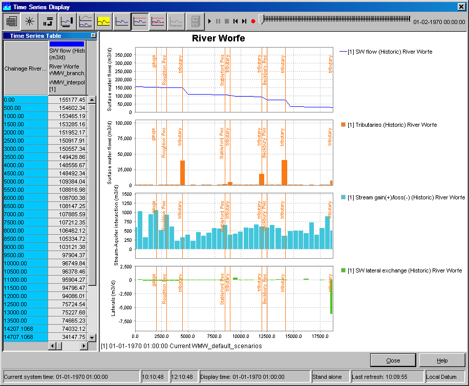
Longitudinal profile
Since release 2007.02, the display offers also the opportunity to show longitudinal profiles. In such graph, the parameter values (Y-axis) are plotted against the river chainage (X-axis). The graph can progress over time, eitehr step by step or animated, via the time control toolbar, described in the Spatial display. both the graph and table will change over time as they shown data along the profile.
Longitudinal profiles can be simply added to the display by configuration of timeSeriesSet’s with value type longitudinalprofile in the config file DisplayGroups.xml
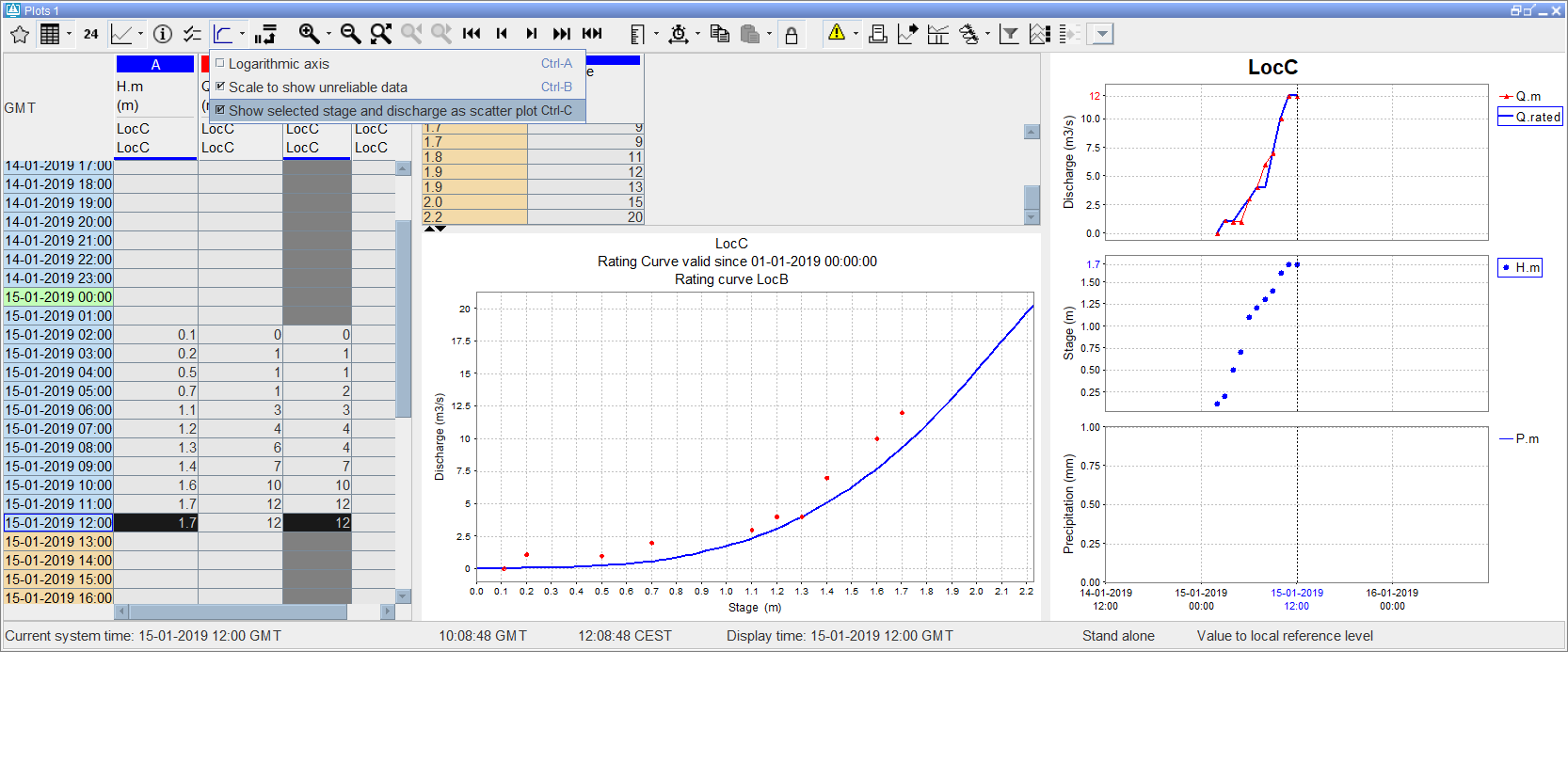
Rating curve
The display offers also the opportunity to show rating curves. In such graph, the rating curve stage values are plotted against discharge values. By default stage is shown on the Y-axis and discharge on the X-axis. Configure stageAxisOrientation ‘horizontal’ in TimeSeriesDisplay config if the axes should be switched. Rating curve display shows the rating curve that belongs to the location selected in the table or in the chart legend. If this location has multiple rating curves with different qualifiers, rating display shows a list where the specific rating curve can be selected

Displaying gaugings along with the rating curves
Since release 2019.02 it is possible to display gaugings (observations of level and discharge (velocity) combinations) along with the rating curve. To show the observations in rating curve display, follow these steps:
- open TimeSeriesDialog with the time series you want to see along with the rating curve,
- open rating curve display for required location,
- select option “Show selected stage and discharge as scatter plot” from the drop down menu of the button “ Rating Curves” (on the TSD toolbar),
- select one stage series and one discharge series from the time series table or from the chart legend. The selected series will be shown as scatter plot along the rating curve. All values in the chart zoom period will be displayed. The number of values shown can be changed by changing of the zoom period.
Note that the selected series must be stage and discharge, it means the series parameter must be from the same parameter group as the rating curve parameters configured in Parameters.xml. Other series selection will be ignored.
Category plot
| Note |
|---|
This graph type is available in DELFT-FEWS versions 2011.01 and higher. |
In Category plot the parameter values (X-axis) are plotted against the locations (Y-axis).
The graph can progress over time, either step by step or animated, via the time control toolbar. Both the graph and table will change over time
The detail description of the time toolbar can be found in the paragraph Spatial display.

If there are more subplots in a plot, a separate table wil be created for each subplot.
 F
F
Configuration
To show the data in the category plot, the 'category' plot viewer type should be specified in DisplayGroups.xml with element <plotViewerId> :
| Code Block | ||
|---|---|---|
| ||
<plot id="MODISCategory1Plot">
    <subplot>
        <timeSeriesSet>
            <moduleInstanceId>ImportModis</moduleInstanceId>
            <valueType>scalar</valueType>
            <parameterId>OWA</parameterId>
            <qualifierId>Aspect-ID   0</qualifierId>
            <locationSetId>ImportModis</locationSetId>
            <timeSeriesType>external historical</timeSeriesType>
            <timeStep unit="hour" multiplier="1"/>
            <relativeViewPeriod unit="hour" start="-24" end="4"/>
            <readWriteMode>read only</readWriteMode>
        </timeSeriesSet>
        <timeSeriesSet>
            <moduleInstanceId>ImportModis</moduleInstanceId>
            <valueType>scalar</valueType>
            <parameterId>SFR</parameterId>
            <qualifierId>Aspect-ID   0</qualifierId>
            <locationSetId>ImportModis</locationSetId>
            <timeSeriesType>external historical</timeSeriesType>
            <timeStep unit="hour" multiplier="1"/>
            <relativeViewPeriod unit="hour" start="-24" end="4"/>
            <readWriteMode>read only</readWriteMode>
        </timeSeriesSet>
    </subplot>
    <plotViewerId>category</plotViewerId>
</plot>
|
Restrictions
The category plot can be customized in TimeSeriesDisplay.xml and in DisplayGroups.xml, similar to the other plot types. However not all configuration elements are applicable to the category plot. If these elements are still configured, they wil be ignored.
The category plot is only applicable to scalar timeseries.
Storing 'favorites'
The data selection made in the Data Viewer can be stored through its toolbar. This allows for storing favorite data selections / graphs in the user settings. More information on this functionality can be found in the location parameter selection section of the FEWS Explorer page.
| Code Block | ||
|---|---|---|
| ||
<readOnlyPeriod>
   <relativeTime value="-2" unit="day"></relativeTime>
   <timeSeries>
      <locationId>LocA</locationId>
   </timeSeries>
</readOnlyPeriod> |
Long Term Scroller
For viewing a longer period than is shown in specific graphs, the long term scoller can be openen via the button highlighted in red below.
It will open a zoomed out graph were a smaller period can be selected via the black vertical lines. The red vertical line shows the display time and the green vertical line the system time.

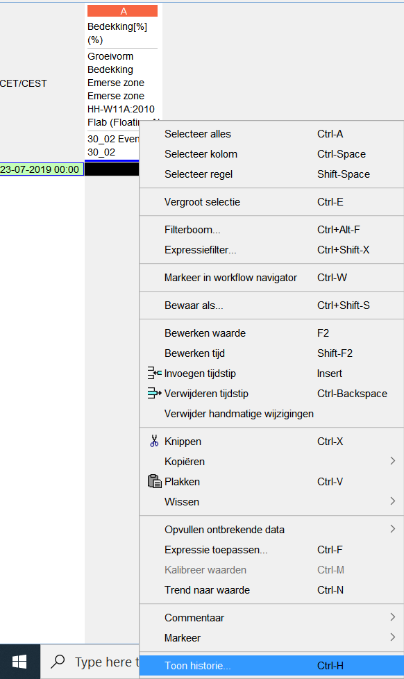
History popup
When clicking ctrl+H on a value, a popup will appear which shows the history of data on that time step.

Wiki Markup