| scrollbar |
|---|
| Table of Contents |
|---|
Components of spatial display
Spatial Display
The Spatial Display grid display can be used to display show time series of any typekind: scalar, polygon, or grid (see the figures below for examples). The display will depict the data is shown on a map background. The time on the display time is then set using a ruler that can be moved manually by hand or made set to move automaticallyon its own.
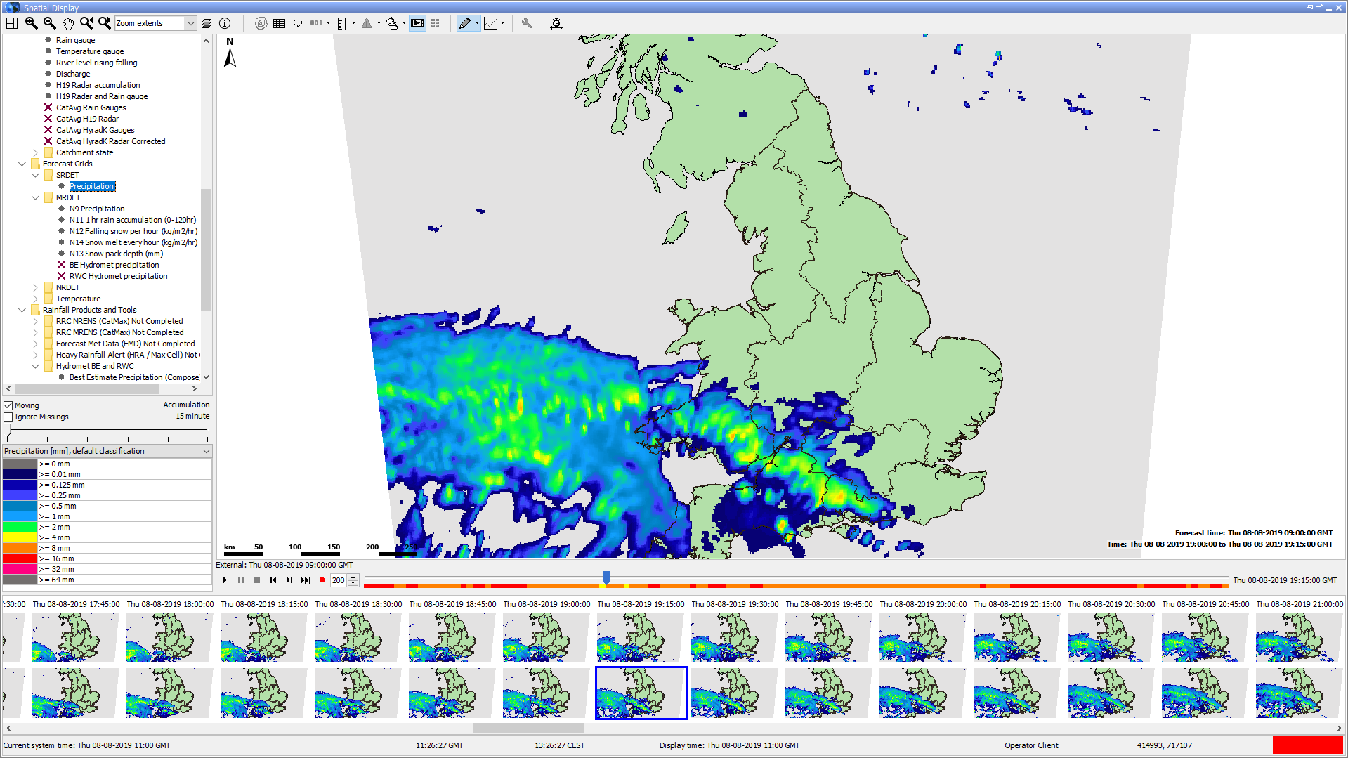


The spatial display
...
is made up of the following
...
parts:
- Spatial/grid/A spatial, grid, or map display with configurable background layers that you can change
- A Control Toolbar with following generic general options for:
- Zooming in and out and panningmoving around
- Turning map layers or metadata Toggling on and off map layers or meta data, such as , like labels, values, flags, thresholds, etc.
- A Time Slider Toolbar with the following generic general options (located found at the bottom of the map since 2019.02):
- PlayButtons for play, pause, stop, step forward, step backward, and record buttons
- Time A time slider with a time slice indicator
- Data An indicator for data availability and maximum value indicator (colours are in accordance with (the colors match the legend)
- Filters for selecting what to show in the Spatial Display selection filters (preconfigurable plots)
- Table or Bar Legend (with optional accumulation)
- (you can set up plots ahead of time)
- A table or bar legend (you can choose to accumulate data)
- Options for exporting or recording Options to export or record data and time series

Control Toolbar
The toolbar provides the offers controls for displaying presenting the spatial information via through the following various buttons. The functionality of zoom options and layers is explained detailed in the FEWS Explorer section. (see see chapter 2).
Button | Description |
|---|

| Contours. |

| You can turn contour lines on |
| or off. Numbers |
| show up when the animation |
| is stopped or paused. The colors, which |
| show the |

![]()
| value, stay visible. A bilinear interpolation is used to make the grid smooth. This is necessary for calculating the contours. Even when the labels and contour lines are turned off, the smooth grid can still be seen. The bilinear interpolation is only used on the cells of the grid that are rectangular and aren’t rotated too much compared to the screen orientation. | |
| Grid lines. Toggles grid or polygon lines on or off |
| Product Info. Toggles product info on or off. (only shown if there are products present in the |
| configuration, see the page on the Forecast Product Information Panel) |
| Labels. |
| You can toggle labels on or off |
| . The drop-down options include turning |
| locations, values, and/or units in the labels on or off, and increasing |
| or decreasing the number of decimals shown in the labels and tooltips |
| . Since FEWS 2022.02, this also works for grids, but only when you zoom in until there are fewer than 20,000 grid cells displayed and one of the cells is larger than 10 pixels. |
|

| Value to local reference level. |


| Flags. Switches to flags for selected time series / gridplot (quality, modifiers or thresholds) |
| Search and select forecasts. Switches to (previous) forecasts. |
| Show spatial thumbnails. Toggles thumbnails of each time step below the main spatial display on or off. |
| Show spatial ensemble thumbnails. Displays the ensemble thumbnails panel. |
| Sketch mode buttons and other sketch drawing options. Switches the sketch mode between drawing points, adding points, drawing longitudinal profiles and drawing areas when the map is clicked. Contains additional options to save/load sketches and delete the current sketch. |
| Options to show a graph based on current sketch. Drop-down menu with options to extract scalar time series, vertical profiles, longitudinal profiles, 2D longitudinal profiles, calculate budget and calculating the mean max min time series (for sketched areas). |
| Activate spatial modifier mode. Toggles spatial modifier mode on or off (only shown if at least one spatial modifier is configured in ModifierTypes.xml). The additional modifier mode buttons shown when modifier mode is toggled on are explained in the spatial modifier section. |

| Display time. Choose display time (period) |

| Attributes. |
Time Slider Toolbar
Since 2019.02 the The time slider and its buttons have been moved to a separate toolbar located at the bottom of the spatial display.

|
| Preload. |
| The preload button allows the grids for all time steps to be downloaded in the background. This ensures a smooth animation without pauses. The progress of the download is indicated by a green line on the time slider. | |
| Play. Starts continuous play mode. The slider will indicate the time slice being shown. This button is merged with the pause button. So after this button is pressed, the pause button appears. |

| Pause. Stops continuous play mode. The time slider remains at the time displayed at the moment. This button appears if the play button is previously pressed and the continuous play mode is running. |

Stop. Stops continuous play mode. The time reverts back to the start time.

| One frame back. Moves the time slider back one timestep. |

| One frame forward. Moves the time slider forwards one timestep. |
| Record. |
This function creates a movie file in AVI or animated |
GIF format. By default, the AVI format is used |
unless the filename ends with |
‘. |
gif’. |
Once the file is opened, the display will start playing from the current time position |
and will continue until the stop button is clicked. |
| Time |
| Slider | The time slider can be dragged to specific time slice. |
Data availability | The data availability indicator |
gives a visual |
hint about where data can be found. When data is available, the |
color of the data availability indicator will |
match the |
highest value found in the data for that time slice.
|
|
|
|
|
|
|
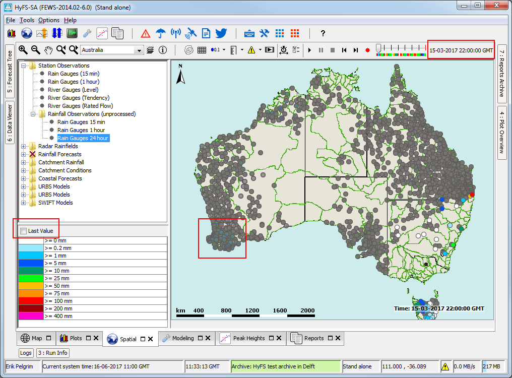
Selection filters
The selection filters show indicate which displays have been configured. Select set up. You can select a filter to display show the data. Note Keep in mind that each grid display may might be configured differently, i.e. with a different period of data to be displayed, with a different background map, etcset up differently, for example, they might show data from different periods, use different background maps, and so on. The configuration allows certain filters to be highlighted in bold. in bold.

Locations attribute filter
With the location attribute filters, you can hide one or more locations/grids in the plot. The button ( ![]() ) is only visible when attributes are configured for the plot.
) is only visible when attributes are configured for the plot.

Legend
The legend can be
...
displayed as a table
...
or
...
a bar
...
.
...
It identifies the color
...
associated with each range of values.
...
You can rescale the range of values
...
for each color
...
by right-clicking on the display and
...
choosing ‘Rescale Classification’ from the pop-up menu. The display colors will then be updated to
...
match the new classification. After rescaling, the lowest and highest values in the legend will
...
match the minimum and maximum values of the data in the current zoom extent of the display (for the selected time slice).
...
If you zoom in on an area where all data points or grid cells have similar colors, you can use rescaling
...
to better see
...
the differences in
...
data values. To
...
go back to the default classification, right-click on the display and
...
choose ‘Back To Default
...
Classification’ from the pop-up menu. When
...
you select a different plot, the classification always
...
reverts back to the default
...
for that plot.
The user Users can change the classification colors by double-clicking the colored squares in the table legend. These changes are stored saved in the user settings. If a user has made changes, they can be discarded discard them by right-clicking the display and selecting 'Discard ‘Discard User-Defined Classification Colors'Colors’.
When several multiple classifications are configuredset up, the user users can select a classification through from the drop-down menu located directly above the table legend.


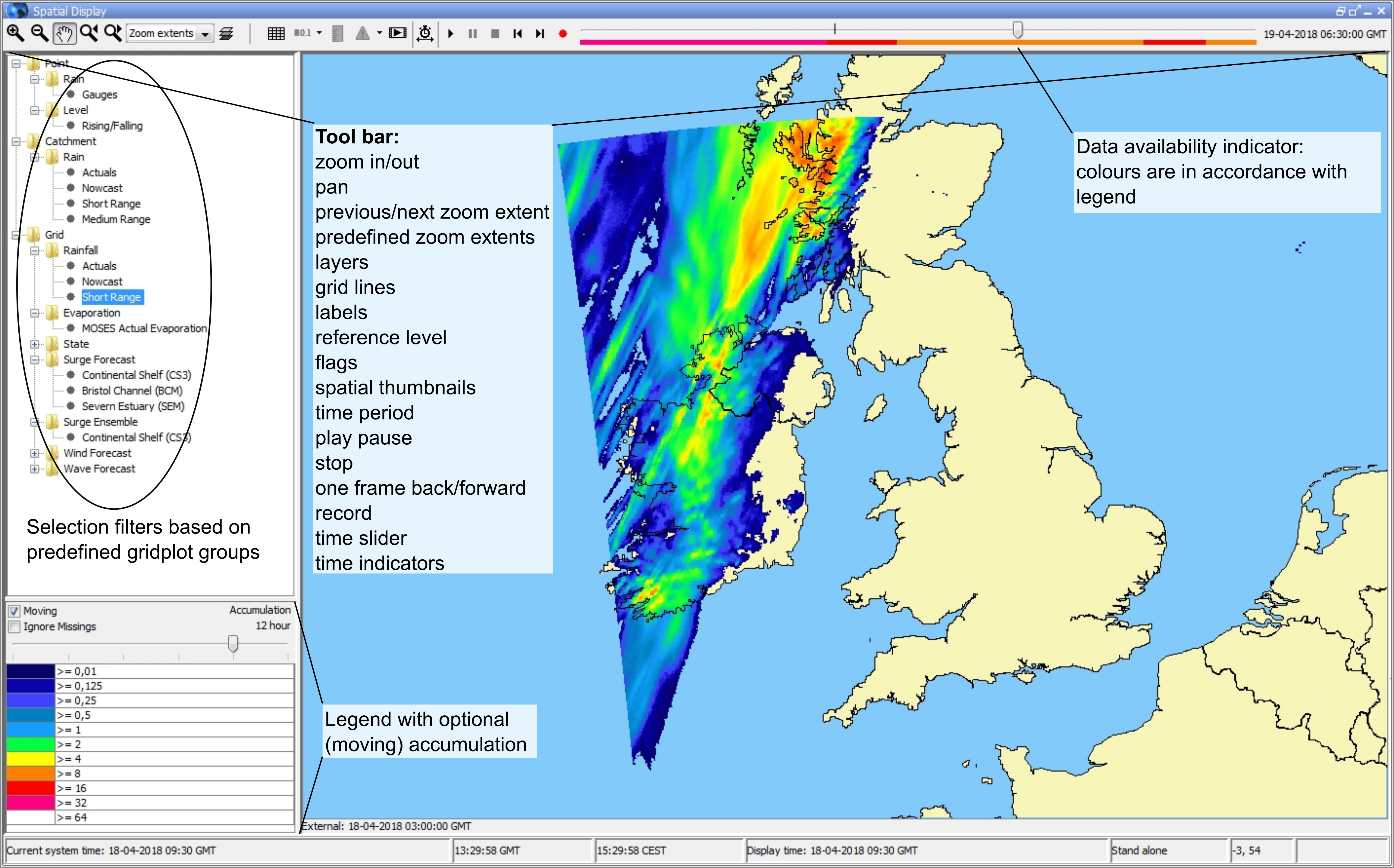
A bar legend displays fluent displays fluent scale bar as shown in the picture below:


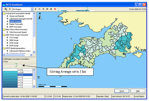
Moving Average or Accumulation Slider
The moving average slider can be
...
set up to
...
let the user
...
choose from a number of moving average settings. Each moving average window is then recalculated for the
...
whole period.
Both When you close the program, both the selected grid plot and the selected chosen aggregation time step are stored saved in the user settings when closing. When reopening you reopen FEWS, the same aggregation time step will be selected. When If you’ve selected an aggregation time step has been selected and the user switches and then switch between different plots, FEWS will attempt try to select the same time step again for the new plot. In the image below, the Moving Accumulation Slider is set to 1 day.
Last Value Checkbox

Since the 2023.02 the accumulation slider automatically contains an extra tick at the end of the slider do accumulate the time steps to/from the display time
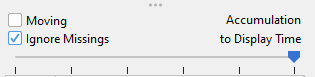
Last Value Checkbox
When this checkbox is selected, it displays the last available When selected this checkbox shows the last available of time series configured in the grid plot. This can be useful handy when there are multiple timeseries time series with a different or non-equidistant time step are steps defined within one grid plot, and a time is selected where one time series does not doesn’t have a time step. The time series can be either scalar or grid. For scalars, the last time step (that is still within the visible period) that does not have without a missing value is shown. For grids, but for grids just the last time step is shown, even though if it can might be a missing value. The checkbox will only appear when no neither an accumulation or nor a moving average slider has been configured, and it can be hidden via through configuration. The next screenshots show how data with a daily time step will appear at 22:00 even though it is not defined for that time:


Selecting different forecasts
Selecting different forecast times
...
A “search and select forecast” (![]() ) button is available
) button is available
...
. This button
...
becomes active if
...
more than one forecast is available,
...
meaning there are
...
multiple forecast time series with different forecast times
...
in the database and the <numberOfRecentForecasts> is set to more than 1 for the selected grid plot.
...
Clicking the button allows you to cycle through the available forecasts. The drop-down menu will
...
display the forecast times of the available forecasts, and selecting one of these
...
times will
...
change the
...
displayed forecast to the one selected.
Alternatively, you can use the spatial thumbnails can be used to select different forecasts (and select different time steps). The spatial thumbnails panel will show display one row for each available forecast available. Toggle the . You can toggle this panel on or off using the  buttonthe button (
![]() ).
).


Selecting different ensemble members
Available since 2019.02. The ![]() can The button (
can The button (![]() ) can be used to open the spatial ensemble thumbnails panel.
) can be used to open the spatial ensemble thumbnails panel.


The spatial ensemble thumbnails window will open
...
, displaying a thumbnail for each
...
individual ensemble member at the selected time.
In this window the user , users can select choose the desired ensemble thumbnail to visualize this they want to view. This selected ensemble member will then be visualized in the grid display.
The ensemble member is specified identified at the bottom of the thumbnail and on the bottom right corner of the grid display.

The thumbnails can be resized at the bottom right corner of the first thumbnail, a resize mouse cursor will be show when hoovering over that corner.
in the bottom right corner of the grid display.
The thumbnails can be resized at the bottom right corner of the first thumbnail. A resize mouse cursor will appear when hovering over that corner.
The size will be stored in the user settings for future use.
Contours
The contour button generates contours in real-time for the grids being displayed. Since 2021.01, it’s also possible to show contours for irregular grids and across multiple grids displayed simultaneously. When the contour button is pressed, bilinear interpolation is used to calculate a value for each pixel individually. The grid display knows the grid cell for every pixel at the current map extent and zoom level. The detection of neighboring cells is done at the screen pixel level and works for existing configurations. The interpolation is automatically turned off for individual cells that are not rectangular or are rotated more than 10 degrees compared to the screen. The contours are calculated for the interpolated pixel values for the current zoom extent. The contour button is disabled for point data and when contours are configured for a different parameter on top of the parameter that is using the colors from the legendThe size will be stoed in the user settings afterwards.
Extracting data from the Spatial Display
...
| Info | ||
|---|---|---|
| ||
In 2019.02 the options to extract data from the spatial display were moved from the right-click menu of the map to the drop-down menu of a new |
Export time step data in data in ascii grid-file
By right clicking on the display, the grid data for a specific timestep can be exported in an ascii file. Select the desirable time step with the control toolbar.
Extracting scalar time series from grid
...
You can extract scalar time series
...
from the grid by double-clicking on the point of interest. Depending on the type of data
...
displayed, the scalar time series will
...
correspond to
...
a point, polygon, or grid cell.
...
Here’s another way to do it:
- First, select the point of interest by left-clicking. A colored dot will
...
- appear to
...
- mark the selected point. For grid data, an additional green dot will be drawn to indicate the center of the selected grid cell (you may need to zoom in to see the green dot
...
- if it overlaps with the colored dot
...
- ).
- Extract the time series for the selected point either by selecting
...
- ‘Show Time
...
- Series’ from the drop-down menu of
...
- the (
 )button or by using the Ctrl+F3 shortcut.
Instead of immediately extracting the time series and showing the a time series dialog, you can use the "Copy “Copy Time Series" Series” option can be used to copy the time series for the selected point to the FEWS clipboard. Copied time series can then later be pasted in into a time series dialog through later using the paste button in its tool bartoolbar.
Several points can be drawing You can draw several points by selecting the "Add Point" sketch mode ![]() “Add Point” sketch mode through the sketch mode button (
“Add Point” sketch mode through the sketch mode button (![]() ) or by holding the left ctrl and shift buttons while left-clicking on the points of interest. When several points have been drawn, the "Show time Series" and "Copy Time Series" “Show Time Series” and “Copy Time Series” options will show /or copy separate time series for each of the drawn points.
) or by holding the left ctrl and shift buttons while left-clicking on the points of interest. When several points have been drawn, the "Show time Series" and "Copy Time Series" “Show Time Series” and “Copy Time Series” options will show /or copy separate time series for each of the drawn points.
Instead of manually drawing a point / or points, you can use the 'Show ‘Show Time Series For Coordinates...' Coordinates…’ option in the drop-down menu of the ![]() button can be used (shortcut: Ctrl+Shift+F3) which the (
button can be used (shortcut: Ctrl+Shift+F3) which the (![]() ) button. This will open a small dialog prompting the user you to enter the coordinates of the point they you wish to use.
) button. This will open a small dialog prompting the user you to enter the coordinates of the point they you wish to use.
A series , that is extracted from a grid , is not related to a known location or polygon ID. The series will then be identified using the grid coordinates.
The graph will automatically pop up with the time series of the selected point, polygon, or grid cell. When animating the grid display, a marker will move over the time series graph as well.
To extract a different scalar time series, double-click on another point of interest. This will draw a new dot and extract a scalar time series for that point. Please be aware note that when extracting a scalar time series from a data point in the display, then the dot drawn on top of the data point has a different colour color from the point itself. This way might make it may look like the data point has a different color because of the dot. The dot can be erased by selecting 'Delete Points' ‘Delete Points’ in the drop-down menu of the sketch mode button (or using the keyboard shortcut Ctrl+Delete).
Note:
...
It’s important to stop the grid movie before
...
creating a time series graph
...
. Running both at the same time can slow down the system
...
due to the heavy processing load from executing multiple processes simultaneously.
The extraction
...
of scalar time series is not available for rotated pole geodatum types. In some cases, the extraction of scalar time series
...
may behave unexpectedly near the North Pole or South Pole.
...
Extracting scalar time series for each ensemble member at one from grid
Since Since the 2020.01 it is version, it’s possible to show display the scalar time series for each ensemble member for a single grid cell.


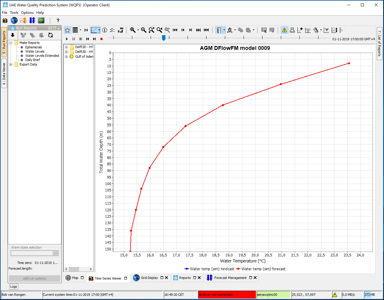
Extracting vertical profiles from 3D data
When the spatial display is
...
presenting 3D (layered) data, you can extract a vertical profile
...
. Here’s how:
- Draw a point as described in the previous section.
- Then,
...
- select the
...
- ‘Show Vertical
...
- Profile’ option in the drop-down menu of the
...
- button or press Ctrl+
...
- F4. This will open a time series dialog with the vertical profile for the drawn point.
Alternatively, you can use the ‘Show Alternatively a 'Show Vertical Profile For Coordinates...' option is available Coordinates…’ option in the drop-down menu or by pressing press Ctrl+Shift+F4. The vertical profile will be shown as a line graph of the parameter versus the water depth. One
You can also create a vertical profile with a color map by selecting the 'Use Color Map' :
- Select the ‘Use Color Map’ option in the drop-down menu of
...
- the button or use Ctrl-M.
- The vertical profile will then be
...
- displayed as a graph of
...
- a parameter over time, with the colors in the plot indicating the values of the selected parameter.
Extracting longitudinal profiles (Xsections) from a grid time series
...
Once a profile sketch has been drawn, extract the profile either by selecting 'Show Longitudinal Profile' from the drop-down menu of the ![]()
![]() button or by using the Ctrl+F2 shortcut. The graph of the profile will show automatically.
button or by using the Ctrl+F2 shortcut. The graph of the profile will show automatically.
...
When spatial modifier mode is activated, the spatial modifier button section will appear in the toolbar. This contains the following buttons.
Button | Description |
|---|---|
| Start time. Select the current time as new modifier start time. |
| End time. Select the current time as new modifier end time. |
| Clear period. Clear the selected new modifier period. |
| Copy modifier. Used when creating spatial copy modifiers. |
| Paste modifier. Used when creating spatial copy modifiers. |
| Spatial profile. Used to create a spatial profile modifier. |
When spatial modifier mode is activated the colors on the time slider will indicate the time periods on which modifiers are applied and the selected period for new modifiers (if any). The new modifier period will be shown in green. The color for the time steps on which a spatial modifier is active can be configured. In this example the configured color is black. It is also possible to configure ticks for the start and end time of the period of applied modifiers and start and end time of the selected new modifier period.
...
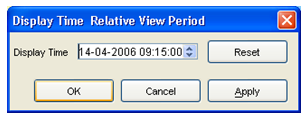
The display time in the spatial display can be changed in the standalone system onlyan Operator Client and in a Stand Alone system. The use is similar to the setting the display time in the data display, but with less modification possibilities. When the display time is modified, the relative start and end times of the data to be shown are reset and the time slider is adjusted accordingly.
When pressing the <Save> button in the pop-up, the changes made to the display time are stored in the user_settings.ini. Next time the FEWS system is started these 'non-default' settings will be used. To revert back to the default display period, press the <Reset> button and press <Save> again.