| scrollbar |
|---|
<p><br /></p> |
| Table of Contents |
|---|
| Children Display |
|---|
...
Available since 2021.02. This provides a simple option to temporarily import files (PI XML, NetCDF or NetCDFCSV format) so you can inspect files without first having to configure a specific import and display.
1D timeseries (scalar) can be imported using either PI XML or NetCDF, additionally the NetCDF format also allows the import of 2D grid data for a single time step. The imported data is not stored in the datastore and will be disconnected when you exit FEWS Explorer UI.
Button bar
The Tool bar provides quick access to frequently used tools. Tools are plug-ins to FEWS Explorer. See FEWSExplorer-StatusBar for more information.
Log Panel
The Log Viewer relays high level messages generated by active system components. Additionally, detailed messages are available in the Log Browser.
Status Bar
The Status Bar provides information about the status of the forecasting system.
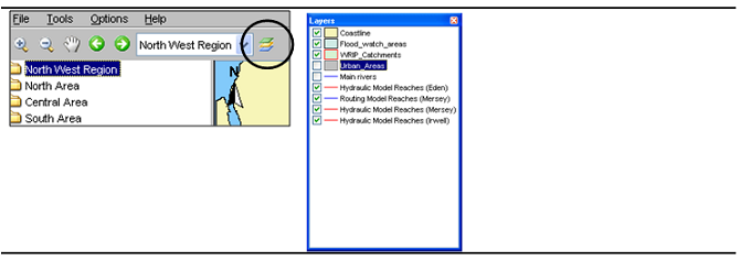
Map Display
Locations are displayed on top of the background map. The selected main filter determines which locations will be displayed. The background map may be configured to consist of stacked layering of various maps. For each map details about line types and fill colours may be set as well. Map layers can be disabled via the Layers button on the Button Bar..
Tooltip
Information that is displayed when the user is moving the mouse cursor over a shape. To see this information turn on the 'I' button, in the button bar.
Map navigation
Please note that NetCDF is a very flexible format so not every NetCDF file will be imported successfully, FEWS will try to use the NetCDF CF convention to identify location, parameter and time related dimensions, for 1-D scalar data NETCDF-CF_TIMESERIES import type is assumed and for 2D grid data the NETCDF-CF_GRID import type is used.
For import of CSV format, some configuration is required, as a Table Layout needs to be defined to control which columns of the CSV file contain location ID, parameter ID and date / time information. The table layouts to use are to be configured in the explorer.xml config file, as in the following example:
| Code Block | ||
|---|---|---|
| ||
</interactiveExportFormats>
<temporaryImportFormats>
	<temporaryImportFormat>
        <name>General CSV</name>
        <table>
            <dateTimeColumn name="DateTime" pattern="dd-MM-yy HH:mm"/>
            <locationColumn name="Location"/>
            <parameterColumn name="Parameter"/>
            <valueColumn name="Value"/>
        </table>
	</temporaryImportFormat>
</temporaryImportFormats>
<explorerTasks> |
For the CSV import the General Csv parser is used, so it may be possible to copy the table definition from an existing CSV import configuration. Multiple table definitions can be configured, each with a given name, then the user will be prompted to select a table definition to use for the import.
Button bar
The Tool bar provides quick access to frequently used tools. Tools are plug-ins to FEWS Explorer. See FEWSExplorer-StatusBar for more information.
Log Panel
The Log Viewer relays high level messages generated by active system components. Additionally, detailed messages are available in the Log Browser.
Status Bar
The Status Bar provides information about the status of the forecasting system.
Map Display
Locations are displayed on top of the background map. The selected main filter determines which locations will be displayed. The background map may be configured to consist of stacked layering of various maps. For each map details about line types and fill colours may be set as well. Map layers can be disabled via the Layers button on the Button Bar..
Tooltip
Information that is displayed when the user is moving the mouse cursor over a shape. To see this information turn on the 'I' button, in the button bar.
Map navigation
Map navigation Map navigation options are set in the zoom toolbar item. After clicking the ''button you can manually zoom in to a user defined map area. With the '-' button you can zoom out. Panning is possible after having clicked the hand button. From version 2008-01 the zoom in, zoom out and pan have been combined. After selecting the '' button, drawing a box from top left to bottom right zooms in, while bottom right to top left zooms out. Holding down the right mouse button allows you to pan. The buttons for zoom out and pan remain for users with only one mouse button.
...
Alternatively, zooming can be done with help of the scroll wheel on the mouse (when available). Zooming in and out is done by respectively turning the scroll wheel away and towards for the user. The position of the cursor determines the centre point of the zoom action.the centre point of the zoom action.
Distance ruler
With the ruler button you can measure a distance on the map

Selecting locations and parameters
...
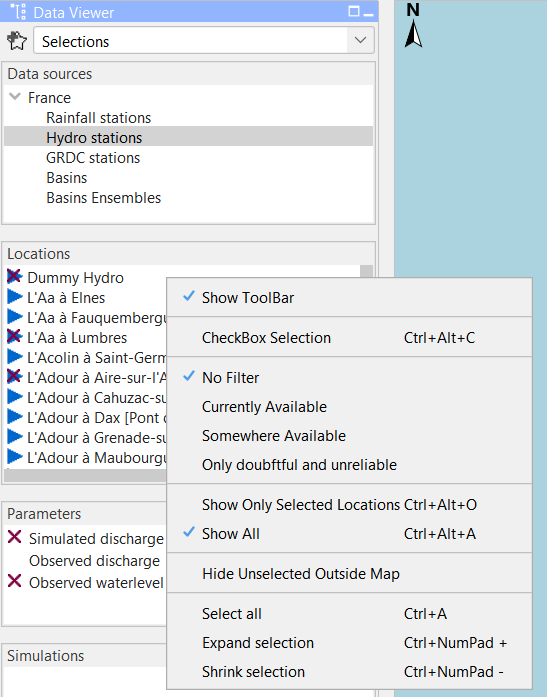
 | Add selection: Stores the current filter, location and parameter selection. A Pop-up will allow you to enter a name for this selection. After entering the name and pressing OK, the selection can be found in the dropdown box to the right. |
 | Remove selection: Removes the current item in the saved selection dropdown box to the right of this icon. If there is no current item, or it is empty, nothing will happen. |
| Saved selection dropdown: When selecting an item from this list the filters, locations and parameters contained in that item will be selected in the Map Display and Data Viewer. Selections can be added or removed with the Add / Remove location selection buttons. |

The stored selections endure a restart of FEWS and will only be deleted by manually removing them or when overwritten. The selections are stored in the user settings and will not be visible to other users. The toolbar in the data viewer can be hidden to preserve space by right-clicking one of the trees in the data viewer. The right-click menu contains a "Show ToolBar" menu item.
Note: In versions older than 2018.02, the buttons to store selections were located in the button bar of the map display instead. The stored selections only contained location and parameter selections, the selected filters were not stored. To update old stored location parameter selections with the selected filters, the selection will have to be recreated and re-added manually.
Show map layer information
An icon on the toolbar can be pressed to activate the presentation of information for map layers as a tooltip. If a map layer has been configured such that it shows information from the dbf file, a user can show this information by clicking the information button.
Note
In case the zoom mode has been activated, the desired location will not be selected, but the map will be panned instead. The zoom or pan mode must first be deactivated by clicking the magnifying glass again.
When moving the cursor to a location, a tool tip will be displayed with the following information:
- Location ID
- Location name
- Site description
- Information about time series...
- Last available value and date & time of last value
- Maximum value (in view period) and date & time of maximum
An example is given below;
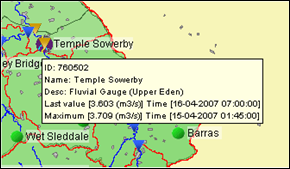
| Info |
|---|
The tooltip shown above is the default tooltip. Within Delft-Fews it is possible that the tooltip has been configured differently to e.g. display a picture of the location. Consult the documentation of your local system or the Delft-FEWS configuration guide (locations) for more information. |
Filters
The filters are the 4 list boxes at the left hand side of the FEWS Explorer. The filters are used to select the data to be displayed in a graph or table. Your selection can be filtered by making one of more choices in the list boxes.
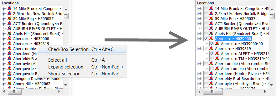
Using Check box selection
Locations, parameters and qualifiers have the ability to be selected with check boxes. To do so, right click on the windows for which you want the check box selection and select "Show check box selection".
With check box selection, selecting the label does not select the item. You will have to check the checkbox to select the item. A greyed out selected checkbox means that one, but not all locations associated with the local branch (the parent and its children) are selected. Like in the normal selection mode, it is possible in check box mode to select only the children without the parent.
Visibility of locations and parameters
The context menu of the listboxes includes the option Show only selected [CTRL ALT O]. This option restricts the visibility of locations and parameters in the listbox to the elements that are selected at the moment this option is chosen. In case of locations, the visibility in the map is also restricted. The visibility of all elements can be restored using the option Show All [CTRL ALT A]. It should be noted that these options require the listbox tree to be rebuilt; in check box selection mode, this leads to collapsing all children, except for the element with focus (dashed box).
Selection of location types
Time series sets can be selected in the upper filter. Time series sets are configured groups of locations with similar data types. The locations with the selected time series set(s) will be displayed on the map display and listed in the locations filter, the second list box. The data types associated with the locations are displayed in the data types filter, the third list box.
To select a list of multiple locations, hold down the [SHIFT ] key between the first and second selection. Hold down the [CTRL ] key to select multiple location types individually.
Using the right mouse button or a shortcut key, some context menu options become available:
locations and parameters contained in that item will be selected in the Map Display and Data Viewer. Selections can be added or removed with the Add / Remove location selection buttons. |
The stored selections endure a restart of FEWS and will only be deleted by manually removing them or when overwritten. The selections are stored in the user settings and will not be visible to other users. The toolbar in the data viewer can be hidden to preserve space by right-clicking one of the trees in the data viewer. The right-click menu contains a "Show ToolBar" menu item.
Note: In versions older than 2018.02, the buttons to store selections were located in the button bar of the map display instead. The stored selections only contained location and parameter selections, the selected filters were not stored. To update old stored location parameter selections with the selected filters, the selection will have to be recreated and re-added manually.
Show map layer information
An icon on the toolbar can be pressed to activate the presentation of information for map layers as a tooltip. If a map layer has been configured such that it shows information from the dbf file, a user can show this information by clicking the information button.
Note
In case the zoom mode has been activated, the desired location will not be selected, but the map will be panned instead. The zoom or pan mode must first be deactivated by clicking the magnifying glass again.
When moving the cursor to a location, a tool tip will be displayed with the following information:
- Location ID
- Location name
- Site description
- Information about time series...
- Last available value and date & time of last value
- Maximum value (in view period) and date & time of maximum
An example is given below;
| Info |
|---|
The tooltip shown above is the default tooltip. Within Delft-Fews it is possible that the tooltip has been configured differently to e.g. display a picture of the location. Consult the documentation of your local system or the Delft-FEWS configuration guide (locations) for more information. |
Filters
The filters are the 4 list boxes at the left hand side of the FEWS Explorer. The filters are used to select the data to be displayed in a graph or table. Your selection can be filtered by making one of more choices in the list boxes.
Using Check box selection
Locations, parameters and qualifiers have the ability to be selected with check boxes. To do so, right click on the windows for which you want the check box selection and select "Show check box selection".
With check box selection, selecting the label does not select the item. You will have to check the checkbox to select the item. A greyed out selected checkbox means that one, but not all locations associated with the local branch (the parent and its children) are selected. Like in the normal selection mode, it is possible in check box mode to select only the children without the parent.
Visibility of locations and parameters
The context menu of the listboxes includes the option Show only selected [CTRL ALT O]. This option restricts the visibility of locations and parameters in the listbox to the elements that are selected at the moment this option is chosen. In case of locations, the visibility in the map is also restricted. The visibility of all elements can be restored using the option Show All [CTRL ALT A]. It should be noted that these options require the listbox tree to be rebuilt; in check box selection mode, this leads to collapsing all children, except for the element with focus (dashed box).
Selection of location types
Time series sets can be selected in the upper filter. Time series sets are configured groups of locations with similar data types. The locations with the selected time series set(s) will be displayed on the map display and listed in the locations filter, the second list box. The data types associated with the locations are displayed in the data types filter, the third list box.
To select a list of multiple locations, hold down the [SHIFT ] key between the first and second selection. Hold down the [CTRL ] key to select multiple location types individually.
Using the right mouse button or a shortcut key, some context menu options become available:
- Select All [CTRL A] : Select all locations.
- Expand selection: [CTRL Numpad +] : A popup is shown where the selected locations can be expanded using a wildcard search. The wildcard characters are "*", matching zero or more characters, and "?", matching exactly one character. All matching locations will be selected.
For example, "Maas km 1?.00" will match "Maas km 10.00", "Maas km 11.00", etc., but not "Maas km 101.00".
As another example, "Maas km 1*" will match "Maas km 10.00", Maas km 11.00", etc., but also "Maas km 100.00", Maas km 101.00", etc. - Shrink selection: [CTRL Numpad -
- Select All [CTRL A] : Select all locations.
- Expand selection: [CTRL Numpad +] : A popup is shown where the selected locations can be expanded shrunk using a wildcard search. The wildcard characters are "*", matching zero or more characters, and "?", matching exactly one character. All matching locations will be selected.
For example, "Maas km 1?.00" will match "Maas km 10.00", "Maas km 11.00", etc., but not "Maas km 101.00".
As another example, "Maas km 1*" will match "Maas km 10.00", Maas km 11.00", etc., but also "Maas km 100.00", Maas km 101.00", etc. - Shrink selection: [CTRL Numpad -] : A popup is shown where the selected locations can be shrunk using a wildcard search (using * and ?). All matching locations will be deselected.
Locations list box
The locations associated with the selected main filter(s) are shown in the locations filter. Selected location will be highlighted on the map by means of a blue square. Locations can also be selected in the map display.
Location related icons are displayed on the map as well as in front of the location names.
Different icons are used to display locations and give information about the availability of data and about the hydrological status of the locations. More information about location related icons is given below in a separate section.
The location list box has its own context menu. e.g. you can toggle the "Hide Unselected Outside Map". The content of the location list is updated while panning or zooming the map and this menu item is checked.
- search (using * and ?). All matching locations will be deselected.
Locations list box
The locations associated with the selected main filter(s) are shown in the locations filter. Selected location will be highlighted on the map by means of a blue square. Locations can also be selected in the map display.
Location related icons are displayed on the map as well as in front of the location names.
Different icons are used to display locations and give information about the availability of data and about the hydrological status of the locations. More information about location related icons is given below in a separate section.
The location list box has its own context menu. e.g. you can toggle the "Hide Unselected Outside Map". The content of the location list is updated while panning or zooming the map and this menu item is checked.
It is also possible to filter locations that have data "currently available", this means there is data within their configured view period of the filter.
Filtering locations by "Somewhere available" means that there is data either within or outside their configured view period of the filter.
Filtering locations by "only doubtful and unreliable" means that only locations are visible for which there is unreliable or doubtful data within their configured view period of the filter. This can be useful when this data still needs to be manually validated.

Data types list box
...
- Clear Messages will remove all messages from the panel
- Save As will allow you to save the messages in the Log Panel to file
Tabs
"Open At Startup" menu item. When the tab is already opened at startup by explorer configuration this menu item will not be available. The last selected panel in a schematic status display is now saved in the user settings. The last selected tab is also saved in the user settings to make this feature more powerful

Status Bar
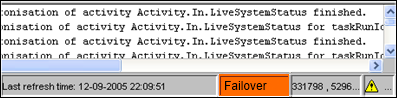
The Status Bar provides information about the status of the forecasting system. The information that is displayed can be defined by the user via the Options menu (see also Options ). Some information is always visible.
...
- In case the colour is orange, the MC which the OC is logged into is in failover mode, either manually or because the FSS's are down.
Mouse coordinates
Mouse coordinates displayed in the configured coordinate system
...
| Icon | Color | Description |
|---|---|---|
 | Green | System is running normally but warnings have been encountered. |
 | Yellow | System encountered severe errors in the past 48 hours. This means that at least one system message has been generated with log level ERROR. After all messages with this log level have been acknowledged by the user via the System Monitor (see also System Monitor ), the icon becomes green again. |
 | Red | System encountered fatal errors in the past 48 hours. This means that at least one system message has been generated with log level FATAL. After all messages with this log level have been acknowledged by the user via the System Monitor (see also System Monitor ), the icon becomes green again. |
...
Notification (default disabled)
...