...
- Display of time series in:
- graphs (scalar/longitudinal profiles)
- tables (scalar/longitudinal profiles)
- Tabular data editor
- Display of actual data with:
- Historical events__
- Threshold levels__
Data is displayed in a table and a graph simultaneously. The splitter between the table and the graph can be moved to modify the display. Select the data series, that should be displayed with help of the List Boxes and/or the Map Display (see also Filters ).
...
Following buttons are used in the Time Series Display:
 Table
Table Table
Table
By clicking this button the time series in the graph is also displayed in tabular format. Please note that in case you like to edit data, you have to select the Data Editor from the Tools menu (see section 4.3).

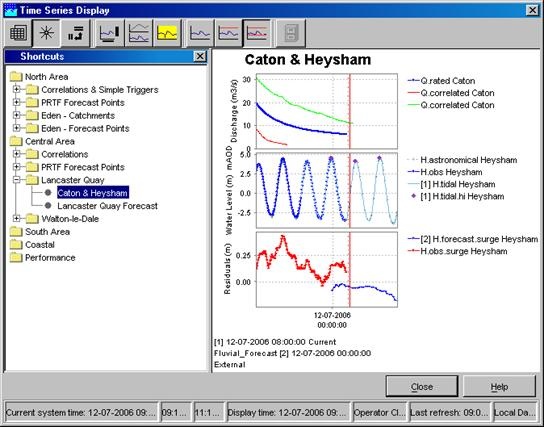
 Shortcuts
Display templates are available for rapid assessment of data. The templates can be activated by clicking the above mentioned button. The left side of the display shows the available shortcuts in a pre-configured grouping.
Selecting the small arrow at the right of the icon shows the next menu:

| function | description |
|---|---|
| Validation | shows a separate column with the validation flags |
| Users | shows a separate column with the user names of editted values |
| Comments | shows a separate column with the comments |
| Units | shows in the header the unit of the parameter |
| Location Names | shows in the header the location name |
| Location Ids | shows in the header the location ID |
| Module | shows in the header the moduleInstanceId |
| Column statistics | shows between the header and the table statistics of the values in the current relativeViewPeriod, like mean, sum, min, max |
| Threshold crossing | shows in the cells (on the left side) a small bar with a color according to the threshold definition, that indicates a threshold crossing |
| Normal | shows the values in a normal table, so all times have a row |
| Days | shows the values in an aggregated way, so that each day gets its own column. Usefull to series with for example an hourly time step. |
| Weeks | shows the values in an aggregated way, so that each week gets its own column. Usefull to series with for example a daily time step. |
| Months | shows the values in an aggregated way, so that each month gets its own column. Usefull to series with for example daily time step. |
| Years | shows the values in an aggregated way, so that each year gets its own column. Usefull to series with for example monthly time step. |
| Show empty RVP series | shows/hides the series which are empty in the current viewperiod. Usefull while using shortcuts or thumbnails. |
| Show empty complete series | shows/hides the series which are completely empty. Usefull while using shortcuts or thumbnails. |
| Time order reversed | Shows the times in reversed order, so from new to old |
 Shortcuts
Display templates are available for rapid assessment of data. The templates can be activated by clicking the above mentioned button. The left side of the display shows the available shortcuts in a pre-configured grouping.
The The data shown via the Shortcuts belong to the forecasts selected in the Forecasts panel of the FEWS Explorer. Please note that the current forecast is always displayed in the graphs.
 Graph
Graph Graph
Graph
This button can be used to hide or show the graph. If the table was not yet selected, it will show up.
Selecting the small arrow at the right of the icon shows the next menu:

 Descriptive
  Descriptive statistics
This button will add a table to the display with descriptive statistical information. The statistics only appear if a column in the table is selected. Use the right mouse button to copy this table to the clipboard for pasting in Excel.
...