This is an example of how to use the sealevel R package. This package is part of OpenEarth and available through r-forge for the convenience of R users. See Trends in Sea-Level Trend Analysis for a discussion on sea-level trend analysis.
This example generates an overview of tide gauges near Jakarta and generates a plot of the measurements of the nearby stations.

|

|
# This is an example of how to get tide gauge data for Jakarta

library(sealevel) # the sealevel package
library(plyr) # reshape
library(ggplot2) # grammar of graphics
library(ggmap) # plot on top of googlemap

# get all the tide gauge data from PSMSL

# For Jakarta no revised local reference data is available.
# Please see the PSMSL site for details

# Get the url for the metric dataset
url <- get.psmsl.url(type='metric')

# Get the name of the file
path <- basename(url)
# Download all data (takes a while)
download.file(url, path)

# Read all monthly data
stations <- read.psmsl(path)

# Create an overview of all locations and names
stations.latlon <- ldply(stations, function(station){data.frame(lat=station$lat, lon=station$lon, name=station$name)})

# Plot a map of Jakarta
# 6.2S 106.8E
jakarta <- get_map(location = c(lon = 106.8, lat = -6.2), zoom = 8)
jakarta.map <- ggmap(jakarta)
# Plot the nearby tide gauges with the name as a lable
p <- jakarta.map + geom_point(data=stations.latlon, aes(x=lon, y=lat), color='red')  + geom_text(data=stations.latlon, aes(x=lon, y=lat, label=name), hjust=0.1, vjust=0.1, size=3)

# Save it to png
png('tidegaugemapjakarta.png', width=1000, height=600)
print(p)
dev.off()

# compute the distance from jakarta
dist <-  laply(stations, function(station){sqrt((station$lon - 106.8)**2 + (station$lat - -6.2)**2)})
# use the first 5 stations
jakarta.stations <- stations[order(dist)][1:10]
# combine them into 1 data fram
jakarta.df <- ldply(jakarta.stations, function(station) {df <- station$data; df$name <- station$name; df$waterlevel <- df$waterlevel - mean(df$waterlevel, na.rm=TRUE); return(df)})
# categorize by name
jakarta.df$name <- factor(jakarta.df$name)
# plot all gauges in one plot
jakarta.df$waterlevel <- jakarta.df$waterlevel + 100*as.numeric(jakarta.df$name)
p <- ggplot(jakarta.df, aes(year.month,waterlevel, color=name)) + geom_line() + geom_smooth() + labs(x='year', y='water level [mm]')

# Save it to png
png('tidejakarta.png', width=1000, height=600)
print(p)
dev.off()
I just made the sealevel R package, which we used for the sea-level rise articles, available. It provides some functions to quickly download, read and analyse the global tide gauges and satellite data.
All suggestions, patches, comments are welcome. This package is part of OpenEarth but available through r-forge for the convenience of R users.
- Trends in Sea-Level Trend Analysis
- The Effect of the 18.6-Year Lunar Nodal Cycle on Regional Sea-Level Rise Estimates
Example
The code below generates the plot of the Dutch tide gauges.
# install.packages("sealevel", repos="http://r-forge.r-project.org")
library(sealevel)
library(ggplot2)
library(plyr)

# Load the Dutch sealevel data
data(dutch)

# Let's plot them all

# The stations are a list of objects, but we can make a data frame like this
station2df <- function(x){
  df <- x$data
  df$name <- x$name
  # set -999 to missing
  df$waterlevel[df$waterlevel==-999.9] <- NA
  return(df)
}

# Let's do bit of map reducing, list -> station2df -> data.frame
dutchdf <- ldply(dutch, station2df)
# Now make a factor instead from the strings
dutchdf$name <- as.factor(dutchdf$name)
# so we can use it to shift the waterlevels a bit
dutchdf$waterlevel <- dutchdf$waterlevel - as.numeric(dutchdf$name)*10

# Use the gramar of graphics approach
p <- ggplot(dutchdf, aes(year, waterlevel, color=name))
# Fit a nodal cycle (long term tide), See Baart et al 2012 in JCR.
p + geom_point() + geom_smooth(method='lm', formula=y~x+I(cos(2*pi*x/18.613))+I(sin(2*pi*x/18.613)))
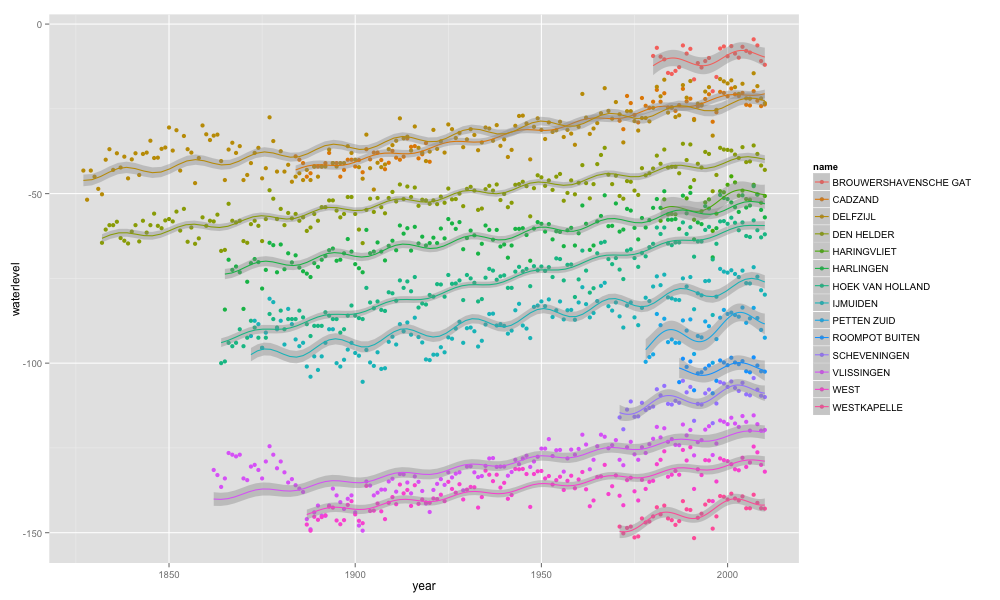
Notice that after the last 6 years of (average) sea-level decline we are about to see a rising sea level at the Dutch coast again for the next 12 years.