...
If specified, then the tags in the text of this component are replaced using data from the specified variable. Tags should be separated by "%" signs. Text can be e.g. "Last value = %LASTVALUE(numberFormatId)%", which would be replaced by e.g. "Last value = 10.0". The following tags can be used in the text (numberFormatId/dateFormatId should be replaced by the id of a numberFormat/dateFormat that is defined at the start of this configuration file):
Tag | Replacement |
|---|---|
%CURRENTTIME(dateFormatId)% | the Delft FEWS time. |
%STARTTIME(dateFormatId)% | the start date and time of the relative view period of the time series. |
%ENDTIME(dateFormatId)% | the end date and time of the relative view period of the time series. |
%LASTVALUE(numberFormatId)% | the most recent reliable or doubtful value in the time series. |
%LASTVALUETIME(dateFormatId)% | the date and time of the most recent reliable or doubtful value in the time series. |
%MINVALUE(numberFormatId)% | the minimum reliable or doubtful value in the time series. |
%MAXVALUE(numberFormatId)% | the maximum reliable or doubtful value in the time series. |
%EXTERNALFORECASTINGSTARTTIME(dateFormatId)% | the start of the external forecast. |
%MAXTIME(dateFormatId)% | the date/time of maximum value found in the time series (occurrence closest to T0). |
%MINTIME(dateFormatId)% | the date/time of minimum value found in the time series (occurrence closest to T0). |
%TIMEZERO(dateFormatId)% | in case of forecast data the forecast time, otherwise timezero. |
%MAXWARNINGLEVEL(thresholdId)% | name of the highest warning level threshold that has been crossed (requires an available thresholdValueSet) |
Left Single Click Action and Left Double Click Action Configuration Options
Click action configuration elements
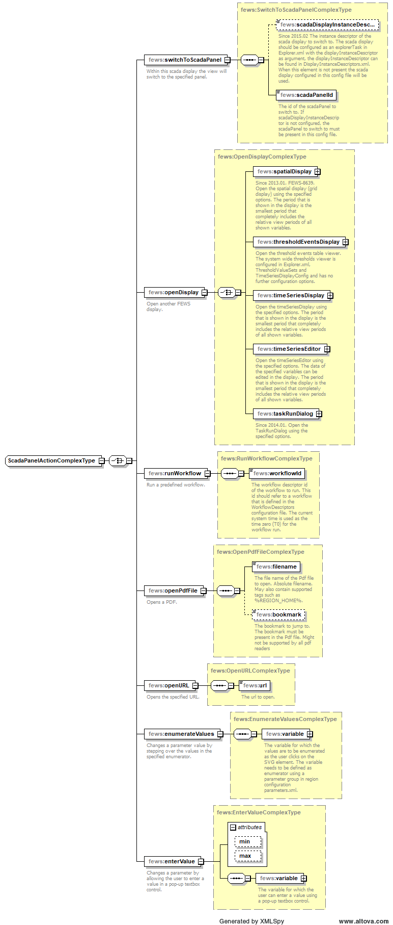
switchToScadaPanel
Within this schematic status display the view will switch to the specified panel.
scadaPanelId
The id of the scadaPanel to switch to. The scadaPanel to switch to must be present in this config file.
openDisplay
Open another Delft-FEWS display.
timeSeriesDisplay
Open the timeSeriesDisplay using the specified options. The period that is shown in the display is the smallest period that completely includes the relative view periods of all shown variables.
timeSeriesEditor
Open the timeSeriesEditor using the specified options. The data of the specified variables can be edited in the display. The period that is shown in the display is the smallest period that completely includes the relative view periods of all shown variables.
title
Title of the display window.
variable
One or more variables to define the data that is shown in the display.
showGraph
Optional. If true then a graph is shown in the opened display. If false, then the graph is not shown.
showTable
Optional. If true then a table is shown in the opened display. If false, then the table is not shown.
runWorkflow
Run a predefined workflow.
workflowId
The workflow descriptor id of the workflow to run. This id should refer to a workflow that is defined in the WorkflowDescriptors configuration file. The current system time is used as the time zero (T0) for the workflow run.
OpenPdfFile
Opens a PDF viewer the specified file and at the specified bookmark.
OpenURL
Opens the specified URL.
Link Properties To Data Configuration Options

Link properties to data configuration elements
There are several options available:
Link Height To Data Configuration Options

Link height to data configuration elements
See #tags.
Left Single Click Action and Left Double Click Action Configuration Options
Click action configuration elements
switchToScadaPanel
Within this schematic status display the view will switch to the specified panel.
scadaPanelId
The id of the scadaPanel to switch to. The scadaPanel to switch to must be present in this config file.
openDisplay
Open another Delft-FEWS display.
timeSeriesDisplay
Open the timeSeriesDisplay using the specified options. The period that is shown in the display is the smallest period that completely includes the relative view periods of all shown variables.
timeSeriesEditor
Open the timeSeriesEditor using the specified options. The data of the specified variables can be edited in the display. The period that is shown in the display is the smallest period that completely includes the relative view periods of all shown variables.
title
Title of the display window.
variable
One or more variables to define the data that is shown in the display.
showGraph
Optional. If true then a graph is shown in the opened display. If false, then the graph is not shown.
showTable
Optional. If true then a table is shown in the opened display. If false, then the table is not shown.
runWorkflow
Run a predefined workflow.
workflowId
The workflow descriptor id of the workflow to run. This id should refer to a workflow that is defined in the WorkflowDescriptors configuration file. The current system time is used as the time zero (T0) for the workflow run.
OpenPdfFile
Opens a PDF viewer the specified file and at the specified bookmark.
OpenURL
Opens the specified URL.
Link Properties To Data Configuration Options
Link properties to data configuration elements
There are several options available:
Link Height To Data Configuration Options
Link height to data configuration elements
Optional. If specified, then for this component the height attribute is linked to the data values for the specified variable. This option can only be used for svg objects of type "rect". If the data value is less than dataLowerLimit, then the height is set to heightLowerLimit. If the data value is greater than dataUpperLimit, then the height is set to heightUpperLimit. If the data value is between dataLowerLimit and dataUpperLimit, then the height will be linearly interpolated between heightLowerLimit and heightUpperLimit. If no data is available, then this component is made invisible.
Note: it is required that dataUpperLimit is greater than dataLowerLimit. However it is possible to define heightUpperLimit less than heightLowerLimit to control the direction of the change of the height.
variable
The data for this variable is used to determine the height for this component.
dataLowerLimit
If the data value is less than or equal to dataLowerLimit, then the height will be equal to heightLowerLimit.
dataUpperLimit
If the data value is greater than or equal to dataUpperLimit, then the height will be equal to heightUpperLimit.
heightLowerLimit
The height that corresponds to the dataLowerLimit value.
heightUpperLimit
The height that corresponds to the dataUpperLimit value.
anchorPoint
The anchor point describes which part of the component should remain at the same position when the height is changed. Can be "bottom" or "top".
Link Rotation To Data Configuration Options
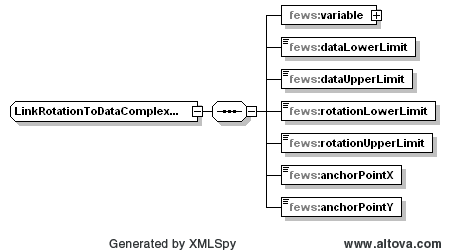
Link rotation to data configuration elements
Optional. If specified, then for this component the rotation Optional. If specified, then for this component the height attribute is linked to the data values for the specified variable. The rotation that is derived from the data values is always relative to the rotation angle that is specified for this component in the svg file. This option can only be used for svg objects of type "path", "rect". If the data value is less than dataLowerLimit, then the height is set to heightLowerLimit, "circle", "ellipse", "line", "polyline", "polygon" or "text". If the data value is less than dataLowerLimit, then the rotation is set to rotationLowerLimit. If the data value is greater than dataUpperLimit, then the height rotation is set to heightUpperLimitrotationUpperLimit. If the data value is between dataLowerLimit and dataUpperLimit, then the height rotation will be linearly interpolated between heightLowerLimit rotationLowerLimit and heightUpperLimitrotationUpperLimit. If no data is available, then this component is made invisible. If the data value is flagged as "varying direction" (e.g. varying wind direction), then the rotation will increase linearly in time (animation). In this case the rotation will increase from rotationLowerLimit to rotationUpperLimit and then start from rotationLowerLimit again.
Note: it is required that dataUpperLimit is greater than dataLowerLimit. However it is possible to define rotationUpperLimit less than rotationLowerLimit to control the direction of the rotation. If rotationUpperLimit is greater than rotationLowerLimit, then increasing data values result in clockwise rotationNote: it is required that dataUpperLimit is greater than dataLowerLimit. However it is possible to define heightUpperLimit less than heightLowerLimit to control the direction of the change of the height.
variable
The data for this variable is used to determine the height rotation for this component.
dataLowerLimit
If the data value is less than or equal to dataLowerLimit, then the height rotation will be equal to heightLowerLimitrotationLowerLimit.
dataUpperLimit
If the data value is greater than or equal to dataUpperLimit, then the height will be equal to heightUpperLimit.
heightLowerLimit
The height that corresponds to the dataLowerLimit value.
heightUpperLimit
The height that corresponds to the dataUpperLimit value.
anchorPoint
The anchor point describes which part of the component should remain at the same position when the height is changed. Can be "bottom" or "top".
Link Rotation To Data Configuration Options
Link rotation to data configuration elements
Optional. If specified, then for this component the rotation is linked to the data values for the specified variable. The rotation that is derived from the data values is always relative to the rotation angle that is specified for this component in the svg file. This option can only be used for svg objects of type "path", "rect", "circle", "ellipse", "line", "polyline", "polygon" or "text". If the data value is less than dataLowerLimit, then the rotation is set to rotationLowerLimit. If the data value is greater than dataUpperLimit, then the rotation is set to rotationUpperLimit. If the data value is between dataLowerLimit and dataUpperLimit, then the rotation will be linearly interpolated between rotationLowerLimit and rotationUpperLimit. If no data is available, then this component is made invisible. If the data value is flagged as "varying direction" (e.g. varying wind direction), then the rotation will increase linearly in time (animation). In this case the rotation will increase from rotationLowerLimit to rotationUpperLimit and then start from rotationLowerLimit again.
Note: it is required that dataUpperLimit is greater than dataLowerLimit. However it is possible to define rotationUpperLimit less than rotationLowerLimit to control the direction of the rotation. If rotationUpperLimit is greater than rotationLowerLimit, then increasing data values result in clockwise rotation.
variable
The data for this variable is used to determine the rotation for this component.
dataLowerLimit
If the data value is less than or equal to dataLowerLimit, then the rotation will be equal to rotationLowerLimit.
dataUpperLimit
If the data value is greater than or equal to dataUpperLimit, then the rotation will be equal to rotationUpperLimit.
rotationLowerLimit
The rotation (in degrees) that corresponds to the dataLowerLimit value. This rotation is always relative to the rotation angle that is specified for this component in the svg file.
rotationUpperLimit
The rotation (in degrees) that corresponds to the dataUpperLimit value. This rotation is always relative to the rotation angle that is specified for this component in the svg file.
anchorPointX
The x coordinate of the anchor point. The rotation will be around the anchor point. This x coordinate has to be specified in the user space coordinate system of the svg object for this component in the svg file. The user space coordinate system is determined by all transforms that are specified in the parent svg objects of the svg object for this component. All transforms that are specified in the svg object itself are not part of the user space coordinate system and thus should be taken into account in the coordinates that are specified here. E.g. to rotate a "rect" svg object with attributes width="200" height="200" x="500" y="300" transform="translate(50 0)" around its center, use anchorPoint coordinates (x, y) = (650, 400). See also Determining the rotation anchor point for an SVG object in user space coordinates.
anchorPointY
greater than or equal to dataUpperLimit, then the rotation will be equal to rotationUpperLimit.
rotationLowerLimit
The rotation (in degrees) that corresponds to the dataLowerLimit value. This rotation is always relative to the rotation angle that is specified for this component in the svg file.
rotationUpperLimit
The rotation (in degrees) that corresponds to the dataUpperLimit value. This rotation is always relative to the rotation angle that is specified for this component in the svg file.
anchorPointX
The x The y coordinate of the anchor point. The rotation will be around the anchor point. This y x coordinate has to be specified in the user space coordinate system of the svg object for this component in the svg file. The user space coordinate system is determined by all transforms that are specified in the parent svg objects of the svg object for this component. All transforms that are specified in the svg object itself are not part of the user space coordinate system and thus should be taken into account in the coordinates that are specified here. E.g. to rotate a "rect" svg object with attributes width="200" height="200" x="500" y="300" transform="translate(50 0)" around its center, use anchorPoint coordinates (x, y) = (650, 400). See also Determining the rotation anchor point for an SVG object in user space coordinates.
Use Threshold Warning Level Colors Configuration Options
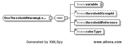
Use threshold warning level colors configuration elements
variable
The data for this variable is used to determine threshold crossings. For crossed thresholds, warningLevels are activated. The color of the most severe activated warningLevel is used as the fill and/or stroke color for the component, as specified below.
thresholdGroupId
Optional. If specified, then only thresholds in the specified thresholdGroup are used in the determination of threshold crossings and warningLevels for the specified variable. If not specified, then thresholds in all thresholdGroups are used.
thresholdReference
Specify which data is used for determining threshold crossings. Either choose the first or last reliable or doubtful value within the relative view period, or choose all reliable or doubtful values within the relative view period. Can be "first_value", "last_value" or "relative_view_period".
colorType
Specify which color type (fill and/or stroke) should be changed to use warningLevel colors. Color types that are not specified here are not changed. Can be "fill", "stroke" or "fill_and_stroke".
Tooltip Configuration Options
, y) = (650, 400). See also Determining the rotation anchor point for an SVG object in user space coordinates.
anchorPointY
The y coordinate of the anchor point. The rotation will be around the anchor point. This y coordinate has to be specified in the user space coordinate system of the svg object for this component in the svg file. The user space coordinate system is determined by all transforms that are specified in the parent svg objects of the svg object for this component. All transforms that are specified in the svg object itself are not part of the user space coordinate system and thus should be taken into account in the coordinates that are specified here. E.g. to rotate a "rect" svg object with attributes width="200" height="200" x="500" y="300" transform="translate(50 0)" around its center, use anchorPoint coordinates (x, y) = (650, 400). See also Determining the rotation anchor point for an SVG object in user space coordinates.
Use Threshold Warning Level Colors Configuration Options
Use threshold warning level colors 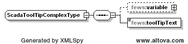
Tooltip configuration elements
variable
The data from for this variable is used to replace the tags in the specified toolTip text. If for a given tag the required data is not available, then that tag is replaced by a dash symbol "-". This variable is only required if the specified toolTip text contains tags.
toolTipText
Text that is displayed in the toolTip for this component. This text can contain tags. The tags are replaced using data from the specified variable. Tags should be separated by "%" signs. Text can be e.g. "Last value = %LASTVALUE(numberFormatId)%", which would be replaced by e.g. "Last value = 10.0". The following tags can be used in the text (numberFormatId/dateFormatId should be replaced by the id of a numberFormat/dateFormat that is defined at the start of this configuration file):
...
determine threshold crossings. For crossed thresholds, warningLevels are activated. The color of the most severe activated warningLevel is used as the fill and/or stroke color for the component, as specified below.
thresholdGroupId
Optional. If specified, then only thresholds in the specified thresholdGroup are used in the determination of threshold crossings and warningLevels for the specified variable. If not specified, then thresholds in all thresholdGroups are used.
thresholdReference
Specify which data is used for determining threshold crossings. Either choose the first or last reliable or doubtful value within the relative view period, or choose all reliable or doubtful values within the relative view period. Can be "first_value", "last_value" or "relative_view_period".
colorType
Specify which color type (fill and/or stroke) should be changed to use warningLevel colors. Color types that are not specified here are not changed. Can be "fill", "stroke" or "fill_and_stroke".
Tooltip Configuration Options
Tooltip configuration elements
variable
The data from this variable is used to replace the tags in the specified toolTip text. If for a given tag the required data is not available, then that tag is replaced by a dash symbol "-". This variable is only required if the specified toolTip text contains tags.
toolTipText
Text that is displayed in the toolTip for this component. See the next section on tags
...
.
Replace Tags Configuration Options
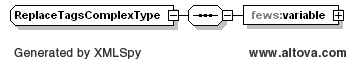
Replace tags configuration elements
If specified, then the tags in the text of this component are replaced using data from the specified variable. Tags should be separated by "%" signs. Text can be e.g. "Last value = %LASTVALUE(numberFormatId)%", which would be replaced by e.g. "Last value = 10.0". The following tags can be used in the text (numberFormatId/dateFormatId should be replaced by the id of a numberFormat/dateFormat that is defined at the start of this configuration file):
...
defined at the start of this configuration file):
%CURRENTTIME(dateFormatId)% | the Delft FEWS time. |
%STARTTIME(dateFormatId)% | the start date and time of the relative view period of the time series. |
%ENDTIME(dateFormatId)% | the end date and time of the relative view period of the time series. |
%LASTVALUE(numberFormatId)% | the most recent reliable or doubtful value in the time series. |
%LASTVALUETIME(dateFormatId)% | the date and time of the most recent reliable or doubtful value in the time series. |
%MINVALUE(numberFormatId)% |
...
the minimum reliable or doubtful value in the time series. |
...
%MAXVALUE(numberFormatId)% |
...
the maximum reliable or doubtful value in the time series |
...
. | |
%EXTERNALFORECASTINGSTARTTIME(dateFormatId)% | the start of the external forecast. |
%MAXTIME(dateFormatId)% | the date/time of maximum value found in the time series (occurrence closest to T0). |
%MINTIME(dateFormatId)% |
...
the date |
...
/time of |
...
minimum value found in the time series (occurrence closest to T0). |
...
%TIMEZERO(dateFormatId)% |
...
in case of forecast data the forecast time, otherwise timezero. | |
%MAXWARNINGLEVEL(thresholdId)% | name of the highest warning level threshold that has been crossed (requires an available thresholdValueSet) |
...
variable |
The data from this variable is used to replace the tags in the text in the svg object that this component refers to. If for a given tag the required data is not available, then that tag is replaced by a dash symbol "-".
...