...
What | TimeSeriesDisplayConfig.xml |
|---|---|
Config group | SystemConfigFiles |
Required | no |
Description | Configuration file for the time series display (line styles etc) |
schema location |
| Table of Contents |
|---|
Introduction
The layout of the time series display is configured in an XML file in the System Configuration folder. When available on the file system, the name of the XML file is for example:
TimeSeriesDisplayConfig 1.00 default.xml
TimeSeriesDisplayConfig Fixed file name for the time series display settings
1.00 Version number
default Flag to indicate the version is the default configuration (otherwise omitted).
Figure 13 shows the main elements of the TimeSeriesDisplay configuration. These are divided into a number of sections, each of which will be discussed individually (these are indicated with a + sign).
...
There are four elements which can be used to influence different font sizes in the time series dialog:
- <legendFontSize>
- <legendFormat><legendTextFunction>
- <axisTitleFontSize>
- <tickLabelFontSize>
- <thresholdLabelFontSize>
...
legendTextFunction
With the use of legendFormat you can customise what insformation information you wish to see on the legend of a graph plot. Currently the supported data types are: location id, location name, location shoert name, parameter name, parameter id.Use the Use the following tags in the legendformat, they will be automatically replaced with the correct values:
- %LOCATION_ID%
...
- %LOCATION_NAME%
...
- %LOCATION_SHORTNAME%
...
- %PARAMETER_ID%
...
- %PARAMETER_NAME%
...
- %FORECAST_INDEX%
- %MODULE_INSTANCE%
- %ENSEMBLE_ID%
- %ENSEMBLE_MEMBER_ID%
- %QUALIFIER_NAME%
- %ADDITIONAL_PREFIX%
- %HISTORICAL_EVENT_NAME%
- %MODIFIED%
- %CUSTOM_LABEL_EXTENSION%
- %FUNCTION_LABEL%
- %POSTPROCESSING%
Tags are case sensitive. If a tag configured that does not exist in the given time series, it will be replaced by an empty string. Example:
<legendTextFunction>%PARAMETER_NAME% %ENSEMBLEMEMBERID% measured
Examples:
...
at %LOCATION_NAME%</
...
legendTextFunction> → Water level measured at Lobith H105
LegendTextFunction does not work with timeseries header label function.
showValueInLegend works the same with or without legendTextFunction.
Examples:
- <legendTextFunction>%PARAMETER_NAME% measured at %LOCATION_NAME%</legendTextFunction> → Water level measured at Lobith H105
- <legendTextFunction>%LOCATION_SHORTNAME% : %PARAMETER_ID%</legendTextFunction> → Lobith : WL
- <legendTextFunction> %LOCATION
- <legendFormat>%LOCATION_SHORTNAME% : %PARAMETER_ID%</legendFormat> → Lobith : WL
- <legendFormat> %LOCATION_SHORTNAME% (%PARAMETER_NAME%)</legendFormat> legendTextFunction> → Lobith (Water level)
Configuring a legendFormat a legendTextFunction will owerride any other (additional) default information.
...
- unit identifies the time unit with which the time span is defined (enumeration of second, minute, hour, day, week).
- start identifies the start time of the time span with reference to the T0 (in multiples of the unit defined).
- end identifies the start time of the time span with reference to the T0 (in multiples of the unit defined).
...
Scroller default view period
The optional scrollerDefaultViewPeriod for the time of Validity (Tv) can be used to define the time span of data displayed in the long term scroller of the time series display (unless overruled by the user).
showAllScrollerData
When true the long term scroller always show the full period where the time series in the scroller have data. This can be configured instead of <scrollerDefaultViewPeriod> and is available since 2023.02.
| Anchor | ||||
|---|---|---|---|---|
|
This optional default view period for the time of Validity (Tv) can be used to define the time span of data displayed in the time series display whenever the Tv button is selected. This view period is whenever the Tv button is selected. This view period is enforced every time the user switches to another display node. This view period is relative to the Tv of the time series in the display and not to T0. This element is required when you have configured a timeOfValidity element in the flagSourceColumns.xml configuration file. The functionality of Time of Validity is more exhaustively described in the Validation Status page.
...
| Code Block |
|---|
<toolTipsConfig> <toolTipProperties> <property>Observed_Date</property> <property>Prediction_Level</property> <property>Prediction_Level_Type</property> </toolTipProperties> </toolTipsConfig> |
Time Markers Display Configuration
Time series display markers are informative lines in the display. These may be defined to display vertical lines for times of interest. The configuration of horizontal lines for thresholds and the zero baseline is also included in this definition. Markers can be defined for four time values as well as for the thresholds and the zero baseline. Vertical lines are also available as lineStyle for plotting of time series, see below.
for time series
...
Legend Tooltips Config
In addition to the default tooltips shown for items in the legend, specific tooltips can be configured using a time series filter, using standard properties and user defined attributes to add information. An example config is as follows:
| Code Block |
|---|
	<toolTipsConfig>
		<legendToolTip>
		   <timeSeries>
		      <valueType>scalar</valueType>
		      <parameterId>DT24</parameterId>
		      <timeSeriesType>external historical</timeSeriesType>
		   </timeSeries>
		   <toolTip>%LOCATION_ID% %PARAMETER_NAME% %QUALIFIER_NAME% [%PARAMETER_UNIT%]</toolTip>
		</legendToolTip>
</toolTipsConfig> |
Multiple legendTooltip elements as show in this example can be added to the tooltips config element, the tooltip text can be formatted in HTML by putting it in a CDATA block and %property% and/or @attribute@ tags can be inserted, with support for user defined attributes for locations, parameters and modifiers as well as the following standard properties:
- %LOCATION_ID%
- %LOCATION_NAME%
- %LOCATION_SHORTNAME%
- %LOCATION_DESCRIPTION%
- %PARAMETER_ID%
- %PARAMETER_NAME%
- %PARAMETER_SHORTNAME%
- %PARAMETER_DESCRIPTION%
- %PARAMETER_UNIT%
- %QUALIFIER_NAME%
- %MODULE_INSTANCE_ID%
- %MODULE_INSTANCE_NAME%
- %MODULE_INSTANCE_DESCRIPTION%
Class Breaks
Class breaks (map legend) is used in the spatial plots and vertical profiles. The classbreaks can be configured in the Spatial Display configuration, but also in the TimeSeriesDisplayConfig file. When calssbreaks are added in this file, it requires a classbreak Id. The classBreak Id can then be used in the Spatial Display or Display Groups.
| Code Block |
|---|
    <classBreaks>
        <classBreaks id="rainfall_forecasts">
            <description>Rainfall Forecasts</description>
            <unitVisible>true</unitVisible>
            <break color="FFFFFF" lowerValue="0" opaquenessPercentage="35"/>
            <break color="99E9FF" lowerValue="0.2" opaquenessPercentage="35"/>
            <break color="00C8FF" lowerValue="1" opaquenessPercentage="60"/>
            <break color="0053FF" lowerValue="5" opaquenessPercentage="60"/>
            <break color="00956A" lowerValue="10" opaquenessPercentage="60"/>
            <break color="00FA10" lowerValue="25" opaquenessPercentage="60"/>
            <break color="F5F50A" lowerValue="50" opaquenessPercentage="60"/>
            <break color="FF9600" lowerValue="75" opaquenessPercentage="60"/>
            <break color="FF0000" lowerValue="100" opaquenessPercentage="80"/>
            <break color="960000" lowerValue="200" opaquenessPercentage="80"/>
            <break color="FF00CC" lowerValue="400" opaquenessPercentage="80"/>
        </classBreaks>
</classBreaks> |
Time Markers Display Configuration
Time series display markers are informative lines in the display. These may be defined to display vertical lines for times of interest. The configuration of horizontal lines for thresholds and the zero baseline is also included in this definition. Markers can be defined for four time values as well as for the thresholds and the zero baseline. Vertical lines are also available as lineStyle for plotting of time series, see below.
for time series
- systemTime
- displayTime: time that can be set with the display time button (clock icon) in the time series dialog, by default equals the system time
- timeZero: T0 of the external forecast time series
- forecastStartTime (since stable build 2014.01). This will show vertical lines in charts for the start times of forecast time series, i.e. time series of type external forecasting, simulated forecasting. It will only be shown when the forecast time series is configured with "read complete forecast" as readWriteMode.
- threshold
- zeroBaseline
timeOfValidity (since 2016.01). This marker should be visualized in the display when the Tv button is activated. This will show vertical lines in charts placed at the Time of Validity (Tv) of that display node. The Tv is determined using the timeOfValiditySearchPeriod. The functionality of Time of Validity is more exhaustively described in the Validation Status page.Anchor timeSeriesDisplayConfig_TimeMarkersDisplayConfiguration timeSeriesDisplayConfig_TimeMarkersDisplayConfiguration
The following marker options can be used to display forecast confidence time spans in the time series display. Up to three forecast confidence time spans can be defined for each sub plot in the displayGroups configuration file.
- forecastConfidence1
- forecastConfidence2
- forecastConfidence3
Within longitudinal profile displays, the markers can be set to display the minimum or maximum values. A variety of river bed levels can be included in a display if these are specified in the branches.xml file. Available are:
- riverBedLevel
- leftBankLevel
- leftFloodPlainLevel
- leftMainChannelLevel
- longitudinalProfileMaximum
- longitudinalProfileMinimum
- rightBankLevel
- rightFloodPlainLevel
- rightMainChannelLevel
Example config code for the marker riverBedLevel:
| Code Block | ||||
|---|---|---|---|---|
| ||||
	<timeMarkerDisplayOptions marker="riverBedLevel">
		<color>black</color>
		<lineStyle>solid</lineStyle>
		<label>Most recent survey</label>
</timeMarkerDisplayOptions> |
To visualize model layer elevations when drawing a cross section in a spatial plot, one should use:
- bottomLayerLevel
- topLayerLevel
This applies only for parameters with unit in meters
It is possible to display vertical lines in the slider bar in the spatial display that mark the start and/or end times of the displayed grid time series. These markers will only be visible when more than one grid is displayed, i.e. multiple data layers in one grid plot. In that case the start and/or end times can be different for each grid time series. These markers are configurable using the following marker options in the time markers display configuration:
- startTime
- endTime
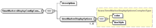
Figure 14 Elements in the TimeMarkersDisplay section of the TimeSeriesDisplay configuration
timeMarkerDisplayOptions
Root element of a definition time markers (multiple entries may exist).
Attributes;
- marker enumeration of the possible markers (see list above).
color
Colour of the time series marker line (see enumeration of colours in appendix A).
lineStyle
Line style of time series marker line. Enumeration of "solid", "none", "bar", "dashdot", "dashed", "dotted", "solid;thick", "dashdot;thick", "dashed;thick"; "dotted;thick"; "area"; "constant".
The "constant" label should preferably only be applied if the time series holds only one value.
label
Define the name of time series marker line.
tableBackgroundColors
Since 2014.01 it is possible to have a time dependent background color in the table, for example to visualise the different night and day hours. This is possible per weekday.
| Code Block | ||||
|---|---|---|---|---|
| ||||
<tableBackgroundColors>
  <timeZone>PST</timeZone>
  <background startTime="07:00:00" endTime="23:00:00" dayOfWeek="Sunday" color="gray80"/>
  <background startTime="07:00:00" endTime="23:00:00" dayOfWeek="Monday" color="gray80"/>
  ...
  <background startTime="07:00:00" endTime="23:00:00" dayOfWeek="Saturday" color="gray80"/>
</tableBackgroundColors> |
highlightedDateTickColor
Color to be used for the highlighted date tick that shows the date on the selected time step, default is blue.
defaultColorsList
Since 2021.01 it is possible to adjust the default colors. A default color is used when no color is configured for a series or to prevent duplicate colors for non-predefined plots. The colors are used in the order as configured. The list below is used when no default colors are configured.
| Code Block | ||||
|---|---|---|---|---|
| ||||
<defaultColorList>
    <color>blue</color>
    <color>red</color>
    <color>green</color>
    <color>aquamarine</color>
    <color>brown</color>
    <color>cadet blue</color>
    <color>coral</color>
    <color>cornflower blue</color>
    <color>cyan</color>
    <color>dark goldenrod</color>
    <color>dark green</color>
    <color>deep pink</color>
    <color>deep sky blue</color>
    <color>firebrick</color>
    <color>gold</color>
    <color>light coral</color>
    <color>blue violet</color>
    <color>magenta</color>
    <color>medium orchid</color>
    <color>medium violet red</color>
    <color>medium spring green</color>
    <color>orange</color>
    <color>royal blue</color>
    <color>sea green</color>
    <color>sky blue</color>
    <color>violet</color>
    <color>chocolate</color>
</defaultColorList> |
Parameters display configuration
In this section of the time series display, default attributes of lines plotted for parameters can be allocated. These defaults will be used when plotting lines for these parameters in the time series displays and in the reports. Note that for allocation of the colour only the preferred colour can be identified. When the line is plotted this colour will be used only if there is no other line with the same colour. If this is the case then the next colour in the colour palette will be used.
Figure showing the options in the ParameterDisplayConfig section of the TimeSeriesDisplay configuration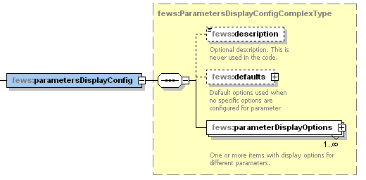
Default Options
The Default Options can be configured (and has the same sequence as the single parameter display options) to be set as default appearance. This default is overruled by an individual ParameterDisplay Configuration for a parameter.
Figure showing the options in the Default Options section of the TimeSeriesDisplay configuration
The sequence is identical to the parameterDisplayOptions Configuration, see below
ParameterDisplayOptions
Figure 15 Elements in the ParameterDisplayOptions section of the TimeSeriesDisplay configuration
PreferredColor
The preferred colour for the line and markers. This colour will only be used if it is not yet available in the current graph. If it is, then the next colour in the template order will be selected.
| Anchor | ||||
|---|---|---|---|---|
|
Line style of timeseries. Enumeration "solid", "none", "solid;thick", "bar", "dashed", "dashed;thick", "dotted", "dotted;thick", "dashdot", "dashdot;thick", "area", "constant", "verticalLine"
Line style "constant" applies to the scalar timeseries with only one value.
For this value a value marker (horizonal line) is created in the plot.
If the timeseries has more values, line style "constant" is ignored and the values are drawn with the line style "solid"
Line style "verticalLine" applies to scalar timeseries where the value will be ignored and a vertical line will be drawn at the time step in the plot with the comment written along with it if present. These vertical lines will be shown in all selected plots, there will not be a separate plot created for the "verticalLine" time series.
markerStyle
Marker style for markers plotted on the vertices of the line. Enumeration of "none", "+", "x", "circle", "square", "rectangle", "diamond", "triangleup" , "triangledown".
Directional arrow markers
Since 2017.02, arrow markers can be plotted, where the direction of the arrow depends on a direction time series. This, for example, allows you to configure a wind speed parameter to include arrow markers signifying the wind direction when available. These arrow markers are currently supported in both the data display, as well as the report module. For the time series display FEWS will automatically search for the rotation time series, this does not have to be included in the display group or data viewer selection. For the report module, the configured chart does have to include both time series to ensure that the rotation data is available.
markerRotationParameterId
The parameter id of the parameter to be used to determine the marker orientation. The given parameter should be a rotation in degrees (0 - 360, clockwise where 0 is north), for example wind direction. The markers drawn on the graph will be arrows (or the configured markerIcon) rotated by the number of degrees given by the marker rotation time series. Note that the time series set with all elements except parameterId (locationId, timeStep etc.) identical to the plotted parameter is used. If no rotation time series can be found, or it contains a missing value for a certain time, no marker is drawn.
markerIcon
Optional element to configure a custom arrow icon. If configured the icon will be used as a marker on the graph. If no custom icon is configured, FEWS will use a default arrow, which is automatically given the same color as the time series on which the markers are drawn.
markerRotationOffset
Optional element (default 0). The configured offset (in degrees) is added to the rotation (as given by the markerRotationParameter) for each marker. Note that for the default arrow icon (when no markerIcon is given), a rotation of 0 degrees (and an offset of 0) corresponds to the arrow pointing up. For displaying wind direction, configure a markerRotationOffset of 180.
Example

The example config below can be used to produce a graph with custom direction icons (displayed on the left in the image above). Removing the <markerIcon> element will result in the default arrow icons being used (displayed on the right in the image above).
| Code Block | ||||
|---|---|---|---|---|
| ||||
		<parameterDisplayOptions id="WindSpeed">
			<preferredColor>purple</preferredColor>
			<lineStyle>solid</lineStyle>
			<markerRotationParameterId>WindDirection</markerRotationParameterId>
			<markerIcon>arrow_icon.png</markerIcon>
			<markerRotationOffset>180</markerRotationOffset>
</parameterDisplayOptions> |
markerSize
Size of the marker in points
precision
Number of decimals displayed on the screen for a parameter value. Normally you don't have to configure this because it is derived from the value resolution configured for the parameter. This screen precision will not affect the precision in the database. The total number of digits (including decimals) is limited to 9. Scientific notation wil be used as fallback. Maximum number of significant digits is 7 because the values are stored in memory as 32 bits floats. When neither the value resolution nor the precision are configured 3 decimals will be displayed. When both are configured the precision will be truncated to the number of decimals derived from the value resolution.
min
Minimum of the y-scale to be used as a default for all displays of this parameter. The minimum is used, unless a value in the time series is lower than this minimum, in which case that is used. The minimum defined here can also be overruled in individual template definition in the DisplayGroups (see below).
max
Maximum of the y-scale to be used as a default for all displays of this parameter. This maximum is used, unless a value in the time series is higher than this maximum, in which case that is used. The maximum defined here can also be overruled in individual template definition in the DisplayGroups (see below).
step
Controls whether the time series is drawn as a step function in graphs. Note that for step functions, drawing markers are only supported from 2022.02.
maxTimeSpan
Optional field, only intended to be used for viewing non-equidistant series. Specifying this value will prevent the drawing of line segments in the TimeSeriesDisplay between adjacent time/value points for which the time difference exceeds the specified maximum time span.
maxValueDifference
Optional field. It should be a positive number. If it is configured, two neighboring points in the time series display will not be connected, if the difference between their values is greater than the configured value. This can be useful feature for parameters such as wind direction, when the values can go back and forth between 0 and 360. As an example, below, the maxValueDifference was set at 5.

tableHeaderBackgroundColor
Optional field to give the table header for a parameter a specific background color.
logarithmic
logatithmic axis can be configured in two places: in the display config xml in the subplot and in theTimeSeriesDisplayConfig.xml parameter display options. The subplot setting has priority. If a parameter is set logarithmic true, but the subplot it appears in is configured logarithmic-false, the axis will not be logarithmic. It is also possible to confige a mixture of logarithmic and non-logarithmic sublots in the same plot. Logarithmic axis can also be turned on and off manually, using the Chart menu bar. If you do so, the setting will effect all subplots the same way. Should you wish to reset the sublots to the configured version, use the reset domain axis to configured button.


Module instance mapping
The module instance mapping allows user defined strings to be defined which will display the moduleInstanceID in the legends of the time series display. This can help shorten legends, or add additional information.

Figure 16 Elements in the Log Panel section of the Explorer configuration
moduleInstanceMapping
Root element for each mapping to be defined.
Attributes;
- id ModuleInstanceId to be replaced
description
String to replace the module instance id in the legends
Statistical functionality
Time series statistical functions are statistical functions that use one equidistant, scalar time series to produce another one using a statistical function. When defined, a list of statistical functions will be displayed in the Time Series Display. If the user selects a function then for each (equidistant, scalar) time series in the display another one is generated and displayed with the calculated results. Calculated time series are displayed in the same graph as the time series they are based on. Check out the User Guide for visual details.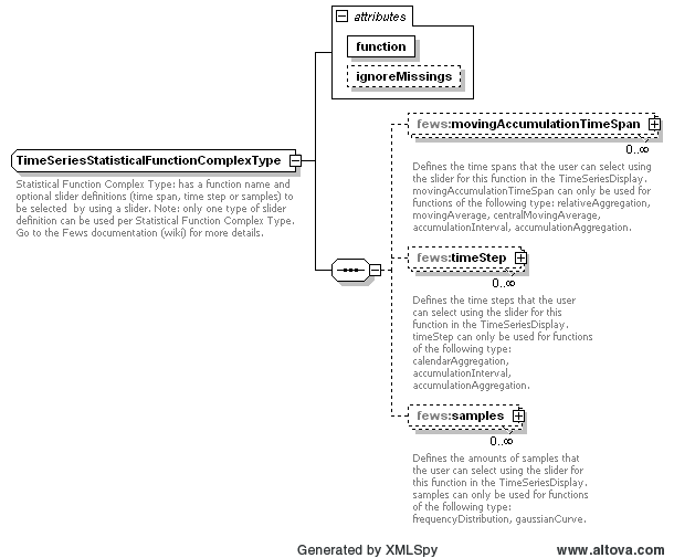
Some statistical functions require an additional accumulation time span, time step or samples which the user can select using a slider. As soon as the user selects a different value from the slider the calculation is launched with the new value.
The Statistical functions group defines dedicated graphing options shown in the combo box in the toolbar:
Accumulation aggregation (with associated time span or time step)
The accumulation interval sums the values for all time steps within the selected time window range. The time window range is defined by the associated time span or time step.
Attributes:
- function: accumulationAggregation
- movingAccumulationTimeSpan: Time spans that the user can select using the slider.
or - timeStep: Time steps that the user can select using the slider.
Accumulation interval (with associated time span or time step)
The accumulation interval function creates cumulative series for several intervals. For the first output time step in each interval the output value equals the input value for that time step. For a given other output time step the output value is equal to the sum of the input value for that time step and the previous output value. The intervals are defined by the selected time span or the selected time step. If a time span is selected, then the function uses the time span as the size for the intervals and the first interval starts at the start of the period that is visible in the time series display. If a time step is selected, then the function uses the selected time step to create intervals. Each period between two consecutive time steps in the selected time step is an interval.
Attributes:
- function: accumulationInterval
- movingAccumulationTimeSpan: Time spans that the user can select using the slider.
or - timeStep: Time steps that the user can select using the slider.
Boxplot
The data is graphically displayed by a box-and-whisker diagram. The following five-number summaries are displayed: the smallest observation (sample minimum), lower quartile (Q1), median (Q2), upper quartile (Q3), and largest observation (sample maximum). An additional dot is plotted to represent the mean of the data in addition to the median.
Attributes:
- function: boxPlot
Note: The displayed diagram is no longer a graph of unit time and therefore uses a different panel for displaying the graph. The associated table panel is currently not working for this type of graph and therefore the table toggle button will be disabled.
Calendar aggregation (with associated time step)
Creates an aggregation of a time series array according to the selected time step.
Attributes:
- function: calendarAggregation
- timeStep: Time steps that the user selects by using the slider.
Central moving average (with associated time span)
A central moving average calculates the mean value of the time window of which the current value is in the middle. It is the same as the moving average, but shifted to the past for half the time window.
Attributes:
- function: centralMovingAverage
- ignoreMissings: when true, missing values are ignored and each average will be calculated from the available values within the current time window.
When false, calculated values will be set to missing if one or more values within the current time window are missing. - movingAccumulationTimeSpan: Time spans that the user selects by using the slider.
The central moving average function only works for true equidistant data (i.e. no daysOfMonths etc.)
The difference between moving average and central moving average is that the central moving average uses values before and after the current value to calculate the average. Moving average only uses values in the past.
Cumulative
Creates a continuous accumulation over entire timeseries.
Attributes:
- function: cumulative
Differences
Shows the difference against a reference level or a series. If using a series, the oldest series (creation time) is taken as reference by default
Attributes:
- function: differences
Double Mass Curve
Plots two series on differnt axis to study consistency and trends
Attributes:
- function: doubleMassCurve
Duration exceedence
Sorts the values in a time series array and its flags in descending order.
Attributes:
- function: durationExceedence
- ignoreMissings: when true, missing values are ignored and each duration will be calculated from the available values within the current time window.
When false, missing values are added to the end of the sorted series.
Duration non-exceedence
Sorts the values in a time series array and its flags in ascending order.
Attributes:
- function: durationNonExceedence
- ignoreMissings: when true, missing values are ignored and each duration will be calculated from the available values within the current time window.
When false, missing values are added to the end of the sorted series.
Elevation
Show parameter values against the elevation of the location on one particular time. The time for which the values are shown can be altered with a slider bar
Attributes:
- function: elevation
Ensemble percentile exceedence
Plots for the selected time stamp(s) each member of an ensemble along the horzontal axis, sorted by value.
Attributes:
- function: ensemblePercentileExceedence
Frequency distribution (with associated samples)
The frequencies of the available values are counted and are plotted within a number of bins to create a frequency distribution. The number of bins can be selected using the slider. The data range that is covered by the bins can be changed as follows. Clicking the "Set boundaries" button brings up the "Set boundaries" dialog. In this dialog the lowest bin boundary and the highest bin boundary can be changed. The space between these two boundaries is divided regularly into the selected number of bins. Initially the boundaries are in automatic mode. In automatic mode for each time series the minimum data value and the maximum data value are used as boundaries. When the user selects new boundaries manually, then the new boundaries will be used instead, i.e. manual mode. In manual mode the boundaries are fixed and the same boundaries are used for all time series, until they are changed again. This makes comparisons between different time series possible. When the user clicks the "Automatic" button, then the boundaries will be in automatic mode again.
In manual mode the selected boundaries are remembered. This means that when the user closes and re-opens the time series display or starts working in another separate time series display, then in manual mode the previously selected boundaries will still be used for new frequency distributions. The mode will also be the same for all time series displays.
Attributes:
- function: frequencyDistribution
- samples: The number of bins that the user can select using the slider.
Gaussian curve (with associated samples)
The mean value and standard deviation are calculated for the timeseries from which the normal distribution function is calculated. The selected sample determines in how many samples the normal distribution function is divided into.
Attributes:
- function: gaussianCurve
- samples: Definition of samples sizes that the user selects by using the slider.
Note: The displayed diagram is no longer a graph of unit time and therefore uses a different panel for displaying the graph. The associated table panel is currently not working for this type of graph and therefore the table toggle button will be disabled.
Historical analysis
Allows comparison of the current situation with selected previous years at the same moment (seasonal selection) within the year.
Attributes:
- function: historicalAnalysis
- historicalPeriods: Definition of season as well as the moment when the display should look forward instead of backward to plot the coming season
| Code Block | ||||
|---|---|---|---|---|
| ||||
   <historicalPeriods>
    <historicalPeriod>
     <startForwardLookingPeriod>--04-01</startForwardLookingPeriod>
     <season startMonthDay="--04-01" endMonthDay="--10-01" label="zomer"/>
    </historicalPeriod>
</historicalPeriods> |
Historical scatter plot
Shows the scatter plot, allows subselection by season and year
Attributes:
- function: historicalScatterPlot
- season: Definition of seasons
| Code Block | ||||
|---|---|---|---|---|
| ||||
<statisticalFunction function="historicalShowPeaksAbove">
	<season startMonthDay="--01-01" endMonthDay="--12-31" label="Year" color="black"/>
	<season startMonthDay="--04-01" endMonthDay="--09-30" label="Grow Season" color="gray"/>
</statisticalFunction> |
Historical show lows below
Shows the lows below a entered value, allows subselection by year and season
Attributes:
- function: historicalShowLowsBelow
- season: Definition of seasons
Historical show peaks above
Shows the peaks above a entered value, allows subselection by year and season
Attributes:
- function: historicalShowPeaksAbove
- season: Definition of seasons
Moving average (with associated time span)
A moving average calculates the mean value of the all values within the selected time window.
Attributes:
- function: movingAverage
- ignoreMissings: when true, missing values are ignored and each average will be calculated from the available values within the current time window.
When false, calculated values will be set to missing if one or more values within the current time window are missing. - movingAccumulationTimeSpan: Time spans that the user selects by using the slider.
The moving average function only works for true equidistant data (i.e. no daysOfMonths etc.)
The difference between moving average and central moving average is that the central moving average uses values before and after the current value to calculate the average. Moving average only uses values in the past.
Normalized Flow
Function to convert flowrate (e.g. in m3/s) to volume/time/area (e.g. l/s/ha) using area function
Attributes:
- function: normalizedFlow
- label: caption used in function selection
- ignoreMissings: when true, missing values are ignored and each average will be calculated from the available values within the current time window.
When false, calculated values will be set to missing if one or more values within the current time window are missing. - areaFunction: attribute aware function to transfer input parameter series
- parameterId: parameter used for unit in display
- allowedInputParameterId: series to be converted using area function
| Code Block | ||||
|---|---|---|---|---|
| ||||
<statisticalFunction function="normalizedFlow" label="Flow (mm/day)" ignoreMissings="true">
  <areaFunction>@AREA_HA@*10/86400</areaFunction>
  <parameterId>Q.mmd</parameterId>
  <allowedInputParameterId>Q.obs</allowedInputParameterId>
</statisticalFunction> |
Principle Component Analysis
The Principal Component Analysis function uses independent historical data (observations) and dependent data (e.g. a simulated basin value) to compute a number of regression equations using the Principal Component Analysis technique. The resulting equation is applied with current observations to estimate the current basin value.
Attributes:
- function: principalcomponentanalysis
- observedParameterId: parameter referencing the independent (observed) series
- simulatedParameterId: parameter referencing the dependent (simulated) series
- dateFormat: optional
| Code Block | ||
|---|---|---|
| ||
<statisticalFunction function="principalcomponentanalysis">
   <observedParameterId>SWE.m</observedParameterId>
   <simulatedParameterId>SWE.sim</simulatedParameterId>
   <dateFormat>MM-dd-yyyy</dateFormat>
</statisticalFunction> |
Principal Component Analysis Jack Knife
Same as principal component analysis, using the Jack Knife technique
Attributes:
- function: principalcomponentanalysisJackKnife
- observedParameterId: parameter referencing the independent (observed) series
- simulatedParameterId: parameter referencing the dependent (simulated) series
- dateFormat: optional
Relative aggregation (with associated time span)
Creates an aggregation of a time series array. A relative time step is calculated by the selected time span and the start time of the period from the time series array.
Attributes:
- function: relativeAggregation
- movingAccumulationTimeSpan: Time spans that the user selects by using the slider.
Scatter plot
Creates a scatter plot of two selected series
Attributes:
- function: scatterPlot
Show lows below value
A scatterplot is made where the x-axis shows the duration of a 'low' (=values within this low-area are all beneath the given reference level), the y-axis shows the normalized difference between the parameter value and the reference level. The reference level can be altered by entering a value into the input field associated with this statistical function. After clicking 'Apply' the result time series array is returned.
If no reference level is entered, then the 'low' areas are determined according to the maximum available value of the input time series array.
Attributes:
- function: showLowsBelow
See "show peaks above" for label and season functionality
...
The following marker options can be used to display forecast confidence time spans in the time series display. Up to three forecast confidence time spans can be defined for each sub plot in the displayGroups configuration file.
- forecastConfidence1
- forecastConfidence2
- forecastConfidence3
Within longitudinal profile displays, the markers can be set to display the minimum or maximum values. A variety of river bed levels can be included in a display if these are specified in the branches.xml file.
for longitudinal profile:
- riverBedLevel
- leftBankLevel
- leftFloodPlainLevel
- leftMainChannelLevel
- longitudinalProfileMaximum
- longitudinalProfileMinimum
- rightBankLevel
- rightFloodPlainLevel
- rightMainChannelLevel
To visualize model layer elevations when drawing a cross section in a spatial plot, one should use:
- bottomLayerLevel
- topLayerLevel
This applies only for parameters with unit in meters
It is possible to display vertical lines in the slider bar in the spatial display that mark the start and/or end times of the displayed grid time series. These markers will only be visible when more than one grid is displayed, i.e. multiple data layers in one grid plot. In that case the start and/or end times can be different for each grid time series. These markers are configurable using the following marker options in the time markers display configuration:
- startTime
- endTime
Figure 14 Elements in the TimeMarkersDisplay section of the TimeSeriesDisplay configuration
timeMarkerDisplayOptions
Root element of a definition time markers (multiple entries may exist).
Attributes;
- marker enumeration of the possible markers (see list above).
color
Colour of the time series marker line (see enumeration of colours in appendix A).
lineStyle
Line style of time series marker line. Enumeration of "solid", "none", "bar", "dashdot", "dashed", "dotted", "solid;thick", "dashdot;thick", "dashed;thick"; "dotted;thick"; "area"; "constant".
The "constant" label should preferably only be applied if the time series holds only one value.
label
Define the name of time series marker line.
tableBackgroundColors
Since 2014.01 it is possible to have a time dependent background color in the table, for example to visualise the different night and day hours. This is possible per weekday.
...
<tableBackgroundColors>
  <timeZone>PST</timeZone>
  <background startTime="07:00:00" endTime="23:00:00" dayOfWeek="Sunday" color="gray80"/>
  <background startTime="07:00:00" endTime="23:00:00" dayOfWeek="Monday" color="gray80"/>
  ...
  <background startTime="07:00:00" endTime="23:00:00" dayOfWeek="Saturday" color="gray80"/>
</tableBackgroundColors>
Parameters display configuration
In this section of the time series display, default attributes of lines plotted for parameters can be allocated. These defaults will be used when plotting lines for these parameters in the time series displays and in the reports. Note that for allocation of the colour only the preferred colour can be identified. When the line is plotted this colour will be used only if there is no other line with the same colour. If this is the case then the next colour in the colour palette will be used.
Figure showing the options in the ParameterDisplayConfig section of the TimeSeriesDisplay configuration
Default Options
The Default Options can be configured (and has the same sequence as the single parameter display options) to be set as default appearance. This default is overruled by an individual ParameterDisplay Configuration for a parameter.
Figure showing the options in the Default Options section of the TimeSeriesDisplay configuration
The sequence is identical to the parameterDisplayOptions Configuration, see below
ParameterDisplayOptions
Figure 15 Elements in the ParameterDisplayOptions section of the TimeSeriesDisplay configuration
PreferredColor
The preferred colour for the line and markers. This colour will only be used if it is not yet available in the current graph. If it is, then the next colour in the template order will be selected.
...
Line style of timeseries. Enumeration "solid", "none", "solid;thick", "bar", "dashed", "dashed;thick", "dotted", "dotted;thick", "dashdot", "dashdot;thick", "area", "constant", "verticalLine"
Line style "constant" applies to the scalar timeseries with only one value.
For this value a value marker (horizonal line) is created in the plot.
If the timeseries has more values, line style "constant" is ignored and the values are drawn with the line style "solid"
Line style "verticalLine" applies to scalar timeseries where the value will be ignored and a vertical line will be drawn at the time step in the plot with the comment written along with it if present. These vertical lines will be shown in all selected plots, there will not be a separate plot created for the "verticalLine" time series.
markerStyle
Marker style for markers plotted on the vertices of the line. Enumeration of "none", "+", "x", "circle", "square", "rectangle", "diamond", "triangleup" , "triangledown".
Directional arrow markers
Since 2017.02, arrow markers can be plotted, where the direction of the arrow depends on a direction time series. This, for example, allows you to configure a wind speed parameter to include arrow markers signifying the wind direction when available. These arrow markers are currently supported in both the data display, as well as the report module. For the time series display FEWS will automatically search for the rotation time series, this does not have to be included in the display group or data viewer selection. For the report module, the configured chart does have to include both time series to ensure that the rotation data is available.
markerRotationParameterId
The parameter id of the parameter to be used to determine the marker orientation. The given parameter should be a rotation in degrees (0 - 360, clockwise where 0 is north), for example wind direction. The markers drawn on the graph will be arrows (or the configured markerIcon) rotated by the number of degrees given by the marker rotation time series. Note that the time series set with all elements except parameterId (locationId, timeStep etc.) identical to the plotted parameter is used. If no rotation time series can be found, or it contains a missing value for a certain time, no marker is drawn.
markerIcon
Optional element to configure a custom arrow icon. If configured the icon will be used as a marker on the graph. If no custom icon is configured, FEWS will use a default arrow, which is automatically given the same color as the time series on which the markers are drawn.
markerRotationOffset
Optional element (default 0). The configured offset (in degrees) is added to the rotation (as given by the markerRotationParameter) for each marker. Note that for the default arrow icon (when no markerIcon is given), a rotation of 0 degrees (and an offset of 0) corresponds to the arrow pointing up. For displaying wind direction, configure a markerRotationOffset of 180.
Example
The example config below can be used to produce a graph with custom direction icons (displayed on the left in the image above). Removing the <markerIcon> element will result in the default arrow icons being used (displayed on the right in the image above).
| Code Block | ||
|---|---|---|
| ||
		<parameterDisplayOptions id="WindSpeed">
			<preferredColor>purple</preferredColor>
			<lineStyle>solid</lineStyle>
			<markerRotationParameterId>WindDirection</markerRotationParameterId>
			<markerIcon>arrow_icon.png</markerIcon>
			<markerRotationOffset>180</markerRotationOffset>
</parameterDisplayOptions> |
...
Size of the marker in points
Precision
Decimal precision with which values are given in the table. Also used when displaying the tool tip value and tick corresponding to the selected value in the time series chart. Not used for other ticks in time series chart.
min
Minimum of the y-scale to be used as a default for all displays of this parameter. The minimum is used, unless a value in the time series is lower than this minimum, in which case that is used. The minimum defined here can also be overruled in individual template definition in the DisplayGroups (see below).
max
Maximum of the y-scale to be used as a default for all displays of this parameter. This maximum is used, unless a value in the time series is higher than this maximum, in which case that is used. The maximum defined here can also be overruled in individual template definition in the DisplayGroups (see below).
step
Controls whether the time series is drawn as a step function in graphs. Note that for step functions, drawing markers is not supported.
maxTimeSpan
Optional field, only intended to be used for viewing non-equidistant series. Specifying this value will prevent the drawing of line segments in the TimeSeriesDisplay between adjacent time/value points for which the time difference exceeds the specified maximum time span.
tableHeaderBackgroundColor
Optional field to give the table header for a parameter a specific background color.
Module instance mapping
The module instance mapping allows user defined strings to be defined which will display the moduleInstanceID in the legends of the time series display. This can help shorten legends, or add additional information.
Figure 16 Elements in the Log Panel section of the Explorer configuration
moduleInstanceMapping
Root element for each mapping to be defined.
Attributes;
- id ModuleInstanceId to be replaced
description
String to replace the module instance id in the legends
Statistical functionality
Time series statistical functions are statistical functions that use one equidistant, scalar time series to produce another one using a statistical function. When defined, a list of statistical functions will be displayed in the Time Series Display. If the user selects a function then for each (equidistant, scalar) time series in the display another one is generated and displayed with the calculated results. Calculated time series are displayed in the same graph as the time series they are based on.
Some statistical functions require an additional accumulation time span, time step or samples which the user can select using a slider. As soon as the user selects a different value from the slider the calculation is launched with the new value.
The Statistical functions group defines dedicated graphing options shown in the combo box in the toolbar:
Calendar aggregation (with associated time step)
Creates an aggregation of a time series array according to the selected time step.
Attributes:
- function: calendarAggregation
- timeStep: Time steps that the user selects by using the slider.
Relative aggregation (with associated time span)
Creates an aggregation of a time series array. A relative time step is calculated by the selected time span and the start time of the period from the time series array.
Attributes:
- function: relativeAggregation
- movingAccumulationTimeSpan: Time spans that the user selects by using the slider.
Duration exceedence
Sorts the values in a time series array and its flags in descending order.
Attributes:
- function: durationExceedence
- ignoreMissings: when true, missing values are ignored and each duration will be calculated from the available values within the current time window.
When false, missing values are added to the end of the sorted series.
Duration non-exceedence
Sorts the values in a time series array and its flags in ascending order.
Attributes:
- function: durationNonExceedence
- ignoreMissings: when true, missing values are ignored and each duration will be calculated from the available values within the current time window.
When false, missing values are added to the end of the sorted series.
Moving average (with associated time span)
A moving average calculates the mean value of the all values within the selected time window.
Attributes:
- function: movingAverage
- ignoreMissings: when true, missing values are ignored and each average will be calculated from the available values within the current time window.
When false, calculated values will be set to missing if one or more values within the current time window are missing. - movingAccumulationTimeSpan: Time spans that the user selects by using the slider.
The moving average function only works for true equidistant data (i.e. no daysOfMonths etc.)
The difference between moving average and central moving average is that the central moving average uses values before and after the current value to calculate the average. Moving average only uses values in the past.
Central moving average (with associated time span)
A central moving average calculates the mean value of the time window of which the current value is in the middle. It is the same as the moving average, but shifted to the past for half the time window.
Attributes:
- function: centralMovingAverage
- ignoreMissings: when true, missing values are ignored and each average will be calculated from the available values within the current time window.
When false, calculated values will be set to missing if one or more values within the current time window are missing. - movingAccumulationTimeSpan: Time spans that the user selects by using the slider.
The central moving average function only works for true equidistant data (i.e. no daysOfMonths etc.)
The difference between moving average and central moving average is that the central moving average uses values before and after the current value to calculate the average. Moving average only uses values in the past.
Accumulation interval (with associated time span or time step)
The accumulation interval function creates cumulative series for several intervals. For the first output time step in each interval the output value equals the input value for that time step. For a given other output time step the output value is equal to the sum of the input value for that time step and the previous output value. The intervals are defined by the selected time span or the selected time step. If a time span is selected, then the function uses the time span as the size for the intervals and the first interval starts at the start of the period that is visible in the time series display. If a time step is selected, then the function uses the selected time step to create intervals. Each period between two consecutive time steps in the selected time step is an interval.
Attributes:
- function: accumulationInterval
- movingAccumulationTimeSpan: Time spans that the user can select using the slider.
or - timeStep: Time steps that the user can select using the slider.
Accumulation aggregation (with associated time span or time step)
The accumulation interval sums the values for all time steps within the selected time window range. The time window range is defined by the associated time span or time step.
Attributes:
- function: accumulationAggregation
- movingAccumulationTimeSpan: Time spans that the user can select using the slider.
or - timeStep: Time steps that the user can select using the slider.
Frequency distribution (with associated samples)
The frequencies of the available values are counted and are plotted within a number of bins to create a frequency distribution. The number of bins can be selected using the slider. The data range that is covered by the bins can be changed as follows. Clicking the "Set boundaries" button brings up the "Set boundaries" dialog. In this dialog the lowest bin boundary and the highest bin boundary can be changed. The space between these two boundaries is divided regularly into the selected number of bins. Initially the boundaries are in automatic mode. In automatic mode for each time series the minimum data value and the maximum data value are used as boundaries. When the user selects new boundaries manually, then the new boundaries will be used instead, i.e. manual mode. In manual mode the boundaries are fixed and the same boundaries are used for all time series, until they are changed again. This makes comparisons between different time series possible. When the user clicks the "Automatic" button, then the boundaries will be in automatic mode again.
In manual mode the selected boundaries are remembered. This means that when the user closes and re-opens the time series display or starts working in another separate time series display, then in manual mode the previously selected boundaries will still be used for new frequency distributions. The mode will also be the same for all time series displays.
Attributes:
- function: frequencyDistribution
- samples: The number of bins that the user can select using the slider.
Gaussian curve (with associated samples)
The mean value and standard deviation are calculated for the timeseries from which the normal distribution function is calculated. The selected sample determines in how many samples the normal distribution function is divided into.
Attributes:
- function: gaussianCurve
- samples: Definition of samples sizes that the user selects by using the slider.
...
.
Show peaks above value
A scatterplot is made where the x-axis shows the duration of a 'peak' (=values within this peak-area are all above the given reference level), the y-axis shows the normalized difference between the parameter value and the reference level. The reference level can be altered by entering a value into the input field associated with this statistical function. After clicking 'Apply' the result time series array is returned.
If no reference level is entered, then the 'peak' areas are determined according to the minimum available value of the input time series array.
...
- function: showPeaksAbove
- label: label used in the combobox to select a statistical function (since 2015.01).
Subelements:
- season (since 2015.01): one ore more color seasons can be configured with a color that will be used to display a point if the time of the show peaks above plot point is in that period. Periods should NOT be overlapping.
| Code Block | ||||
|---|---|---|---|---|
| ||||
<statisticalFunction function="showPeaksAbove" label="Seasonal Show Peaks Above"> <season startMonthDay="--01-01" endMonthDay="--03-31" label="January,February,March" color="orange"/> <season startMonthDay="---03-3104-01" endMonthDay="--06-30" label="April, May, June" color="green"/> <season startMonthDay="--07-01" endMonthDay="--09-30" label="JanuaryJuly,February August,March September" color="orangeyellow"/> <season startMonthDay="--0410-01" endMonthDay="--0612-3031" label="AprilOctober, MayNovember, JuneDecember" color="greenred"/> <season startMonthDay="--07-01" endMonthDay="--09-30" label="July, August, September" color="yellow"/> <season startMonthDay="--10-01" endMonthDay="--12-31" label="October, November, December" color="red"/> </statisticalFunction> |
Show lows below value
A scatterplot is made where the x-axis shows the duration of a 'low' (=values within this low-area are all beneath the given reference level), the y-axis shows the normalized difference between the parameter value and the reference level. The reference level can be altered by entering a value into the input field associated with this statistical function. After clicking 'Apply' the result time series array is returned.
If no reference level is entered, then the 'low' areas are determined according to the maximum available value of the input time series array.
Attributes:
- function: showLowsBelow
See "show peaks above" for label and season functionality.
Scatterplot
The data is displayed as a collection of points, each having the value of the timeseries determining the position on the horizontal axis and the value of the other timeseries (one or more) determining the position on the vertical axis.
The timeseries used for the horizontal- and vertical axis can be changed by the user by using the 'Series selection' dialog, which is opened by clicking on the 'Edit' button. Note: The displayed diagram is no longer a graph of unit time and therefore uses a different panel for displaying the graph. The associated table panel is currently not working for this type of graph and therefore the table toggle button will be disabled.
Attributes:
function: scatterPlot
See "show peaks above" for label and season functionality.
Boxplot
The data is graphically displayed by a box-and-whisker diagram. The following five-number summaries are displayed: the smallest observation (sample minimum), lower quartile (Q1), median (Q2), upper quartile (Q3), and largest observation (sample maximum). An additional dot is plotted to represent the mean of the data in addition to the median.
Attributes:
- function: boxPlot
Note: The displayed diagram is no longer a graph of unit time and therefore uses a different panel for displaying the graph. The associated table panel is currently not working for this type of graph and therefore the table toggle button will be disabled.
Schemas for the slider
movingAccumulationTimeSpan
Defines the time spans that the user can select using the slider for this function in the TimeSeriesDisplay. MovingAccumulationTimeSpan can only be used for functions of the following type: relativeAggregation, movingAverage, centralMovingAverage, accumulationInterval, accumulationAggregation.

timeStep
Defines the time steps that the user can select using the slider for this function in the TimeSeriesDisplay. TimeStep can only be used for functions of the following type: calendarAggregation, accumulationInterval, accumulationAggregation.

samples
Defines the amounts of samples that the user can select using the slider for this function in the TimeSeriesDisplay. Samples can only be used for functions of the following type: frequencyDistribution, gaussianCurve.

quickViewStatisticalFunction
</statisticalFunction> |
Scatterplot
The data is displayed as a collection of points, each having the value of the timeseries determining the position on the horizontal axis and the value of the other timeseries (one or more) determining the position on the vertical axis.
The timeseries used for the horizontal- and vertical axis can be changed by the user by using the 'Series selection' dialog, which is opened by clicking on the 'Edit' button. Note: The displayed diagram is no longer a graph of unit time and therefore uses a different panel for displaying the graph. The associated table panel is currently not working for this type of graph and therefore the table toggle button will be disabled.
Attributes:
function: scatterPlot
See "show peaks above" for label and season functionality.
Schemas for the slider
movingAccumulationTimeSpan
Defines the time spans that the user can select using the slider for this function in the TimeSeriesDisplay. MovingAccumulationTimeSpan can only be used for functions of the following type: relativeAggregation, movingAverage, centralMovingAverage, accumulationInterval, accumulationAggregation.
timeStep
Defines the time steps that the user can select using the slider for this function in the TimeSeriesDisplay. TimeStep can only be used for functions of the following type: calendarAggregation, accumulationInterval, accumulationAggregation.
samples
Defines the amounts of samples that the user can select using the slider for this function in the TimeSeriesDisplay. Samples can only be used for functions of the following type: frequencyDistribution, gaussianCurve.
quickViewStatisticalFunction
Through the quickViewStatisticalFunction you can define a shortcut key (with optional icon) at the toolbar to a statistical function.
LongTermPeriodic
This function adds periodic time series based on the long term scroller (see highlighted in red).
This can be used to compare values of time series compared to what is “normal” on that date of different years.
Multiple different statistic types can be configured within this function, for each type a time series is added.
The statistics wil be calculated based on all values on the same day of the years, for all years included in the whole period of the long term scroller.
For this the long term scroller should be visible.
This is especially designed for time series with a daily time step.
| Code Block | ||||
|---|---|---|---|---|
| ||||
<statisticalFunction function="longTermPeriodic" label="Long Term Periodic" ignoreMissings="true">
	<statisticType type="MIN" label="Minimum"/>
	<statisticType type="MAX" label="Maximum"/>
	<statisticType type="PERCENTILEEXCEEDENCE" value="50" label="50 percentiel"/>
</statisticalFunction> |

combinedTimeSeriesStatisticalFunctions
This option add a new timeseries to a plot which is the result of a statistical operation based the available timeseries in that plot. It will be filtered per parameter. E.g. if you have 4 waterlevel timeseries of 4 different gauges and you select the MAX statisticType, a new timeseries with the maximum value (per timestep) of those 4 gauges will be plotted.
| Code Block | ||||
|---|---|---|---|---|
| ||||
	<combinedTimeSeriesStatisticalFunctions>
		<combinedTimeSeriesStatisticalFunction>
			<statisticType>MAX</statisticType>
		</combinedTimeSeriesStatisticalFunction>
		<combinedTimeSeriesStatisticalFunction>
			<statisticType>WEIGHTED_AVERAGE</statisticType>
			<weightAttributeId>AREA</weightAttributeId>
		</combinedTimeSeriesStatisticalFunction>
		<combinedTimeSeriesStatisticalFunction>
			<statisticType>SUM</statisticType>
		</combinedTimeSeriesStatisticalFunction>
</combinedTimeSeriesStatisticalFunctions> |
When this is configured a dropdown button will appear on the left of the statistic functions.
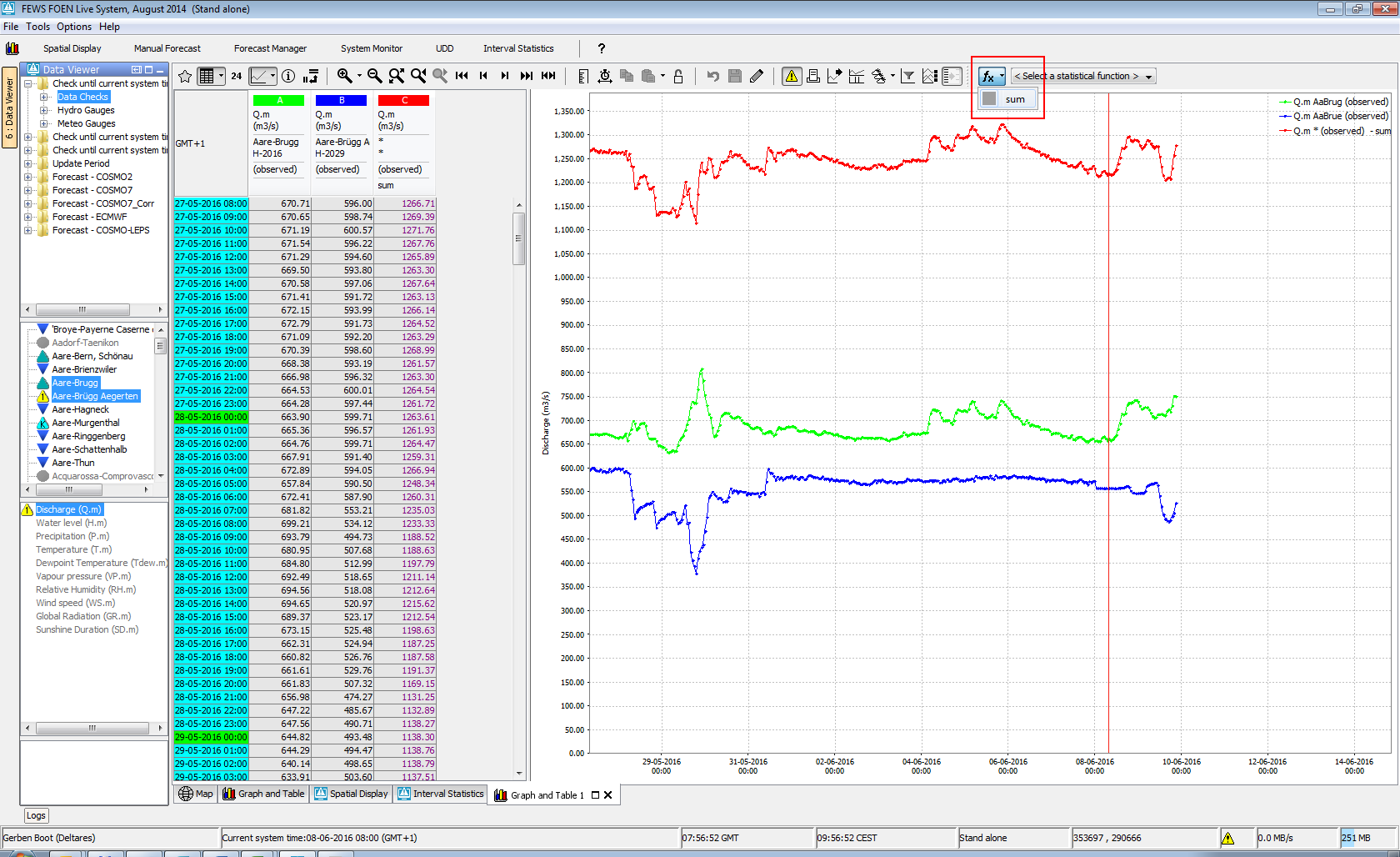
In the screenshot below the red time series has been added which is the sum of the green and blue time series:
 Through the quickViewStatisticalFunction you can define a shortcut key (with optional icon) at the toolbar to a statistical function.
Descriptive Function Group
...
- count: total number of populated records
- missings: total number of missings
- completed: number of records flagged as completed (gap filling)
- corrected: number of records flagged as corrected
- reliables: number of records flagged reliable
- unreliables: number of records flagged unreliable
- doubtfuls: number of records flagged doubtful
- startTime
- endTime
- timeLength: the total length of the time series, for example "1 day 3 hours".
Descriptive statistical functions
...
- info: Name of the time series
- start_time Start time of the time series in the view period
- end_time: End time of the time series in the view period
Grouping functions: - count: Number of time steps in the view period
- missings: Number of missing values in the view period
- doubtfuls: Number of doubtful values in the view period
- reliables: Number of reliable values in the view period
- unreliables: Number of unreliable values in the view period
Statistical functions: - mean: Mean value in the view period
- min: Lowest value in the view period
- max: Highest value in the view period
- movingAccumulationMax: the maximum of the moving accumulation for a given time span (requires one or more <timeSpan> elements inside of the <descriptiveFunction> element)
- percentile: Percentile in the view period for a given percentage (requires one or more value elements to define percentages; see below)
- standard_deviation: Standard deviation in the view period
- sum: Sum of the values in the view period
• ignoreMissings: when true, missing values are ignored and each function will be calculated from the available values within the current time window.
When false, calculated values will be set to missing if one or more values within the current time window are missing.
...
Buttons in the TimeSeries Dialog can individually be set to be shown or hidden with use of the buttonsSettings element. More information on which sub-element controls which button can be found on the Button Visibility Settings subpage.
thresholdDisplayConfig
The thresholdDisplayConfig The thresholdDisplayConfig element allows more detailed configuration of threshold colours and location in the timeseries display. The example below shows the different attributes and elements of the thresholdDisplayConfig the thresholdDisplayConfig. For each threshold a thresholdDisplayOptions element is added containing the following elements.
- id: this is the Threshold ID as used in the Thresholds.xml file
- visible: set to true to indicate the threshold must be visible in the graph
- color: select the correct color of the threshold line
- backgroundOpaquenessPercentage: set the opaqueness percentage of the threshold background, filled area below between the threshold value values in the graph
- labelIncludesValue: set to true to add the threshold value in the threshold labellabelAlignment: select right or left to align the threshold label in the graphto true to add the threshold value in the threshold label
- labelAlignment: select right or left to align the threshold label in the graph
In addition to the above options per threshold, an extra noThresholdDisplayOptions can be added to configure a color and opaqueness for the area of the chart that is outside the range of any threshold, for example when the thresholds are displayed as filled areas in yellow/orange/red colors, you may want to show the area below any threshold to be filled with a green color.

Display Group hide all tool windows
...
| Code Block | ||||
|---|---|---|---|---|
| ||||
<resampling> <timeStep label="minute" unit="minute"/> <timeStep label="5 minutes" unit="minute" multiplier="5"/> <timeStep label="10 minutes" unit="minute" multiplier="10"/> <timeStep label="15 minutes" unit="minute" multiplier="15"/> <timeStep label="30 minutes" unit="minute" multiplier="30"/> <timeStep label="hour" unit="hour"/> <timeStep label="2 hour" unit="hour" multiplier="2"/> <timeStep label="3 hour" unit="hour" multiplier="3"/> <timeStep label="6 hour" unit="hour" multiplier="6"/> <timeStep label="12 hour" unit="hour" multiplier="312"/> <timeStep label="day"6 hour" unit="hour" multiplier="6unit="day"/> <timeStep label="week" unit="week"/> <timeStep label="12 hourmonth" unit="hour" multiplier="12month"/> <timeStep label="year" unit="day" unit="day"/> <timeStep label="week" unit="week"year"/> </resampling> |
Info Attributes
In order to show attribute values for locations of time series in the time series dialog <infoAttrribute> elements can be configured:
| Code Block | ||||
|---|---|---|---|---|
| ||||
</resampling> <infoAttribute id="MAAIVELD"/> <timeStep<infoAttribute labelid="month" unit="monthPEILBESLUIT"/> <timeStep<infoAttribute labelid="year" unit="yearGERELATEERD"/> </resampling> |
<documentViewer> |
They will then appear in the Attributes table of the time series information panel:

This needs to be configured in order to prevent to many attributes to be shown.
...