...
Attribute: id
Elements:
- description
- legendFontSize: Font size of legend
- axis TitleFontSize: Title font size
- tickLableFontSize: tick label font size
- tickTimeStep: to tie ticks to a time step (since 2018.02)
- synchronizeParameterAxis: synchronize the axis range of subplots displaying time series for the same parameter group (since 2018.02)
- visibilityGroup: defines order of the visibility groups in the drop down box (since 2019.02)
- subplot: see below for details
- plotViewerId & tableViewerId: to use alternative viewers for plot or tables
...
Attributes: name and id
Elements:
- description: Optional description
- nodeId
- viewPermission
- editPermission
- locationLoop
- types of display
- display: see below for details
- singleLocationDisplays Single location displays can be used to easily create plots for individual locations. This can either be done for individual locations, or alternatively for a locationSet which will then produce a list of location with their corresponding plot.
- singleParentLocationDisplays
- displayGroup: see below for details
- Adds multiple displays at once, each showing the children and parent for one parent location.
- displayGroupId (since 2023.01) include a displayGroup defined elsewhere by referencing the id. displayGroupId
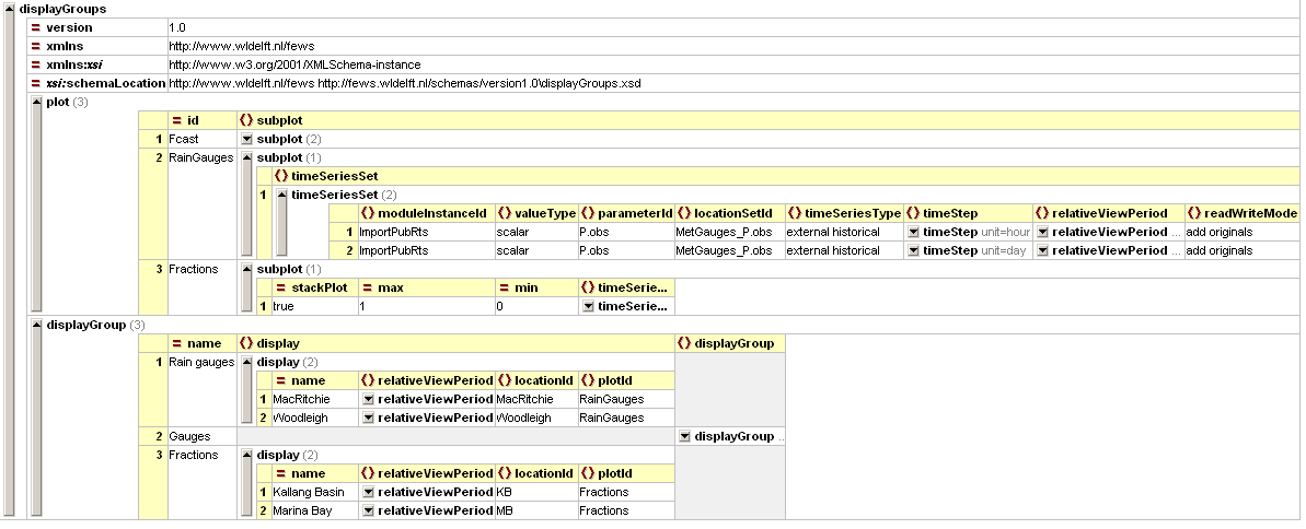

Figure 3 - example of a configured displayGroup file (click to enlarge)
Figure 4 Root element of the display groups definition
...
| Info |
|---|
Display groups may be defined while DELFT-FEWS is running and reloaded by re-opening the time series dialogue. |
| Anchor | ||||
|---|---|---|---|---|
|
Element of plot. Root element for each subplot. Multiple sub-plots may be defined per plot.
...
- min (max is not implemented): set default minimum value for y-axis, which will be overruled by data that is below this value
- yAxisScalingType (since 2020.02): Default is scaleOutsideMinAndMax. If it is set to scaleOutsideMinAndMax, the y axis will scale to the data available. If it is set to fixedBetweenMinAndMax, the min and max of the y axis will always be the configured values, regardless of the data. This could make the entire data set fall of the visible chart. If all the data is in the middle of min and max withing a small range, the axis will scale to the data, it will appear as a small line in the middle. If it is set to scaleBetweenMinAndMax, the min will never be smaller than what is configured, and the max will never be greater than configured, but if the available data falls between these values, the axis will scale so that the data fills the whole area. If the data falls entirely outside of min and max, it will not be visible.
- convertDatum
stackPlot - deprecated since 2014.02
Elements :
- descriptionsubPlotType
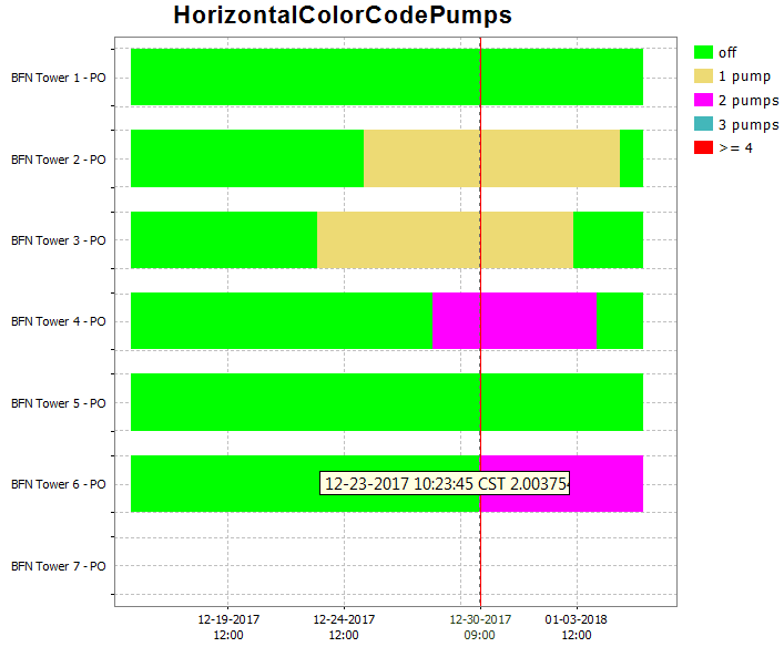
- subPlotType: stack, colorMapBars, horizontalColorCode
- axisLable, axisScaleUnit, lowerMarginPercentage, upperMarginPercentage
- leftAxis, rightAxis
- barMarginPercentage (Since 2018.02) Percentage of the bar width by which it will be reduced, to create space between the bars.
General option to be applied to all plots containing bars (e.g. "horizontalColorCode" or bar charts). Overrules the general barMarginPercentage for a specific subplot.
Default value is the barMarginPercentage of the TimeSeriesDisplayConfig.xml (which defaults to 0). - inverted
- logarithmic
- drawingOrderInverted
- splitForDifferentRuns
- plotweight
- plotSeparatorWeight
- thresholdAxis
- thresholdAxisScaling
- forecastConfidenceTimeSpanline, with dual axis plot
- sub plot types
- line
- area Fills the area between multiple time series.
- clusteredBars
- variableLineWidth
- classBreaksId, classBreaks
- direction
- line elements
- color: Overides colors specified in the timeseriesdiplay
- lineStyle: Line style of time series marker line. Enumeration of "solid", "none", "bar", "dashdot", "dashed", "dotted". When a suffix of ";thick" is given, 1 will be added to the linewidth found in the TimeSeriesDisplayConfig.xml. For example, if a linewidth of 2 is configured in the TimeSeriesDisplayConfig and for a subplot the linestyle is set to "solid;thick", the resulting linewidth will be 2 + 1 = 3.
- markerStyle, markerText, markerSize
- axis for dual axis plots
- ratingAxis, lookupAxis, datumAxis
- visibleInLegend
- label
- visibleInTable, visibleInPlot
- descriptiveFunction, with value and timeSpan
- timeSeriesSet, with
- additionalTimeSeries
subPlotType
...
A horizontal bar is plotted for each time series. The color of the bars signify the value for that time series at the given time on the x-axis.
|
|
leftAxis and rightAxis
| Info |
|---|
2022.02 and later |
Use elements leftAxis and rightAxis to confiure the axes separately.If the rightAxis is configured, the leftAxis must be configured too.
An example :
If the optional attributes min and max are not configured, then subplot attributes min and max are used.
An example :
| Code Block | ||||||||
|---|---|---|---|---|---|---|---|---|
| ||||||||
| Code Block | ||||||||
| ||||||||
<subplot>
       <leftAxis min="-10" max="100"/>
		<axisLabel>Label left axis</axisLabel>
   		<lowerMarginPercentage>10</lowerMarginPercentage>
   		<upperMarginPercentage>20</upperMarginPercentage>
	</leftAxis>

    <rightAxis min="20" max="50"/>
		<axisLabel>Label right axis</axisLabel>
   		<lowerMarginPercentage>5</lowerMarginPercentage>
   		<upperMarginPercentage>5</upperMarginPercentage>
	</rightAxis>
..... |
If the optional attributes min and max are not configured, then subplot attributes min and max are used.
inverted
This tag can be used to invert the y-axis of a plot. Below a screenshot of an inverted graph. In the example the timeseries with parameter RAIM is inverted.
...
Available since 2020.02. If it is set to true, the subplot y-axis (or domain axis) will be logarithmic. A parameter can also be configured to always/never be displayed on a logarithmic scale, but the subplot setting has precedence. If a parameter is set logarithmic true, but the subplot it appears in is configured logarithmic-false, the axis will not be logarithmic. It is also possible to configure a mixture of logarithmic and non-logarithmic subplots in the same plot: .
.
Logarithmic axis can also be turned on and off manually, using the menu bar. If you do so, the setting will effect all subplots the same way. Should you wish to reset the subplots to the configured version, use the reset domain axis to configured button.
|
|

...
|

drawingOrderInverted
This option can be used to invert drawing order of the lines. By default the lines are drawn in the same order as shown in the legend : the first line first, the last line last. The last line is then on top. If drawing order is inverted the last line in the legend is drawn first and the first line last. The first line is then on top.
...
| Code Block | ||||||||
|---|---|---|---|---|---|---|---|---|
| ||||||||
<plot id="Test">
   <subplot>
      <line>
         <color>dark orange</color>
         <visibleInLegend>false</visibleInLegend>
         <visibleInTable>false</visibleInTable>
		 <visibleInPlot>true</visibleInPlot>
         <timeSeriesSet>
         <moduleInstanceId>Import</moduleInstanceId>
         <valueType>scalar</valueType>
         <parameterId>H.m</parameterId>
         <locationId>LocA</locationId>
         <timeSeriesType>external historical</timeSeriesType>
         <timeStep unit="hour"/>
         <relativeViewPeriod unit="hour" start="-12" end="12"/>
         <readWriteMode>editing visible to all future task runs</readWriteMode>
      </timeSeriesSet>
   </line>
   </subplot>
</plot> |
axis (dual y-axis plot)
It is possible to have two y-axis visible in the same plot. This can be done by having multiple timeseries where some are assigned to the left y axis and some to the right y axis, or by having a timeseries on the left y axis with an associated rating curve on the right y axis. So every timeseries plot (also in reports) will have a mandatory left y axis to which a timeseries is associated and an optional right y axis to which a timeseries or rating curve is associated.
The display of threshold lines are supported for one y axis. But there can be threshold lines for either the left or the right y axis, but not both.
Multiple TimeSeries plots (dual y-axis plot)
To associate a timeseries to the left or right y axis use the <axis> element. This element is optional and leaving it out will associate it (default) to the left axis. Please note that at least one timeseries should be on the left axis (by either settings <axis>left</axis> or leaving the element out and using the default).
Below are two examples of a config and the resulting plot.
area
Attributes available when creating an area type display:
- color: Overides other predefined colours
- opaquenessPercentage: Opaqueness expressed as a percentage
- IncludesZeros: When true the zero is always included in the painted extent
filled vertical lines (area)
Use the <area> element in combination with a <lineStyle> to obtain vertical lines.
|
|
clusteredBars
This option makes it possible to cluster bars per timestep. The config example below shows how clustered bars are displayed and configured:
| |||||||||||
| Code Block | |||||||||||
|---|---|---|---|---|---|---|---|---|---|---|---|
| |||||||||||
| |||||||||||
| |||||||||||
|
| ||||||||||
| Code Block | |||||||||||
| |||||||||||
| |||||||||||
| |||||||||||
| |||||||||||
| |||||||||||
| |||||||||||
| |||||||||||
| |||||||||||
| |||||||||||
| |||||||||||
|
|


...
|
|
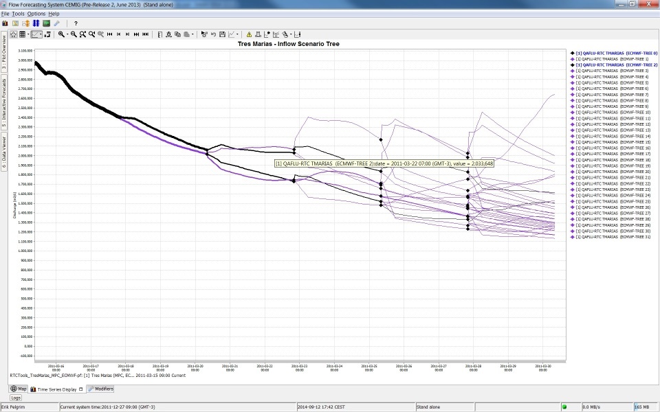
variableLineWidth
Type of plot that can use variable line width's for different graphs. See screenshot below of plot for different ensemble members with different line width's. In this case line width is an indication of the probability of the ensemble member. The sum of probability of all ensemble members at a time is one. Selecting separate ensemble members will mark them with the color black.
Attributes:
- markerColor: option to set marker color different from line color
- lineWidthScaleFactor: factor to increase or decrease the line width
- valueTimeSeriesSet: Time series for XY line plot
- lineWidthTimeSeriesSet: Time series for line width of the XY plot lines
line elements
axis (dual y-axis plot)
When a discharge is displayed, it It is possible to show the stage on the right axis. It is not possible to configure this rating on the left axis (and the timeseries on the right axis), since a plot has to have at least one have two y-axis visible in the same plot. This can be done by having multiple timeseries where some are assigned to the left y axis and some to the right y axis, or by having a timeseries on the left axis.The right axis is then not a linear axis but the ticks y axis with an associated rating curve on the right axis are calculated from the discharge ticks on the left axis.
It is also possible to display the stage and show the discharge on the right axis. The example below shows a display which plots several discharge time series.
The left axis is a linear axis with ticks for the discharge. The right axis is a non-linear axis.
The ticks on the right axis are calculated from the value of the discharge on the left axis by using a rating curve.
y axis. So every timeseries plot (also in reports) will have a mandatory left y axis to which a timeseries is associated and an optional right y axis to which a timeseries or rating curve is associated.
The display of threshold lines are supported for one y axis. But there can be threshold lines for either the left or the right y axis, but not both.
Multiple TimeSeries plots (dual y-axis plot)
To associate a timeseries to the left or right y axis use the <axis> element. This element is optional and leaving it out will associate it (default) to the left axis. Please note that at least one timeseries should be on the left axis (by either settings <axis>left</axis> or leaving the element out and using the default).
Below are two examples of a config and the resulting plot.Below an configuration and resulting plot
| ||||||
| ||||||
| ||||||
| ||||||
| ||||||
| ||||||
| ||||||
| ||||||
| ||||||
| ||||||
| ||||||
| ||||||
| ||||||
| ||||||
| ||||||
| ||||||
| ||||||
| ||||||
| ||||||
|
|

area
Attributes available when creating an area type display:
- color: Overides other predefined colours
- opaquenessPercentage: Opaqueness expressed as a percentage
- IncludesZeros: When true the zero is always included in the painted extent
| Note |
|---|
Making stacked graphs Since 2007/02 release the functionality of the SubPlotArea complex type has been extended to include stack plots. The only thing needed to implement this is to add a stackPlot="true" attribute to a subplot element. Attached to this page is a example of this functionality. |
filled vertical lines (area)
Use the <area> element in combination with a <lineStyle> to obtain vertical lines.

| Code Block | ||||||||
|---|---|---|---|---|---|---|---|---|
| ||||||||
<subplot>
     <area>
        <lineStyle>solid</lineStyle>
        <lineWidth>10</lineWidth>
         <color>blue</color>
         <opaquenessPercentage>50</opaquenessPercentage>
           <timeSeriesSet>
                <moduleInstanceId>ImportMSW</moduleInstanceId>
                <valueType>scalar</valueType>
                <parameterId>Q.m</parameterId>
                <locationId>H-MS-LUIK</locationId>
                <locationId>H-MS-SINT</locationId>
                <timeSeriesType>external historical</timeSeriesType>
                <timeStep unit="hour"/>
                <relativeViewPeriod unit="day" start="-2" end="0"/>
                <readWriteMode>read only</readWriteMode>
           </timeSeriesSet>
        </area>
</subplot>
|
clusteredBars
This option makes it possible to cluster bars per timestep. The config example below shows how clustered bars are displayed and configured:

...
| language | xml |
|---|---|
| title | clusteredBars example (click to expand) |
| linenumbers | true |
| collapse | true |
...
|
| |||||||||||
|
|
Stage/discharge plots (dual y-axis plot)
When a discharge is displayed, it is possible to show the stage on the right axis. It is not possible to configure this rating on the left axis (and the timeseries on the right axis), since a plot has to have at least one timeseries on the left axis.
The right axis is then not a linear axis but the ticks on the right axis are calculated from the discharge ticks on the left axis.
It is also possible to display the stage and show the discharge on the right axis. The example below shows a display which plots several discharge time series.
The left axis is a linear axis with ticks for the discharge. The right axis is a non-linear axis.
The ticks on the right axis are calculated from the value of the discharge on the left axis by using a rating curve.
Below an configuration and resulting plot
|
...
|
...
|
...
|
...
|
...
|
...
|
...
|
...
|
...
|
...
|
|
timeSeriesSet
chainageLocationSetId
(Since 2016.02) By using a chainage location set in a time series set of a plot in the display groups, a longitudinal profile can be plot based on scalar time series for different locations.
Notice that it is not possible to combine a longitudinal plot in with a standard plot (having time on the X-axis). Furthermore, it is not possible to use it for relatedLocations, and also thresholds will not be shown.
|
variableLineWidth
Type of plot that can use variable line width's for different graphs. See screenshot below of plot for different ensemble members with different line width's. In this case line width is an indication of the probability of the ensemble member. The sum of probability of all ensemble members at a time is one. Selecting separate ensemble members will mark them with the color black.
Attributes:
- markerColor: option to set marker color different from line color
- lineWidthScaleFactor: factor to increase or decrease the line width
- valueTimeSeriesSet: Time series for XY line plot
- lineWidthTimeSeriesSet: Time series for line width of the XY plot lines
chainageLocationSetId
(Since 2016.02) By using a chainage location set in a time series set of a plot in the display groups, a longitudinal profile can be plot based on scalar time series for different locations
...
| language | xml |
|---|---|
| title | chainageLocationSetId example (click to expand) |
| linenumbers | true |
| collapse | true |
...
|
|

...
Notice that it is not possible to combine a longitudinal plot in with a standard plot (having time on the X-axis). Furthermore, it is not possible to use it for relatedLocations, and also thresholds will not be shown.
domainParameterId
Single Domain Axis Time Series / 1D Spectra plots
domainParameterId
Single Domain Axis Time Series / 1D Spectra plots
Time series with one domain axis are displayed as one xy chart per time step, Time series with one domain axis are displayed as one xy chart per time step, like longitudinal profiles. A slider is used to navigate through time.
|
|
Dual Domain Axis Time Series / 2D Polar Spectra plots
When a second domain axis is available this will always be used as direction for a polar plot by the time series dialog. When second domain axis is not a directional parameter or the time series has more than two domain axes the time series can not be diplayed the time series dialog with the current functionality
|
|
| Anchor | ||||
|---|---|---|---|---|
|
| Info |
|---|
Important notice: It is possible to configure <visibleInTable>,<visibleInPlot> outside of the wrapper elements <line>, <clusteredBars> or <area>, but it should not be done. |
...
Adding descriptiveFunctions will result in an extra panel in the display, showing relevant descriptive information about the timeseries in view. More information on the descriptive functions available can be found at TimeSeriesDisplayConfiguration
additionalTimeSeries
...
Each additional time series element can be given a name, this name will be used as prefix in the legend of the time series and as GroupNode label in the visibility dialog.
| Note |
|---|
Making stacked graphs Deprecated subplot attribute stackPlot (deprecated since 2014.02) - was used to create an area plot into a plot of stacked areas. |
|
|

...
| Anchor | ||||
|---|---|---|---|---|
|
By defining a location loop within a displayGroup, the display group will be created for each location of location set configured in the loop.
...
| Code Block | ||||||||
|---|---|---|---|---|---|---|---|---|
| ||||||||
	<displayGroup name="Validations Location Loop">
		<displayGroup name=" ">
			<locationLoop>
				<locationSetId>FloodingAreas</locationSetId>
				<includeChildren>true</includeChildren>
				<locationRelationId>L_AREA</locationRelationId>
				<locationRelationId>L_VISIBILIY</locationRelationId>
				<locationRelationId>MEASUREMENT_PARENT</locationRelationId>
			</locationLoop>
			<displayGroup name="Waterbalance">
				<display name="Waterbalance">
					<plotId>Waterbalance</plotId>
				</display>
				<display name="Waterbalance incl. error">
					<plotId>Waterbalance_error</plotId>
				</display>
			</displayGroup>
                           ...
		</displayGroup>
</displayGroup> |
...
| Anchor | ||||
|---|---|---|---|---|
|
Definition of a pre-configured display. Each display may contain multiple sub-plots. Multiple displays may be defined per display group.
...
- parentLocationId:
- description
- startForwardLookingPeriod: way to define view period for seasonal or water year analysis
- nrOfRecentForecasts: Can be applied to show multiple recent forecasts (simulated forecast type)
- plotId
- tickTimeStep
- thresholdLocationSetId
startForwardLookingPeriod
Normally, displays are defined with a relative view period, so that the view window progresses with current system time. This paradigm does not fit systems that are more oriented towards seasonal or water year analysis. Therefore an option has been added since 2011.02 to define a season, such that the time axis is fixed, while the vertical red line (current system time) moves over time from left to right through the display.
To utilize this functionality, a season should be defined instead of a relative view period. This season specification if composed of a start and end date, as well an entry called 'startForwardLookingPeriod'.
The software compares the currentSystemTime against the date specified in the 'startForwardLookingPeriod' entry, to decide if the time axis needs to shift to the next year/season. This decision is relevant within a water supply forecasting context since a few weeks before the end of the water year you may like to look forward to the next wateryear instead of the current wateryear. Use readWriteMode=read only in your time seriessets, as other modes such as 'read complete forecast' stretches the time horizon, disrupting the time horizon displayed outside the season.
...
currentSystemTime | view period x-axis (start-end) |
|---|---|
12 Aug.2012 | 1 Oct.2011 - 30 Sept.2012 |
12 Sept.2012 | 1 Oct.2012 - 30 Sept.2013 |
12 Oct.2012 | 1 Oct.2012 - 30 Sept.2013 |
| Code Block | ||||||||
|---|---|---|---|---|---|---|---|---|
| ||||||||
<display name="SELI1 - Selway R nr Lowell - SWE">
	<startForwardLookingPeriod>--09-01</startForwardLookingPeriod>
	<season>
		<startMonthDay>--10-01</startMonthDay>
		<endMonthDay>--09-30</endMonthDay>
	</season>
	<locationId>SELI1L</locationId>
	<locationId>SELI1U</locationId>
	<plotId>SWE</plotId>
</display>
|
The associated display looks like:

tickTimeStep
To tie the date/time ticks to the valid times of the (cardinal) time step, configure ‘tickTimeStep’ in DisplayGroups.xml. For example, if the ‘tickTimeStep’ is 6 hours then the ticks are always aligned with the synoptic times 00Z, 06Z, 12Z, 18Z. When we are zooming out and there is no space to display all date/times along the x-axis, then one or more synoptic times ticks are omitted. For example we see ticks at 00Z and 18Z.
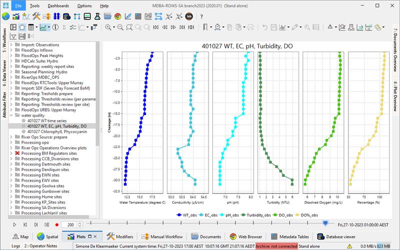
singleLocationDisplays
showAsVerticalProfile
| Info | ||
|---|---|---|
| ||
| todo |
showAsScatterPlot
...
- 30 Sept.2012 | |
12 Sept.2012 | 1 Oct.2012 - 30 Sept.2013 |
12 Oct.2012 | 1 Oct.2012 - 30 Sept.2013 |
|
|
tickTimeStep
To tie the date/time ticks to the valid times of the (cardinal) time step, configure ‘tickTimeStep’ in DisplayGroups.xml. For example, if the ‘tickTimeStep’ is 6 hours then the ticks are always aligned with the synoptic times 00Z, 06Z, 12Z, 18Z. When we are zooming out and there is no space to display all date/times along the x-axis, then one or more synoptic times ticks are omitted. For example we see ticks at 00Z and 18Z.
| Anchor | ||||
|---|---|---|---|---|
|
Adds multiple displays at once to this display group. Every display will show only one location.
showAsVerticalProfile
When true vertical profile timeseries are calculated on the fly from the scalar time series at the child locations of the locations defined in the timeSeriesSet.
|
|
classbreaks or classbreak id
It's possible to configure classbreaks for vertical profile time series. If they are configured, in the time series dropdown menu a "Use color map" button will become visible.
Config example:
| Code Block | ||||
|---|---|---|---|---|
| ||||
	<plot id="waterTemperatureVerticalProfile">
		<subplot>
			<line>
				<color>blue</color>
				<lineStyle>solid;thick</lineStyle>
				<markerStyle>square</markerStyle>
				<timeSeriesSet>
					<moduleInstanceId>ProcessObservedWaterquality</moduleInstanceId>
					<valueType>scalar</valueType>
					<parameterId>WT_obs</parameterId>
					<locationId>R_401027</locationId>
					<timeSeriesType>external historical</timeSeriesType>
					<timeStep unit="hour" multiplier="3"/>
					<readWriteMode>read only</readWriteMode>
				</timeSeriesSet>
			</line>
			<classBreaksId>WaterTemperature</classBreaksId>
		</subplot>
		<subplot>
			<line>
				<color>turquoise</color>
				<lineStyle>solid;thick</lineStyle>
				<markerStyle>square</markerStyle>
				<timeSeriesSet>
					<moduleInstanceId>ProcessObservedWaterquality</moduleInstanceId>
					<valueType>scalar</valueType>
					<parameterId>EC_obs</parameterId>
					<locationId>R_401027</locationId>
					<timeSeriesType>external historical</timeSeriesType>
					<timeStep unit="hour" multiplier="3"/>
					<readWriteMode>read only</readWriteMode>
				</timeSeriesSet>
			</line>
			<classBreaks>
				<break lowerValue="2" color="green"/>
				<break lowerValue="3" color="dark sea green"/>
			</classBreaks>
</subplot> |


alwaysDisplayAsColorMap
| Code Block | ||||
|---|---|---|---|---|
| ||||
		<display id="WT_R_401027_heatmap" name="401027 WT (heatmap)">
			<relativeViewPeriod unit="hour" start="-336" end="168"/>
			<locationId>R_401027</locationId>
			<plotId>waterQualityHeatmapTemperature</plotId>
			<showAsVerticalProfile>true</showAsVerticalProfile>
			<alwaysDisplayAsColorMap>true</alwaysDisplayAsColorMap>
</display> |
If alwaysDisplayAsColorMap is configured, the subplot will alwys appear as a color map; the option to toggle between vertical profile and color map will be disabled. It can only be used in combination with classbreaks.
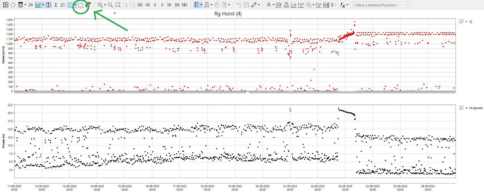
showAsScatterPlot
To plot time series, with the values of the different time series on the X and Y axis. |
...
|
...
|
...
|
...
| Example from operational system
|

Config examplesconfig example:
|
It is also possible to customise the interaction lines. In this case, the <referencePoints> element should be surrounded by <interactionLine> element. None of the customisation options within an <interactionLine> are compulsory. If you wish to configure several interaction lines, all of them have to be configured either as <interactionLine> or as <referencePoints>. You cannot mix <referencePoints> and <infoPlotLine>.
Config example:
|
To display the data in a scatterplot, you can chose between two options: <showAsScatterPlot> and <addInteractionScatterPlot> If you chose the first one, the
- <showAsScatterPlot>: TimeSeries display will be replaced with a
...
- scatterplot
- <addInteractionScatterPlot>: you can turn on an extra scatterplot that is displayed next to the original time series.
...
- This button has to be enabled in the
...
- TimeSeriesDisplayConfig.xml
...
- buttonSettings with <showInteractionScatterPlot visible="true"/>
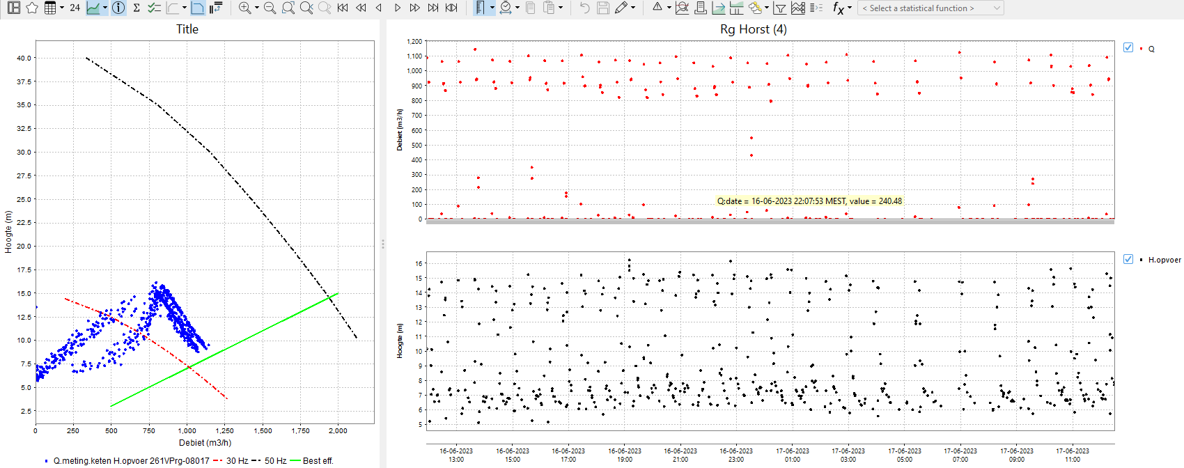
With the elements <xAxisRange> and <yAxisRange> the range of the x and y axis can be defined.
Pairing of time series
By default all time series with the same location are paired up.
Since 2017.02 time series with the same parameter can be paired up by using the element <createPairsByMatchingParameter>true</createPairsByMatchingParameter>
...
, but this behavior can be changed with the following configuration options.
- when there are 2 time series they will be paired up
...
- , regardless of their location or parameter (since 2019.
...
- 02)
- createPairsByMatchingParameter: time series with the same parameter can be paired (since 2017.02)
- markerVisibility:
...
- choose whether all data points
...
- ,
...
- none data points
...
- or onlyLast data point
...
- is visualised (since 2019.02)
- matchTimeSeriesPair:
...
- pair up the time series based on their configured order:
...
- timeSeriesOrder (since 2020.02
...
- )
- draw colored areas based on configured points. Also, in the plot, the grid lines in the background and the interaction line are visible, and legends are added next to the plot.
...
- (since 2020.02)
Scatter the scatter series are shown in standard time series table and all all configuration elements are optional , so it is enough suffices to configure <showAsScatterPlot/> (since 2022.02).
A simple scatter plot , without any additional options , is shown below :
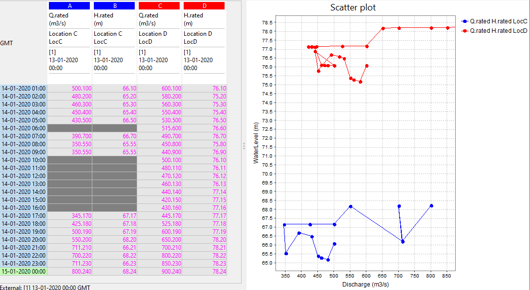
An example of scatter plot configuration that uses all optional elements, together with the resulting plot:
|
An example of the scatter plot created with the configuration above :
|

...
Example from Operational system:
...
statisticalFunctionId
(since 2021.02) Using statisticalFunctionId it is possible to create a preconfigured display with any statistical function.
...