...
- min (max is not implemented): set default minimum value for y-axis, which will be overruled by data that is below this value
- yAxisScalingType (since 2020.02): Default is scaleOutsideMinAndMax. If it is set to scaleOutsideMinAndMax, the y axis will scale to the data available. If it is set to fixedBetweenMinAndMax, the min and max of the y axis will always be the configured values, regardless of the data. This could make the entire data set fall of the visible chart. If all the data is in the middle of min and max withing a small range, the axis will scale to the data, it will appear as a small line in the middle. If it is set to scaleBetweenMinAndMax, the min will never be smaller than what is configured, and the max will never be greater than configured, but if the available data falls between these values, the axis will scale so that the data fills the whole area. If the data falls entirely outside of min and max, it will not be visible.
- convertDatum
stackPlot - deprecated since 2014.02
Elements :
- descriptionsubPlotType
- subPlotType: stack, colorMapBars, horizontalColorCode
- axisLable, axisScaleUnit, lowerMarginPercentage, upperMarginPercentage
- leftAxis, rightAxis
- barMarginPercentage (Since 2018.02) Percentage of the bar width by which it will be reduced, to create space between the bars.
General option to be applied to all plots containing bars (e.g. "horizontalColorCode" or bar charts). Overrules the general barMarginPercentage for a specific subplot.
Default value is the barMarginPercentage of the TimeSeriesDisplayConfig.xml (which defaults to 0). - inverted
- logarithmic
- drawingOrderInverted
- splitForDifferentRuns
- plotweight
- plotSeparatorWeight
- thresholdAxis
- thresholdAxisScaling
- forecastConfidenceTimeSpanline, with dual axis plot
- sub plot types
- line
- area Fills the area between multiple time series.
- clusteredBars
- variableLineWidth
- classBreaksId, classBreaks
- direction
- line elements
- color: Overides colors specified in the timeseriesdiplay
- lineStyle: Line style of time series marker line. Enumeration of "solid", "none", "bar", "dashdot", "dashed", "dotted". When a suffix of ";thick" is given, 1 will be added to the linewidth found in the TimeSeriesDisplayConfig.xml. For example, if a linewidth of 2 is configured in the TimeSeriesDisplayConfig and for a subplot the linestyle is set to "solid;thick", the resulting linewidth will be 2 + 1 = 3.
- markerStyle, markerText, markerSize
- axis for dual axis plots
- ratingAxis, lookupAxis, datumAxis
- visibleInLegend
- label
- visibleInTable, visibleInPlot
- descriptiveFunction, with value and timeSpan
- timeSeriesSet, with
- additionalTimeSeries
subPlotType
...
| Code Block | ||||||||
|---|---|---|---|---|---|---|---|---|
| ||||||||
<plot id="Test">
   <subplot>
      <line>
         <color>dark orange</color>
         <visibleInLegend>false</visibleInLegend>
         <visibleInTable>false</visibleInTable>
		 <visibleInPlot>true</visibleInPlot>
         <timeSeriesSet>
         <moduleInstanceId>Import</moduleInstanceId>
         <valueType>scalar</valueType>
         <parameterId>H.m</parameterId>
         <locationId>LocA</locationId>
         <timeSeriesType>external historical</timeSeriesType>
         <timeStep unit="hour"/>
         <relativeViewPeriod unit="hour" start="-12" end="12"/>
         <readWriteMode>editing visible to all future task runs</readWriteMode>
      </timeSeriesSet>
   </line>
   </subplot>
</plot> |
axis (dual y-axis plot)
It is possible to have two y-axis visible in the same plot. This can be done by having multiple timeseries where some are assigned to the left y axis and some to the right y axis, or by having a timeseries on the left y axis with an associated rating curve on the right y axis. So every timeseries plot (also in reports) will have a mandatory left y axis to which a timeseries is associated and an optional right y axis to which a timeseries or rating curve is associated.
The display of threshold lines are supported for one y axis. But there can be threshold lines for either the left or the right y axis, but not both.
Multiple TimeSeries plots (dual y-axis plot)
To associate a timeseries to the left or right y axis use the <axis> element. This element is optional and leaving it out will associate it (default) to the left axis. Please note that at least one timeseries should be on the left axis (by either settings <axis>left</axis> or leaving the element out and using the default).
Below are two examples of a config and the resulting plot.
...
| language | xml |
|---|---|
| title | dual axis example (click to expand) |
| linenumbers | true |
| collapse | true |
...
area
Attributes available when creating an area type display:
- color: Overides other predefined colours
- opaquenessPercentage: Opaqueness expressed as a percentage
- IncludesZeros: When true the zero is always included in the painted extent
filled vertical lines (area)
Use the <area> element in combination with a <lineStyle> to obtain vertical lines.

| Code Block | ||||||||
|---|---|---|---|---|---|---|---|---|
| ||||||||
<subplot>
     <area>
        <lineStyle>solid</lineStyle>
        <lineWidth>10</lineWidth>
         <color>blue</color>
         <opaquenessPercentage>50</opaquenessPercentage>
           <timeSeriesSet>
                <moduleInstanceId>ImportMSW</moduleInstanceId>
                <valueType>scalar</valueType>
                <parameterId>Q.m</parameterId>
                <locationId>H-MS-LUIK</locationId>
                <locationId>H-MS-SINT</locationId>
                <timeSeriesType>external historical</timeSeriesType>
                <timeStep unit="hour"/>
                <relativeViewPeriod unit="day" start="-2" end="0"/>
                <readWriteMode>read only</readWriteMode>
           </timeSeriesSet>
        </area>
</subplot>
|
clusteredBars
This option makes it possible to cluster bars per timestep. The config example below shows how clustered bars are displayed and configured:

| Code Block | ||||||||
|---|---|---|---|---|---|---|---|---|
| ||||||||
<displayGroup name="bars"> <display name="clusteredBars"> <subplot> <clusteredBars axis="left"> <bar> <color>blue</color> <visibleInLegend>false</visibleInLegend> <visibleInPlot>false</visibleInPlot> <timeSeriesSet> <moduleInstanceId>Import</moduleInstanceId> <valueType>scalar</valueType> <parameterId>H.m</parameterId> <locationId>LocA</locationId> <timeSeriesType>external historical</timeSeriesType> <timeStep unit="hour"/> <relativeViewPeriod unit="hour" start="- |
...
12" end=" |
...
12"/> |
...
<readWriteMode>editing visible to all future task runs</readWriteMode> |
...
</timeSeriesSet> |
...
</ |
...

...
| language | xml |
|---|---|
| title | dual axis with 2 parameterGroups example (click to expand) |
| linenumbers | true |
| collapse | true |
...
bar> <bar> <color>red</color> <visibleInTable>false</visibleInTable> <label>Rated Discharge</label> <timeSeriesSet> <moduleInstanceId>Import</moduleInstanceId> <valueType>scalar</valueType> <parameterId>Q.m</parameterId> <locationId>LocA</locationId> <timeSeriesType>external historical</timeSeriesType> <timeStep unit="hour"/> <relativeViewPeriod unit="hour" start="- |
...
12" end=" |
...
12"/> |
...
<readWriteMode>editing visible to all future task runs</readWriteMode> |
...
</timeSeriesSet> |
...
</ |
...

Threshold line only for timeseries on the right y axis
bar>
         </clusteredBars>
      </subplot>
</display> |
variableLineWidth
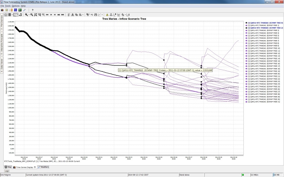
Type of plot that can use variable line width's for different graphs. See screenshot below of plot for different ensemble members with different line width's. In this case line width is an indication of the probability of the ensemble member. The sum of probability of all ensemble members at a time is one. Selecting separate ensemble members will mark them with the color black.
Attributes:
- markerColor: option to set marker color different from line color
- lineWidthScaleFactor: factor to increase or decrease the line width
- valueTimeSeriesSet: Time series for XY line plot
- lineWidthTimeSeriesSet: Time series for line width of the XY plot lines
line elements
axis (dual y-axis plot)
It is possible to have two y-axis visible in the same plot. This can be done by having multiple timeseries where some are assigned to the left y axis and some to the right y axis, or by having a timeseries on the left y axis with an associated rating curve on the right y axis. So every timeseries plot (also in reports) will have a mandatory left y axis to which a timeseries is associated and an optional right y axis to which a timeseries or rating curve is associated.
The display of threshold lines are supported for one y axis. But there can be threshold lines for either the left or the right y axis, but not both.
Multiple TimeSeries plots (dual y-axis plot)
To associate a timeseries to the left or right y axis use the <axis> element. This element is optional and leaving it out will associate it (default) to the left axis. Please note that at least one timeseries should be on the left axis (by either settings <axis>left</axis> or leaving the element out and using the default).
Below are two examples of a config and the resulting plot.
|
Stage/discharge plots (dual y-axis plot)
When a discharge is displayed, it is possible to show the stage on the right axis. It is not possible to configure this rating on the left axis (and the timeseries on the right axis), since a plot has to have at least one timeseries on the left axis.
The right axis is then not a linear axis but the ticks on the right axis are calculated from the discharge ticks on the left axis.
It is also possible to display the stage and show the discharge on the right axis. The example below shows a display which plots several discharge time series.
The left axis is a linear axis with ticks for the discharge. The right axis is a non-linear axis.
The ticks on the right axis are calculated from the value of the discharge on the left axis by using a rating curve.
Below an configuration and resulting plot
| language | xml |
|---|---|
| title | ratingAxis example (click to expand) |
| linenumbers | true |
| collapse | true |
|
|
|
|
|
|
|
|
|
|
|
|
|

area
Attributes available when creating an area type display:
- color: Overides other predefined colours
- opaquenessPercentage: Opaqueness expressed as a percentage
- IncludesZeros: When true the zero is always included in the painted extent
filled vertical lines (area)
Use the <area> element in combination with a <lineStyle> to obtain vertical lines.
| Code Block | ||||||||
|---|---|---|---|---|---|---|---|---|
| ||||||||
<subplot>
     <area>
        <lineStyle>solid</lineStyle>
        <lineWidth>10</lineWidth>
         <color>blue</color>
         <opaquenessPercentage>50</opaquenessPercentage>
           <timeSeriesSet>
                <moduleInstanceId>ImportMSW</moduleInstanceId>
                <valueType>scalar</valueType>
                <parameterId>Q.m</parameterId>
                <locationId>H-MS-LUIK</locationId>
                <locationId>H-MS-SINT</locationId>
                <timeSeriesType>external historical</timeSeriesType>
                <timeStep unit="hour"/>
                <relativeViewPeriod unit="day" start="-2" end="0"/>
                <readWriteMode>read only</readWriteMode>
           </timeSeriesSet>
        </area>
</subplot>
|
clusteredBars
This option makes it possible to cluster bars per timestep. The config example below shows how clustered bars are displayed and configured:
| Code Block | ||||||||
|---|---|---|---|---|---|---|---|---|
| ||||||||
<displayGroup name="bars">
   <display name="clusteredBars">
      <subplot>
         <clusteredBars axis="left">
            <bar>
               <color>blue</color>
               <visibleInLegend>false</visibleInLegend>
               <visibleInPlot>false</visibleInPlot>
               <timeSeriesSet>
                  <moduleInstanceId>Import</moduleInstanceId>
                  <valueType>scalar</valueType>
                  <parameterId>H.m</parameterId>
                  <locationId>LocA</locationId>
                  <timeSeriesType>external historical</timeSeriesType>
                  <timeStep unit="hour"/>
                  <relativeViewPeriod unit="hour" start="-12" end="12"/>
                  <readWriteMode>editing visible to all future task runs</readWriteMode>
               </timeSeriesSet>
            </bar>
            <bar>
               <color>red</color>
               <visibleInTable>false</visibleInTable>
               <label>Rated Discharge</label>
               <timeSeriesSet>
                  <moduleInstanceId>Import</moduleInstanceId>
                  <valueType>scalar</valueType>
                  <parameterId>Q.m</parameterId>
                  <locationId>LocA</locationId>
                  <timeSeriesType>external historical</timeSeriesType>
                  <timeStep unit="hour"/>
                  <relativeViewPeriod unit="hour" start="-12" end="12"/>
                  <readWriteMode>editing visible to all future task runs</readWriteMode>
               </timeSeriesSet>
            </bar>
         </clusteredBars>
      </subplot>
</display> |
variableLineWidth
Type of plot that can use variable line width's for different graphs. See screenshot below of plot for different ensemble members with different line width's. In this case line width is an indication of the probability of the ensemble member. The sum of probability of all ensemble members at a time is one. Selecting separate ensemble members will mark them with the color black.
Attributes:
- markerColor: option to set marker color different from line color
- lineWidthScaleFactor: factor to increase or decrease the line width
- valueTimeSeriesSet: Time series for XY line plot
- lineWidthTimeSeriesSet: Time series for line width of the XY plot lines
...
|
| |||||||||||
|
|
Stage/discharge plots (dual y-axis plot)
When a discharge is displayed, it is possible to show the stage on the right axis. It is not possible to configure this rating on the left axis (and the timeseries on the right axis), since a plot has to have at least one timeseries on the left axis.
The right axis is then not a linear axis but the ticks on the right axis are calculated from the discharge ticks on the left axis.
It is also possible to display the stage and show the discharge on the right axis. The example below shows a display which plots several discharge time series.
The left axis is a linear axis with ticks for the discharge. The right axis is a non-linear axis.
The ticks on the right axis are calculated from the value of the discharge on the left axis by using a rating curve.
Below an configuration and resulting plot
|
|
timeSeriesSet
chainageLocationSetId
...