...
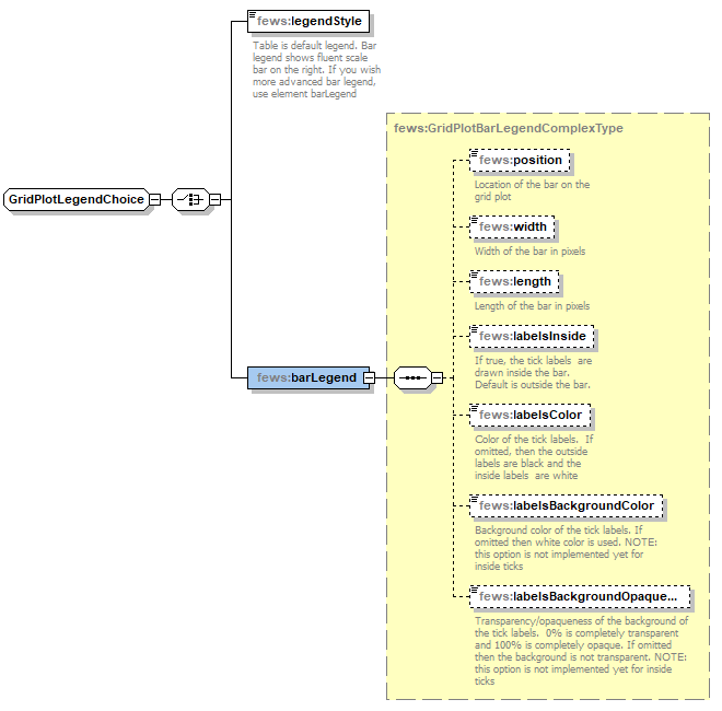
barLegend
Use this element to show a customized color bar legend.
The following legend properties can be changed:
- position: legend can be placed on the right, on the left, at the top or at the bottom. Default is on the right.
- width: width of the bar in pixels. Default is 40 pixels.
- length: length of the bar in pixels. The defaults are 400 pixels for legend on the right/left, and for the legend at the top/bottom the length equals the width of the window.
- labelsInside: if true, ticks and labels are displayed inside the legend bar. The default is outsideBy default (false) labels and ticks are placed outside the color bar.
- labelsColor (since 2021.01): color of the tick labelslabel texts. If omitted, then the outside labels are black and the inside labels labels are white.
- labelsBackgroundColor (since 2021.01): background color of the tick labels. If omitted then , white color is used. Note that this option isnot is not implemented for inside ticks yetand labels (i.e.: labelsInside=true).
- labelsBackgroundOpaquenessPercentage (since 2021.01): transparency/opaqueness of the background of the tick labels. 0% is completely transparent and 100% is completely opaque. If omitted then the background is not transparent. Note that Note that this option is not is not implemented for inside ticks yetticks and labels (i.e.: labelsInside=true).
Elements of the configuration of legend style
...